
AWING, connection with wings
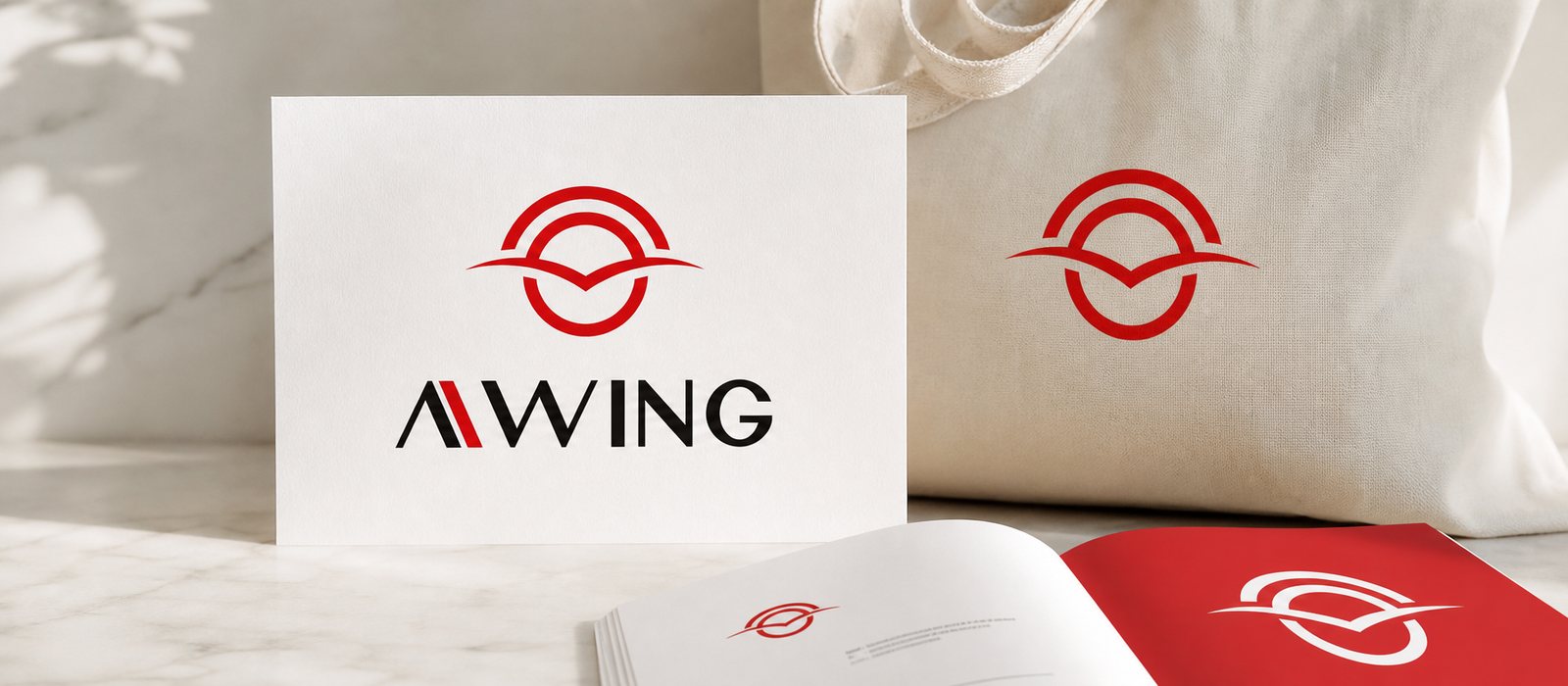
AWING turns free public wifi into a location-based advertising channel, connecting brands with the right people, in the right place, at the right time. Sinh Vũ built the identity for that platform: a bird's wing merged with a wifi wave, balanced on a play of red and black.
The problem
AWING carries a media-technology ambition: turning free public wifi into a location-based advertising channel. A user switches on wifi at a café, a shopping mall or an airport, and in that very moment a brand can appear to the right person, in the right place, at the right time; the wifi owner earns new revenue; the user gets a free connection. It is a multi-sided model, set on covering the whole country and then reaching across the region.
The difficulty lies in the very newness of the model. AWING sits between three very different audiences: end users need it to feel friendly and easy to touch; advertisers and venue partners, often premium brands and premium spaces, need to see a composed, credible technology platform. The brief to Sinh Vũ was therefore never just a pretty logo: the identity had to carry both faces at once, progressive yet grounded, mass yet premium, flexible enough to live on a login screen and inside an investor deck alike.
How it was done
Before drawing anything, we worked with the AWING team to clarify the model and the three audiences the brand had to address at once. From the image of a free bird in AWING leadership's own idea, both sides found the emotional through line: connection is freedom, but a freedom carried by a platform confident enough to stand beside major brands.
That stance solved the hardest problem: a service that reaches the masses can still wear the face of a serious technology platform. Neither dumbed down nor held at a cold, technical distance, AWING had to stand right between those two extremes.
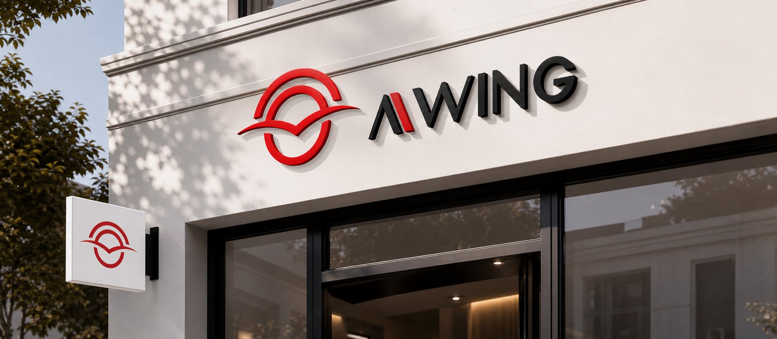
Starting from the idea of a pair of wings, we stylised the wifi wave into wings mid-spread inside a compact circle. The soft lines suggest both a signal rippling outward and a movement reaching far, two things a location-based platform must say at once: the infrastructure of connection and the breadth of its coverage. The mark is simple enough to read at a glance, alive enough never to sit still.
Around the symbol, we built the full identity system: type, placement, breathing space and the variations for flexible use. The lines were tuned to hold their shape from a small mark on a card to a large sign in a lobby. That is where an identity system differs from a logo: it is the full set of signals that lets people recognise the brand in the middle of a crowded public venue.
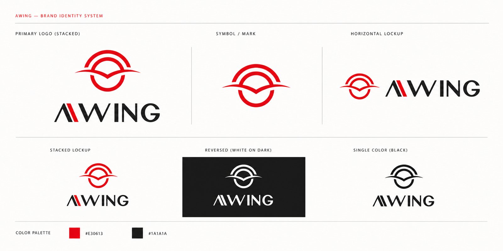
Colour was the second big decision after form. For AWING we chose a strong red, close to a signal red: the colour of energy, of creative breakthrough and of the pioneering nerve a company that redefines advertising ought to have. Red makes the brand stand out at once in the visual noise of a public venue, and matches the consumer tempo AWING is after.
But red alone easily turns loud, and loud rarely lasts. We set beside it a deep, near-absolute black to serve as ground and as anchor. Red is yang: movement, magnetism, the drive to break through; black is yin: depth, and the composure of a platform to be trusted. The two lean on each other in the manner of yin and yang: the brand flares up before its users, yet holds firm in the eyes of advertisers and partners.
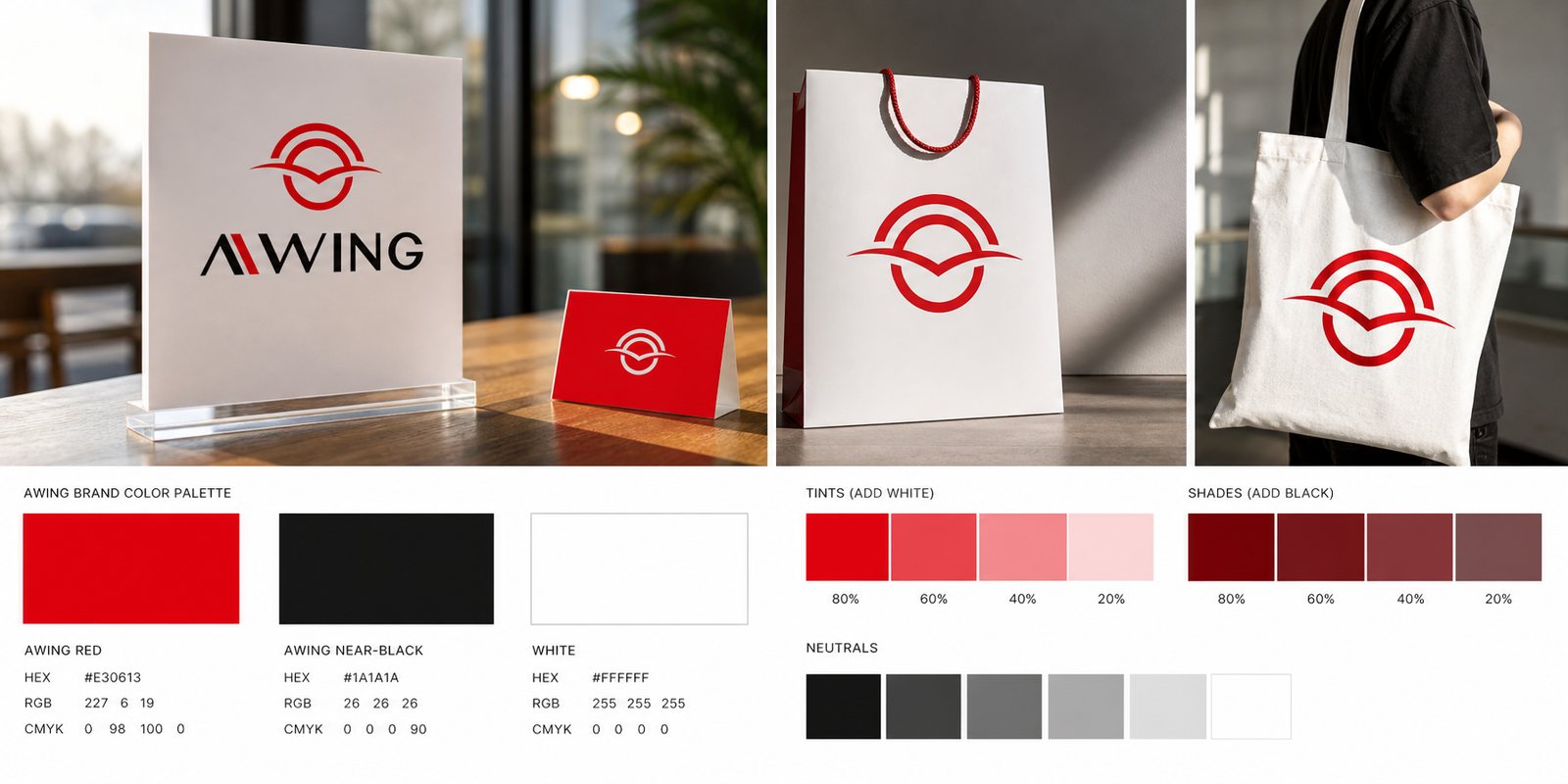
It is precisely this balance that answers the original brief, letting AWING be at once mass and premium, progressive and durable. So that it never drifts as it multiplies across thousands of touchpoints, we wrote the brand guideline: how red and black share their proportions, how the wing is placed, how far type and breathing space may go. The guideline keeps flexibility from turning into licence, letting the red-and-black balance repeat evenly on a standee, a signboard or a login screen.
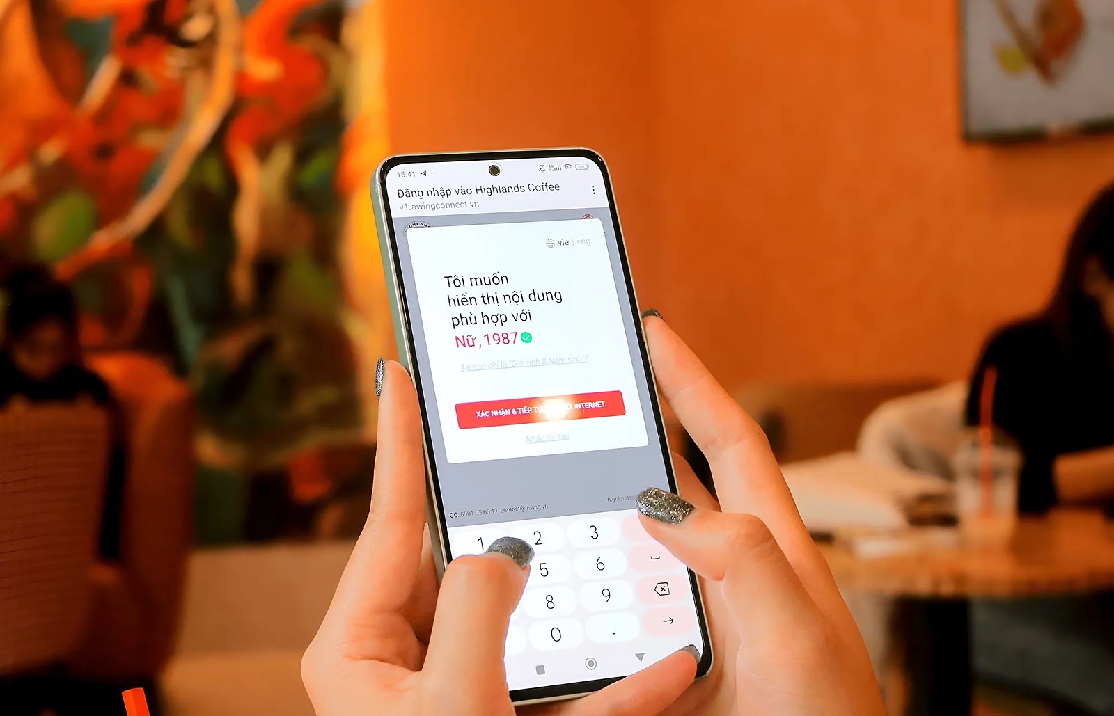
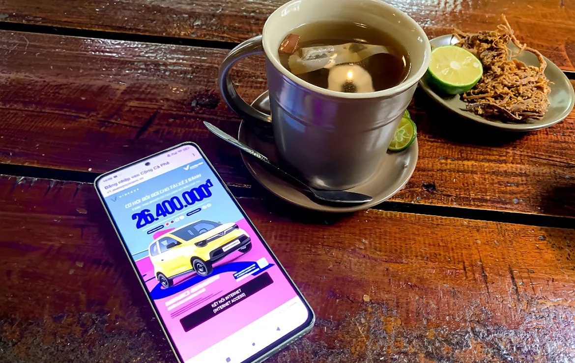
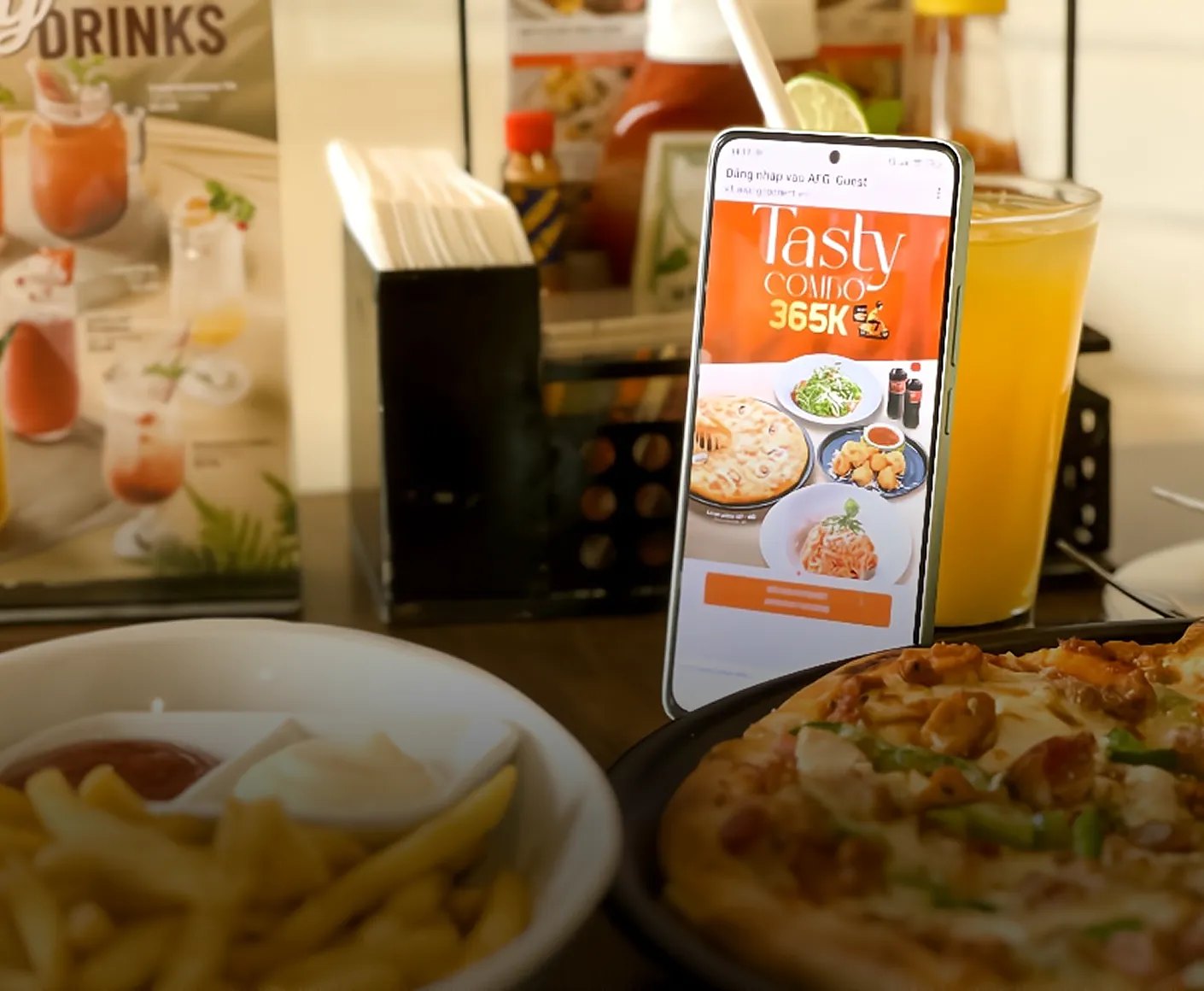
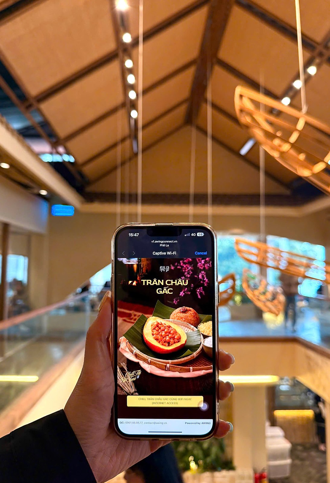
AWING lives on screen. A user switches on wifi, a connection page appears, and that page is at once the first digital touchpoint with the brand and the space where an advertising message can surface. We designed the interface for the login page and the information portal, so that connecting is quick and clean, while the advertising appears in the right place without breaking the experience.
A consistent digital design system turns the connection portal into a living channel: users get online for free, brands reach the right people at the right moment, and wifi owners gain added value. The identity carries onto screen with the same care it carries onto paper, so that every login is another moment AWING is recognised.
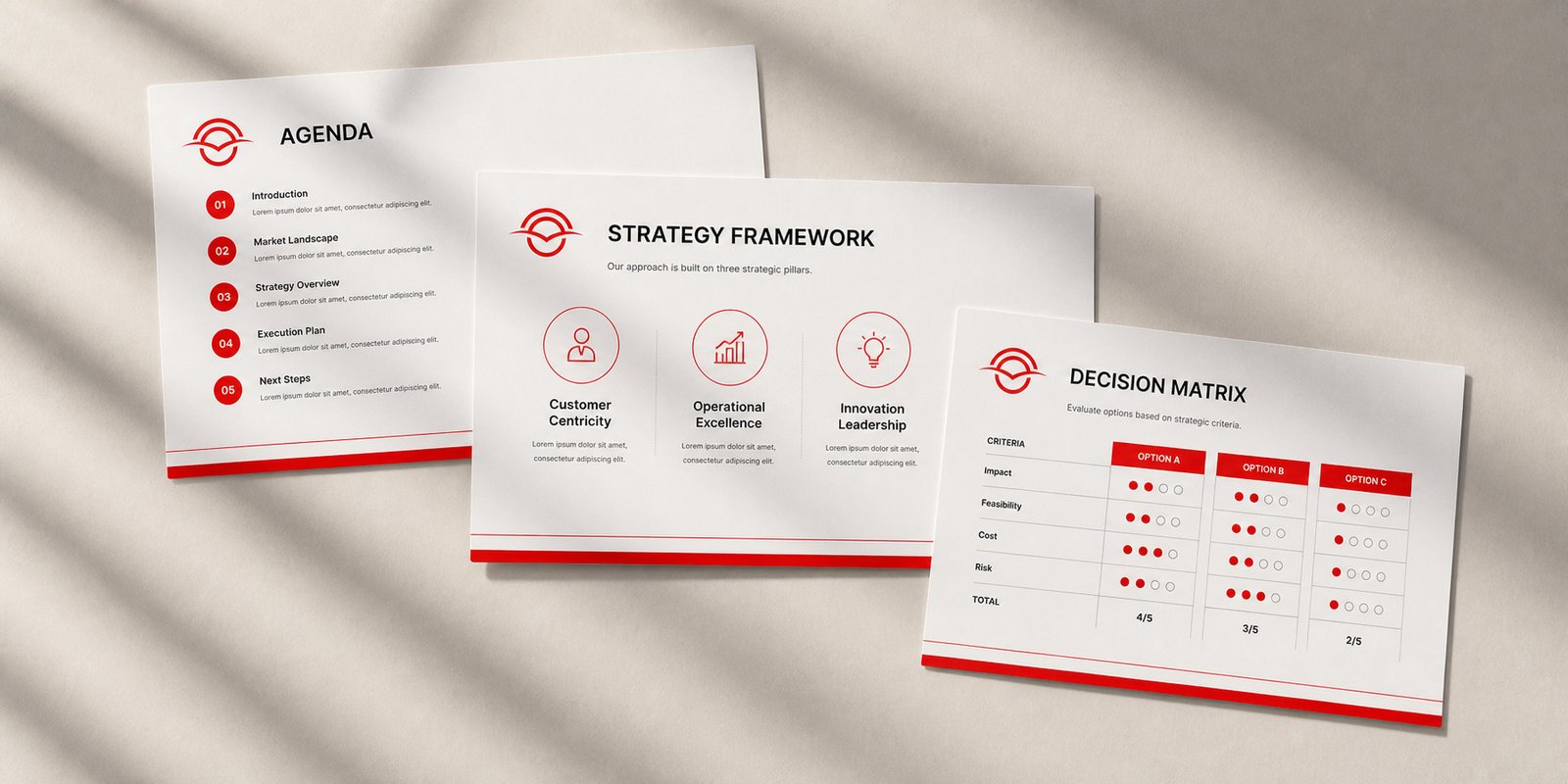
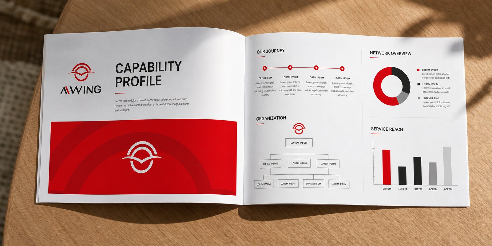
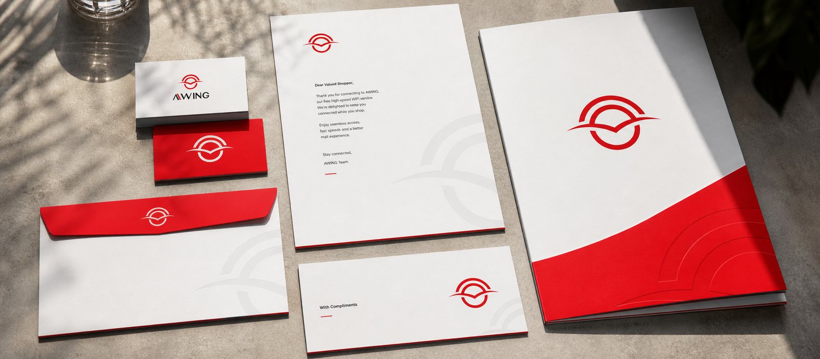
AWING does not speak to end users alone. Much of the model's value rests on the trust of advertisers, of venue partners and of investors. We built the set of corporate documents: a capability profile and materials presenting the model and the vision, coherent enough for a new idea to be understood correctly at the very first meeting.
For a technology company expanding and raising capital, the polish of its documents is the first proof of the seriousness behind it. Here the black of the identity plays its proper part, giving the profile a grounded, trustworthy bearing.
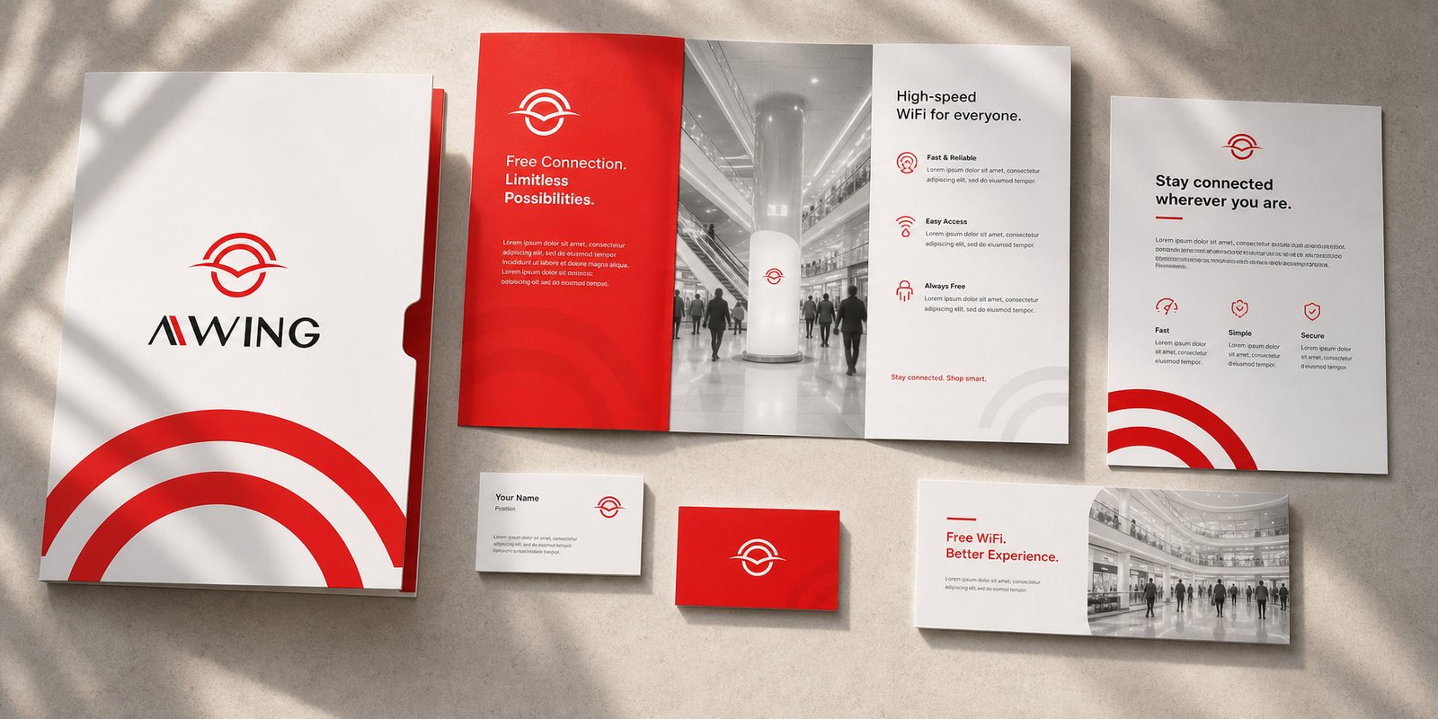
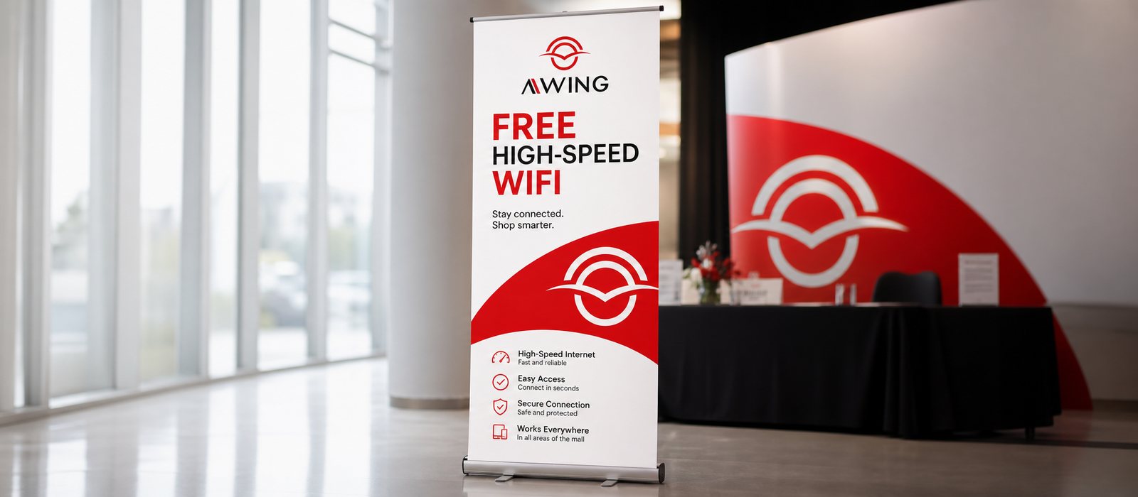
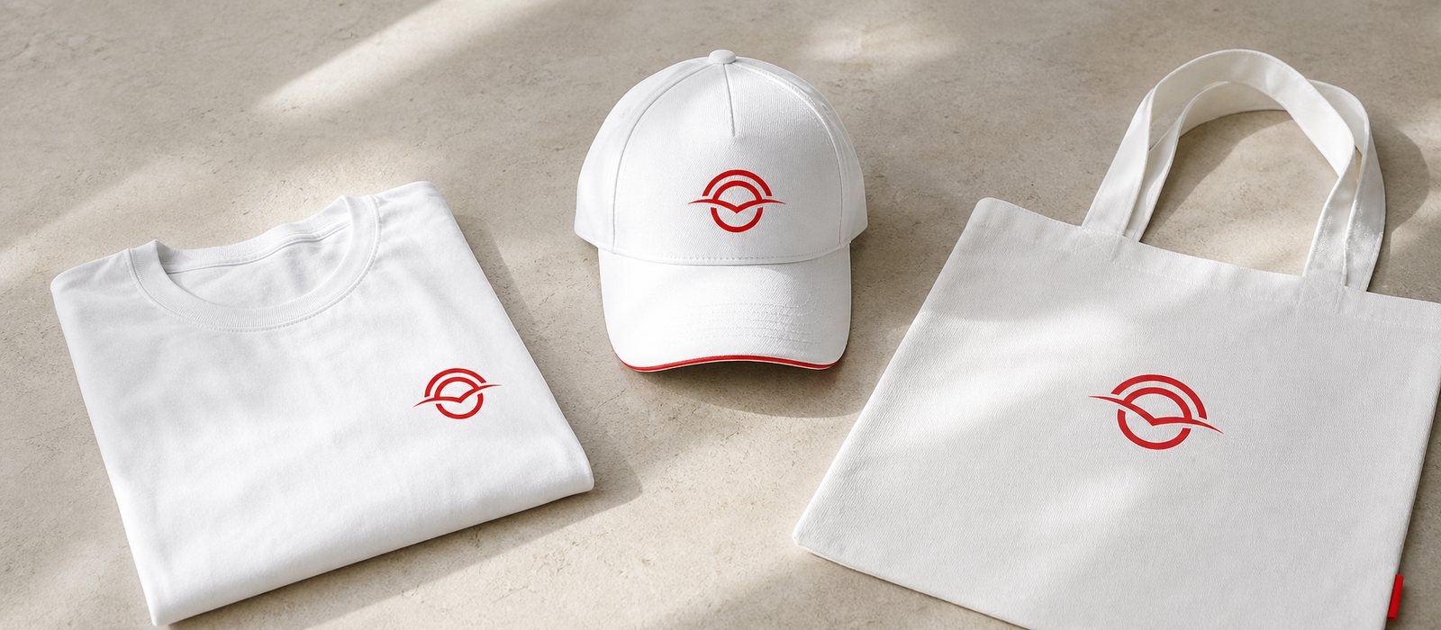
Finally, the brand had to step out into the venues. We built the sales and marketing kit: standees, printed materials, promotional items, signage, so that AWING appears at the entrance, in the lobby, wherever people pause and switch on wifi.
Thanks to its flexible lines and its clear red-and-black balance, the symbol holds its shape across every material, from a single poster to a full campaign. Wherever it goes, AWING wears the same face: energetic enough to invite, grounded enough to trust.
The process
Listening and positioning
Working with AWING to clarify the model and the three audiences the brand must address, settling on a stance both progressive and grounded.
Building the symbol
Stylising the wifi wave into a pair of wings, building the identity on a balanced play of red and black in the manner of yin and yang.
Onto screen and onto paper
Designing the digital connection portal, the brand guideline and the corporate documents.
Reaching across every venue
The sales and marketing kit carrying AWING to every touchpoint, from a mall lobby to a login screen.
The result
What AWING received was not a logo, but a living system of signals at home everywhere: on the login page, on the standee in the lobby, in the profile before investors. The red wing on black, with its flexible lines, keeps the same face however many touchpoints it multiplies into.
For a new model that still has much to explain, a clear, balanced identity is exactly what helps AWING be understood and trusted faster. That red-and-black balance, placed right, gives the brand a breakthrough drive that still stands firm, catching the eye at once yet lasting for the long road.
One wing, across every venue
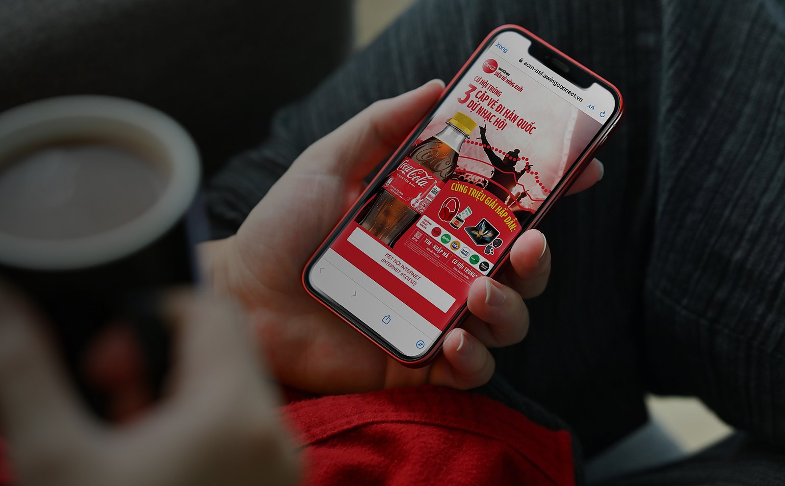
This is AWING in the real world: the connection portal and the advertising formats on users' phones, alongside an identity that reaches across every venue.
Is your problem like AWING's?
Tell Sinh Vũ what is on your mind about your brand. Sinh Vũ will point you to the right direction right away.