360mobi.net: a content library without limits
360mobi.net is a Moore Corp product that gives away ringtones, ringback tones, wallpapers and apps for mobile phones. Sinh Vũ designed the logo, the identity (the logo, colours and lettering used consistently everywhere) and the web interface, so the service name reads clearly on a very small phone screen.
A name that must read on a very small screen
Moore Corp is a company that advises on and runs advertising campaigns in digital media. 360mobi.net is one of its products: a service giving away ringtones, ringback tones, wallpapers and apps for Java phones, the basic small-screen handsets common at the time.
The client gave Sinh Vũ three jobs: the identity, the logo and the website. The brief for the logo was clear: understood at a glance, friendly to users, and legible on a screen of only about 320 x 240 pixels.
At that size a logo with much detail smears into a blur. So the logo had to be very simple and still stand apart from the countless other free download sites.
Three digits joined in one stroke
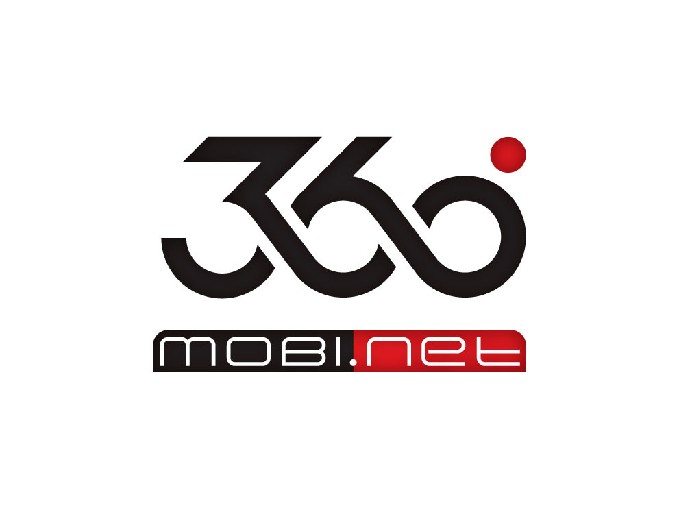
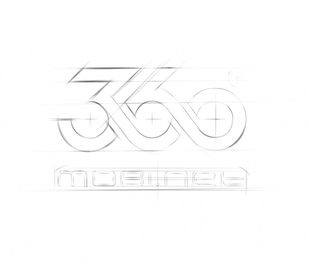
The idea came from a spiral: the digits 3, 6 and 0 run into one another to form a single continuous logo. That join expresses 360mobi's promise to users. Value-added services (extras beyond calls, such as ringtones and wallpapers) come together, without limits, for every kind of phone.
The digits are black only, with a red dot above the 0 as the accent. Beneath is the mobi.net bar, half black and half red, in a light stroke. The sketch shows each curve built on grid lines and circle centres, so the digits join up evenly and cleanly.
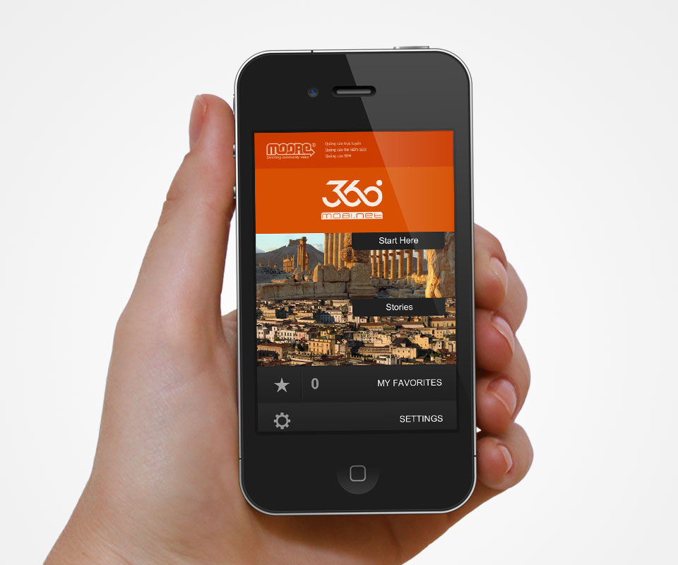
The logo on a phone screen
In the mock-up of the interface, the white logo sits in a deep orange band at the top of the screen, just below the Moore logo. Beneath are two large image tiles leading into the content, then two horizontal bars for favourites and settings.
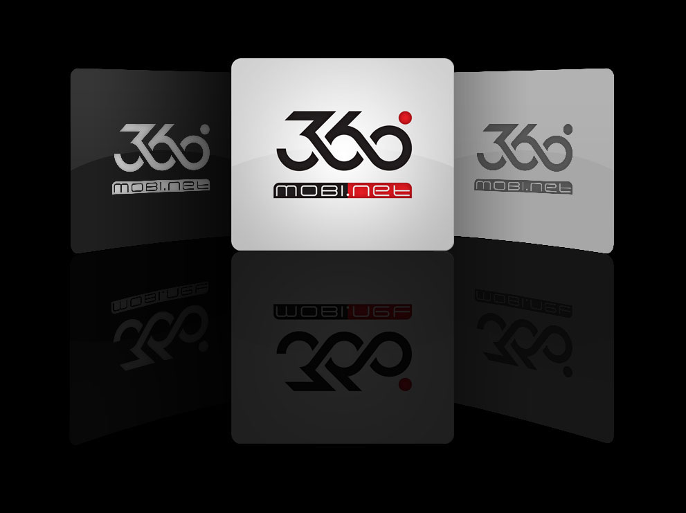
The logo also has three icon versions: black and red on a light ground, and in grey tones on black and grey grounds. This keeps the logo legible whatever colour it is placed on.
The logo on stationery and the identity set
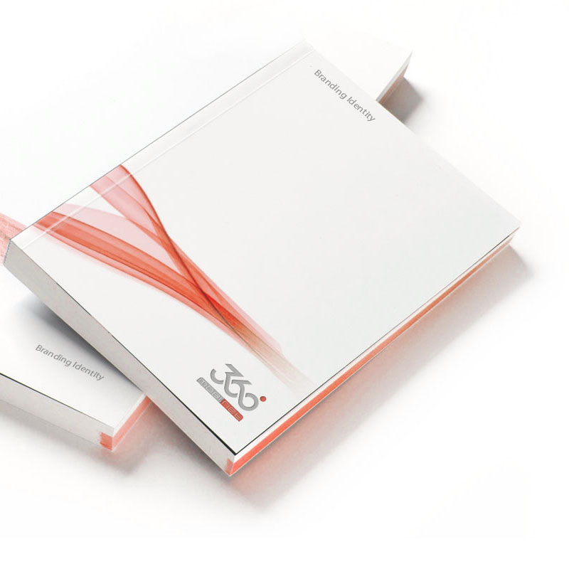
The business stationery set has letterhead, envelopes and business cards. On white paper the logo is embossed (pressed into the paper without ink), so it carries no colour. On the black envelopes and cards it is printed in silver grey, with a red stripe echoing the logo's red dot.
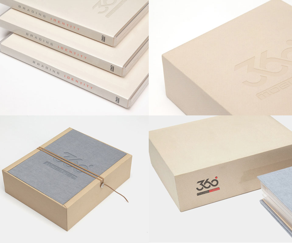
The identity pack is held in a cream paper box with a grey cloth-covered lid and a tie. With it come a brand identity book and a DVD case, all carrying the 360mobi.net logo.
The value
360mobi.net has a compact logo built from one continuous stroke, still recognisable when reduced. The same logo works on the phone interface, on the icons and on business stationery.
A simple logo means leaving out decoration. Sinh Vũ chose clarity, because users mostly meet this service on a very small phone screen.
The digits 360 in one stroke