
Vinawaco: a wave that holds its shape on every material
Vinawaco is a waterway construction corporation: dredging channels, building embankments, shoring banks, raising ports. Sinh Vũ designed its logo and identity so the company looks as steady as its own works.
Work that sits under water
Most of what a waterway contractor builds is hidden below the surface. Channels are dredged deeper and embankment footings reinforced, yet outsiders only see a calm river. So when Vinawaco bids for work or meets partners, it needs an image that speaks for the works no one can see.
Construction has its own rules too. Investors choose a contractor on trust: is the company big enough, durable enough, serious enough for work that runs for years? Vinawaco's logo had to carry that feeling before anyone opened its capability profile.
A wave held inside a circle
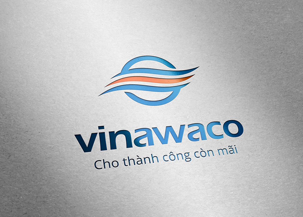
Sinh Vũ drew the symbol from three horizontal waves held inside a circle. The waves speak of water, the circle of something closed and sure, like a dyke keeping a current on course. Together they describe exactly what Vinawaco does: guide the flow of water.
The main colour is a deep sea blue with an orange band on the lowest wave. Blue reads as reliable and belongs to water. The small orange band is the colour of marker buoys, life vests and channel lights, so people in the trade find it familiar at once.
Tested on real materials
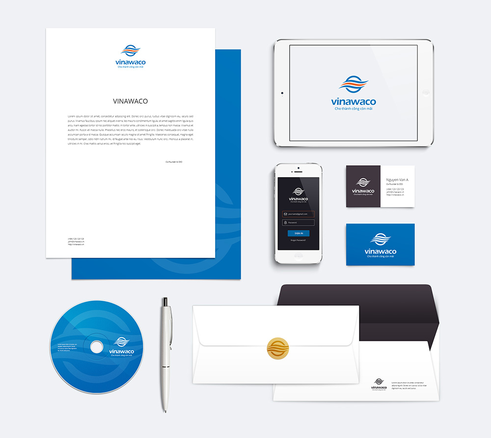
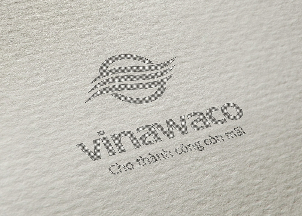
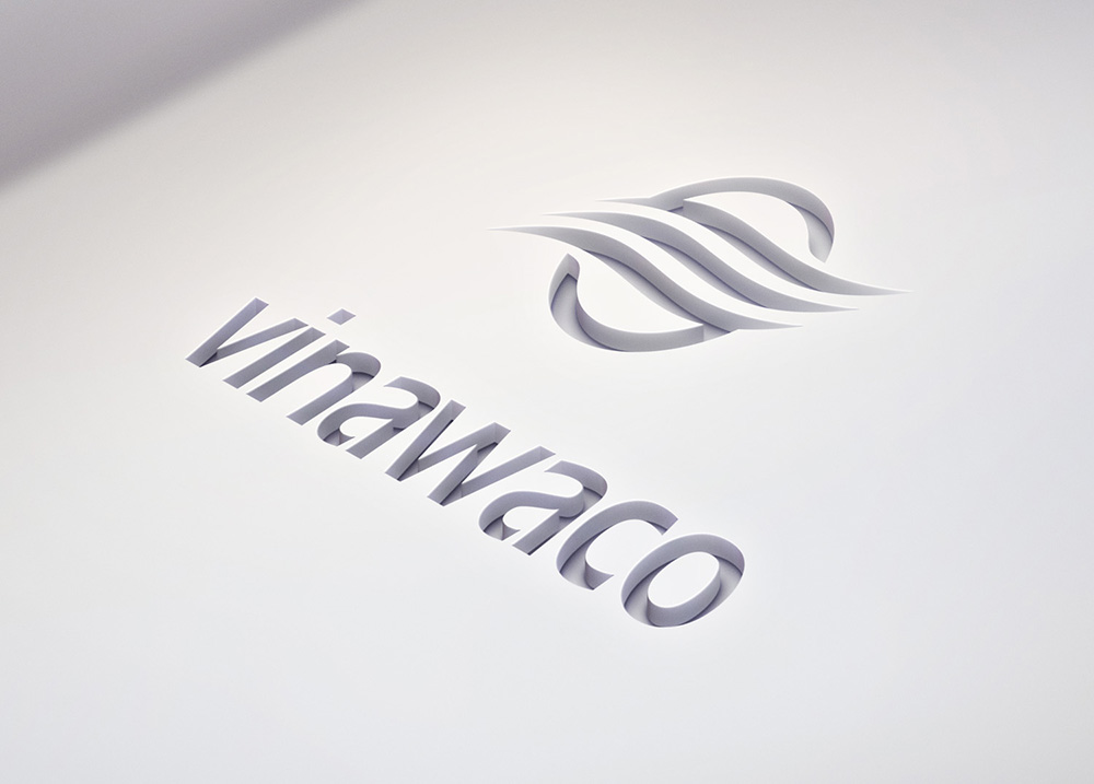
A contractor's logo does not stay on paper. It is embossed on proposal covers, engraved on a brass plate at headquarters, printed in one colour on helmets, painted on dredgers. Sinh Vũ tested the symbol in each of these before signing it off, making sure the three waves never merge when small or in a single colour.
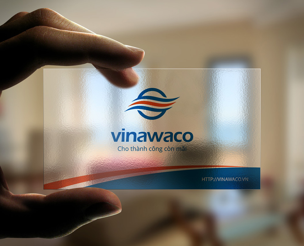
The lowercase vinawaco wordmark has round, medium strokes that read well from a distance. The line Cho thành công còn mãi, success that lasts, sits beneath it and speaks to what investors care about most in infrastructure: it has to last.
Papers that go to meet partners
From the logo, Sinh Vũ built the stationery: letterhead, envelopes, business cards and disc sleeves. They share one logo placement, one wave pattern and one palette, so any set of documents sent out is clearly Vinawaco's.
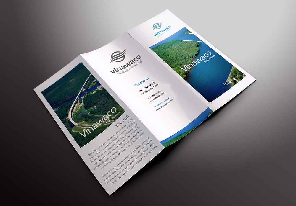
The company leaflet leads with photographs of finished works: an embankment following a river bend, a green channel between wooded banks. Photos take most of the space and the text stays short, because for an investor a real project convinces more than any introduction.
The value
Vinawaco gained an image that matches its size. Whether an investor holds the proposal, looks at a business card or walks through the gate, they meet the same wave in a circle and understand at once that this company works with water.
Because the symbol was proven in print, embossing, engraving and single colour, Vinawaco can put it on sites, vessels and signs without it distorting or losing detail. A contractor's logo should last as long as its works, and that is what Sinh Vũ put first.
Three waves that stay sharp in every technique
In their own words
Thank you, Sinh Vũ, for a professional design service. Thank you, Sinh, for your passion and effort in giving Vinawaco a new image that is beautiful and as solid as the works we build.