
Vietnam.vn: a lotus drawn in one stroke
Vietnam.vn is an information portal whose domain carries the country's name. A name like that needs a symbol dignified enough for the word Vietnam yet approachable for everyday readers. Sinh Vũ designed its lotus logo and identity.
A name of national weight
The domain vietnam.vn carries weight on its own: readers think of the whole country. So its symbol could not be arbitrary. It had to speak a shared language Vietnamese people recognise at once, before adding the portal's own character.
This field has its own rules. National symbols tend to use familiar images such as the lotus, the bronze drum, the bird in flight. Stray too far and readers do not recognise it; copy them literally and it blends into hundreds of other logos.
Keep the lotus, change the drawing
Sinh Vũ kept the lotus, the flower Vietnamese people hold dear, but redrew it in a few continuous curves like a brush stroke. The petals interlock and the last stroke sweeps right and rises, both petal and wave, leading the eye to the word vietnam.vn.
The lowercase vietnam.vn wordmark has soft strokes and joins the lotus so symbol and name read as one. The logo works in white on dark, black on light, and on the red, black or gold of formal occasions.
Tested on many materials
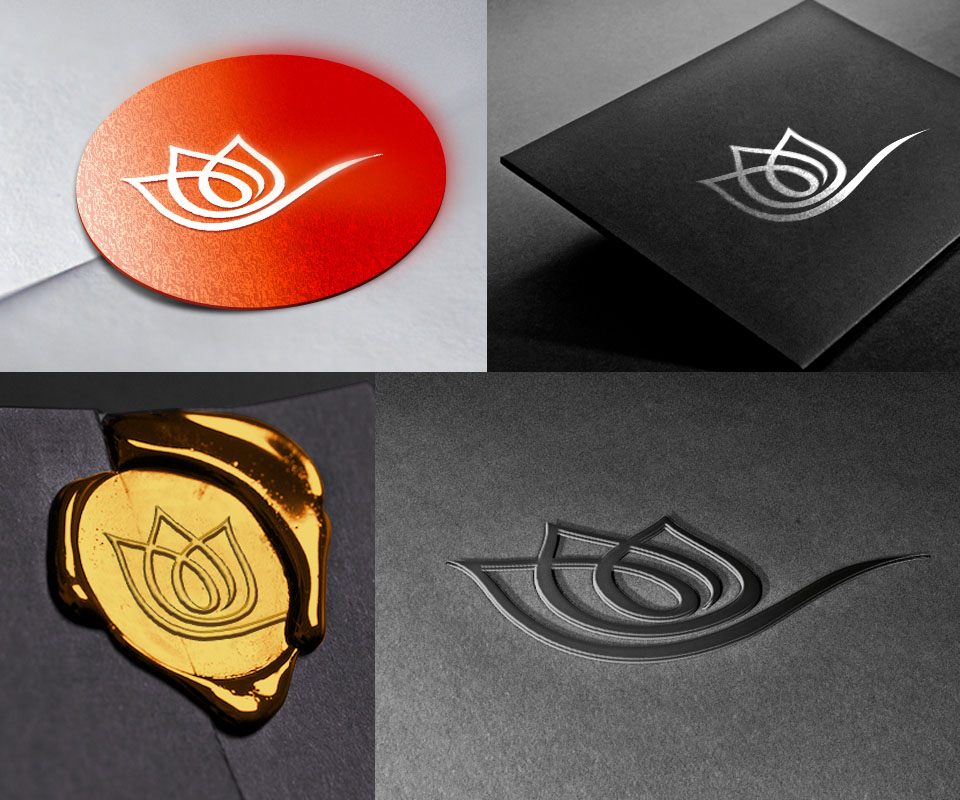
Sinh Vũ put the lotus on different materials: white on a red disc, silver on black paper, pressed into gold wax like a seal, embossed on grey paper. Drawn in single strokes, it stays clear in every technique.
These tests let the portal use its logo in formal places such as invitations and open letters as well as everyday ones such as phone screens and news pages.
Introductory print
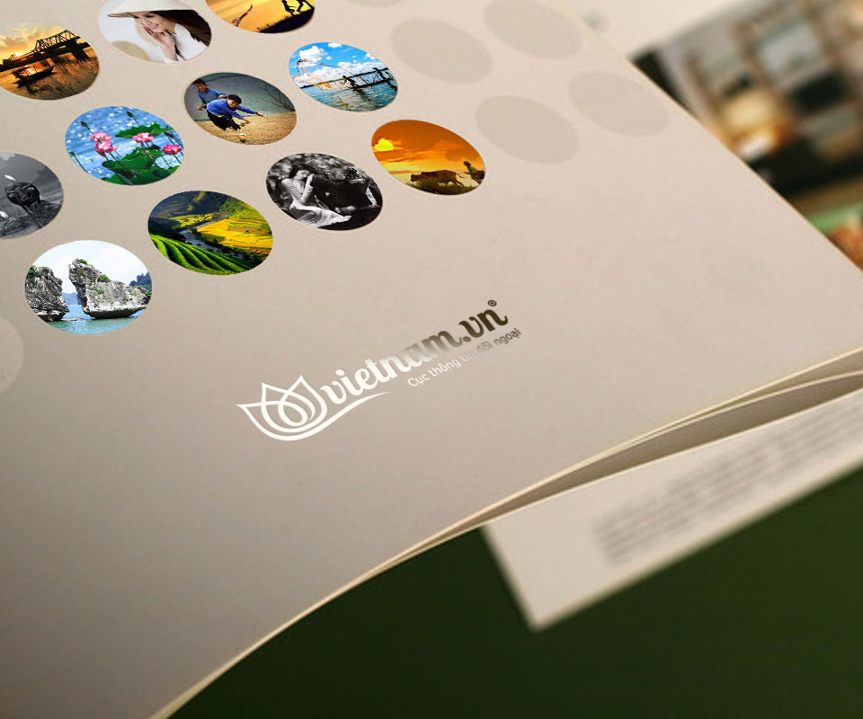
The introductory brochure uses ivory paper, a small logo and round photo windows of Vietnam's landscapes and people: rice terraces, bays, lotus flowers. The round windows echo the lotus in the logo, like small doors opening onto the country.
The white folder carries only a black logo at its centre, keeping a formal, restrained look. Sinh Vũ left generous white space, because a portal bearing the national name should speak quietly and surely rather than loudly.
The value
Vietnam.vn gained a symbol Vietnamese readers recognise at once as a lotus, yet one that does not blur with other lotuses thanks to its continuous line. From the website to folders, wax seals and invitations, the portal appears with the same dignity.
For a name of national weight, Sinh Vũ chose to speak first in an image all Vietnamese share, then make it distinctive in the drawing. Readers find it familiar and remember it.
The lotus on formal paper
Introductory brochure
Folder

In their own words
Sinh Vũ has a professional and energetic team. Vietnam.vn was a difficult project, because the logo, website and external materials had to carry many messages at once. The project was completed excellently and efficiently.