
TV mobile: a memorable pocket TV
TV mobile is a service for watching television on phones. Sinh Vũ designed its logo and identity so users know at once what it does, and so the name appears consistently from the phone screen to staff papers, cups and shirts.
Explain the service at a glance
Watching TV on a phone was once new. Users were not used to it, so the name and logo had to explain the service on first sight without any description. And the logo often appears very small, on a phone screen or in a promotional text message.
Sinh Vũ set two requirements: it must read instantly as television, and it must be fun enough to make people want to try it.
A TV box with an exclamation mark
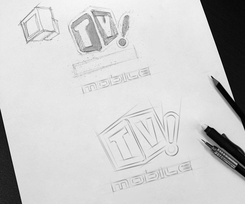
From the sketches, Sinh Vũ drew the letters T and V in two tilted squares like a TV set bouncing, ending with an exclamation mark. The exclamation mark is the cheer when a good show comes on, adding life to an otherwise dry name.
Fresh lime green with a white outline stands out on black or white. The word mobile beneath uses round, open letters that suggest an electronic display. The whole logo is built from simple shapes, so it stays clear when small.
Lime-green stationery
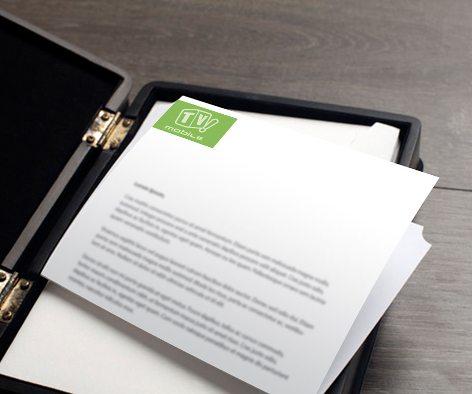
The stationery uses a large lime-green block as its accent: the back of the business card, the envelope flap, the corner of the letterhead. The logo sits in white on that green. Everything else stays white for neatness and easy reading.
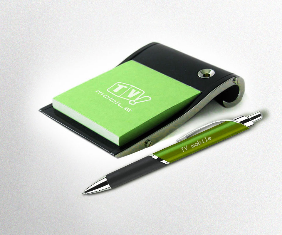
Letterhead goes in a black leather folder, with a lime-green notepad and matching pen. Every item carries the lime-green block, so a partner recognises TV mobile from a single corner of colour.
Everyday items
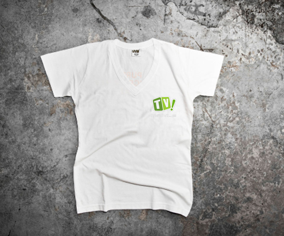
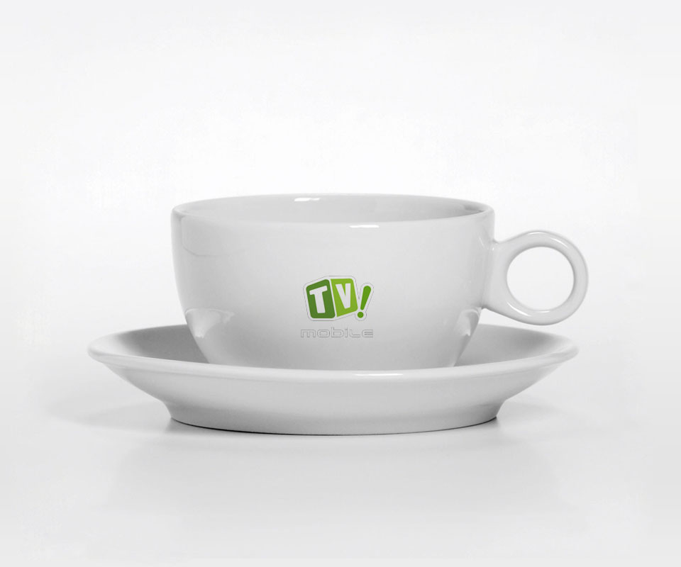
The logo goes on white porcelain cups, white T-shirts with a small chest print, notepads and pens. Sinh Vũ used the logo small on white for everyday items, so they look tasteful and people are glad to use them rather than put them away.
Because the logo is compact and the colour distinctive, a small dot of lime green on a coffee cup is enough to bring the service to mind.
The value
TV mobile gained a logo that explains itself: a TV set, the word mobile, an exclamation mark. Users understand it, remember it and enjoy it. From the phone screen to the office coffee cup, it is the same lime-green block.
Sinh Vũ finished the logo before moving on to papers and merchandise. In that order, every later item simply reuses the agreed logo and colour, with nothing to redraw each time.
A dot of lime green is enough
In their own words
Good design that presents TV mobile well across many kinds of phones. The promotional items, from notebooks and pens to mugs and shirts, are complete and professional, and the name looks the same everywhere.