
Thudo JSC: the letters T and D in one block
Thudo JSC is Thu Do Investment and Trading Joint Stock Company, later renamed the Capital House group. In 2014 the company expanded into apartment construction. Sinh Vũ designed the TD logo and identity to give the company one consistent image for its new direction.
Company changes direction and needs a new identity
In 2014 the apartment market was booming. Thudo JSC decided to expand into infrastructure and affordable apartment building. Its leadership wanted a new, more professional identity system: a set of rules for logo, colour and imagery so the company appears the same on every document and printed piece.
Sinh Vũ's brief was a TD letter logo that matched the message the leadership had set: unity and consistency within the company's leadership.
T and D joined as one block
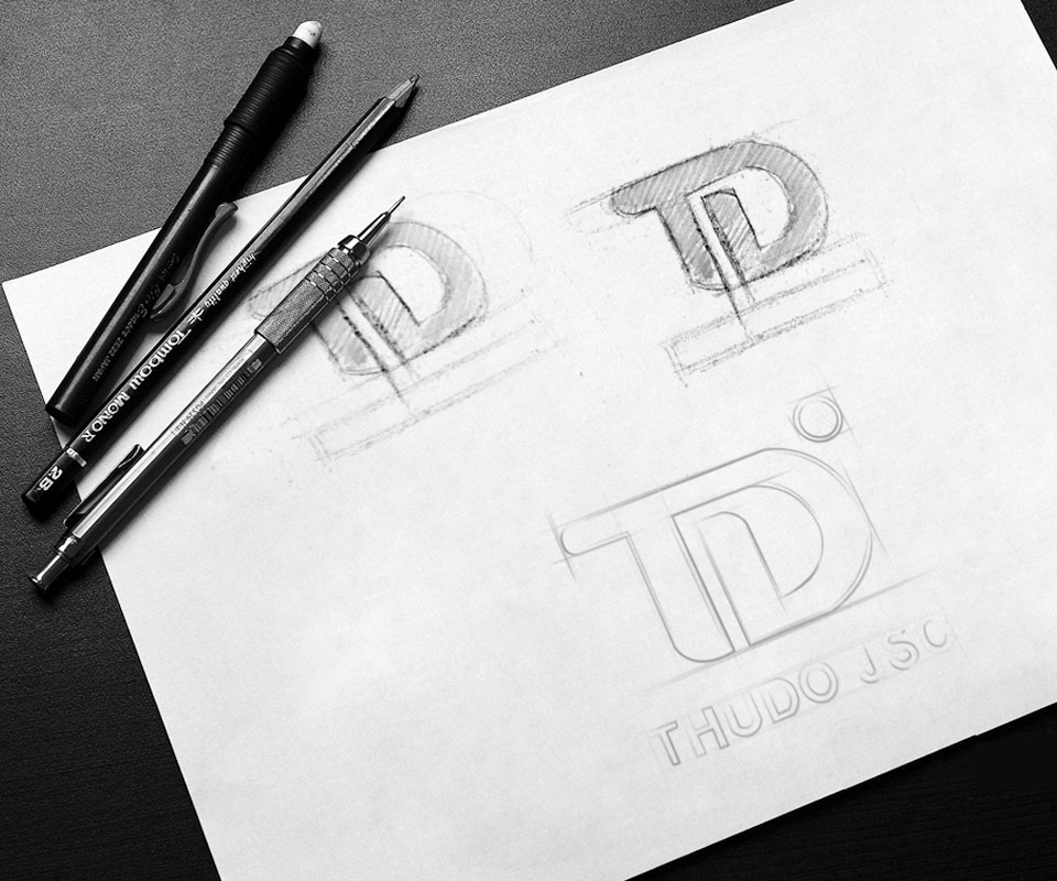
The pencil sketch shows Sinh Vũ trying several ways of joining the T and the D. The first two placed the letters on a horizontal bar. The final choice drops the bar and lets the crossbar of the T run on into the top stroke of the D, so the two letters form one block.
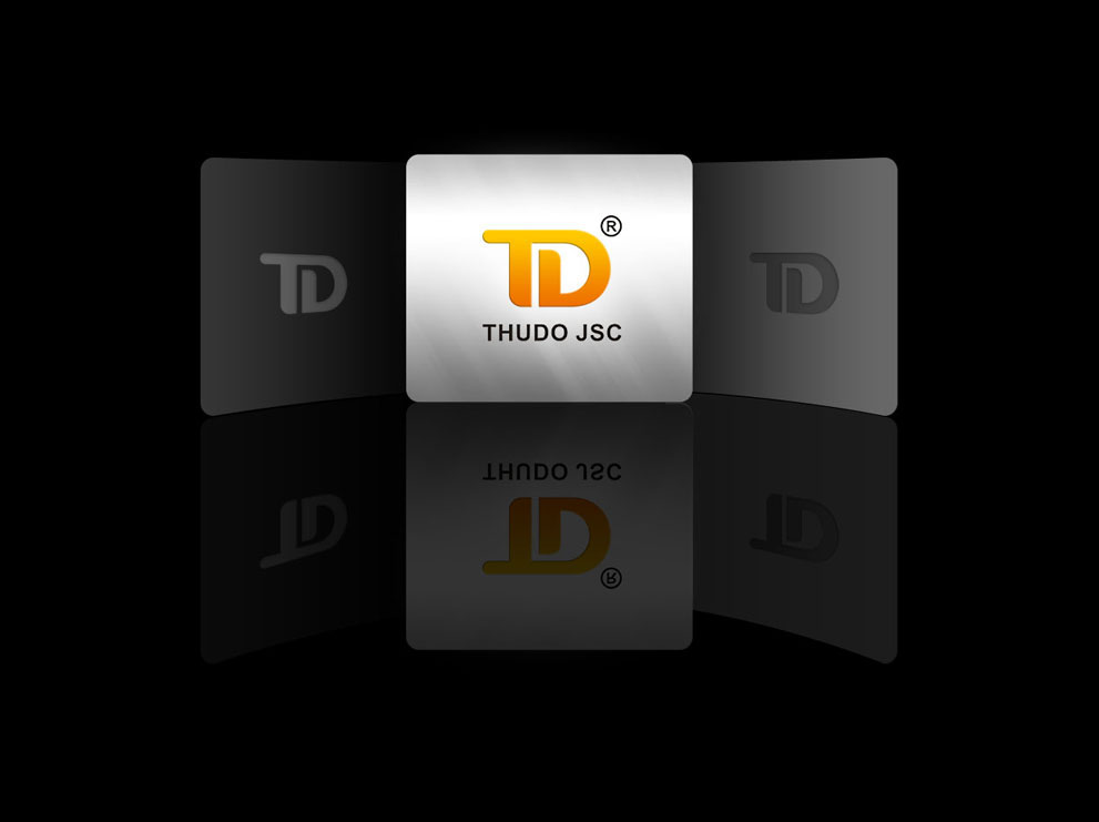
Two letters in one block is how Sinh Vũ expressed the unity and consistency the leadership wanted. Stroke ends and corners are rounded. Beneath sits the name THUDO JSC in capitals, with an even stroke.
One golden orange across every document
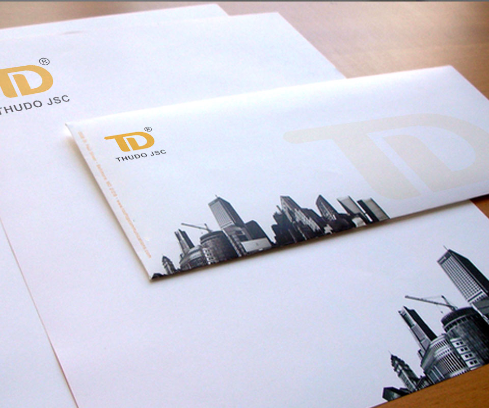
The logo uses a deep golden orange on white. Letterheads and envelopes carry a strip of black-and-white building photography along the bottom edge, and the envelope has a large faded TD in the right-hand corner. At a glance, this is a company in housing and construction.
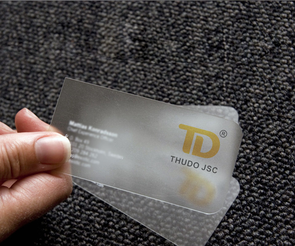
The same golden orange runs through business cards, disc labels and publication covers. The business card is frosted clear plastic, with the TD in metallic gold and the name THUDO JSC in dark grey. Whoever holds it sees at once that it is not an ordinary paper card.
Printed pieces introducing the company
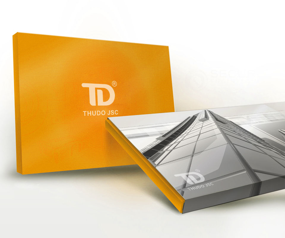
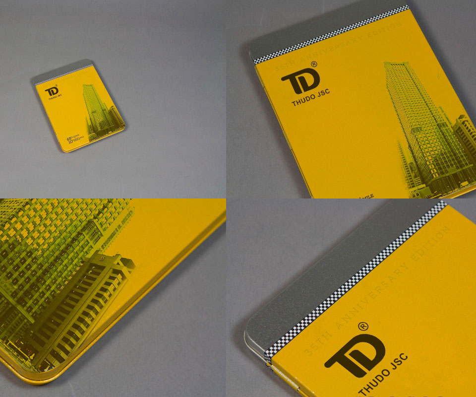
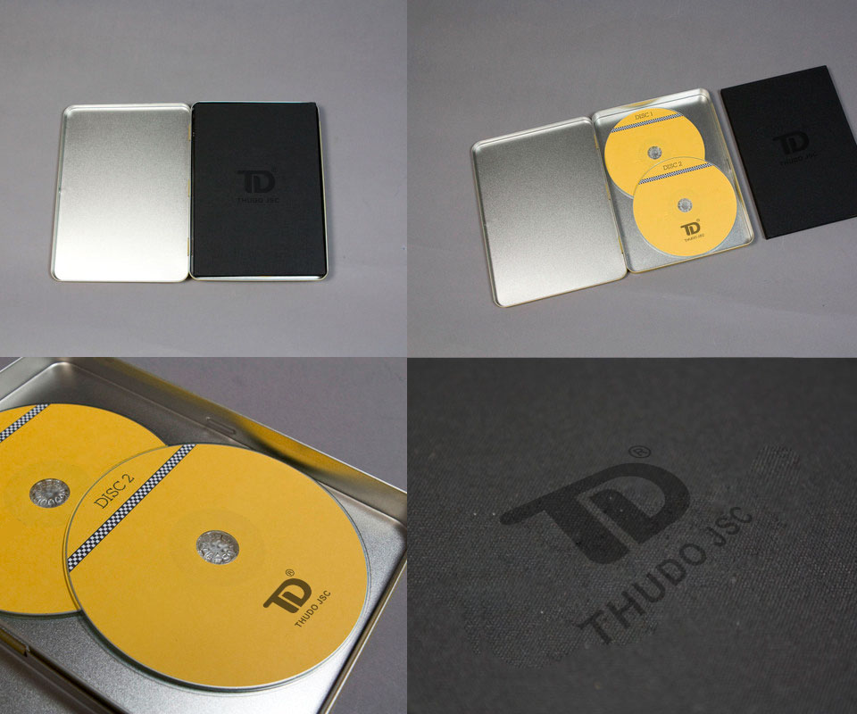
Beyond office stationery, Sinh Vũ designed promotional pieces, the items used to introduce and publicise the company to partners. The set includes a tin holding two discs with yellow labels, with a black card printed with the logo in a matching black tone. There is also a yellow-covered publication printed with a building photograph, and an orange box with the logo in the middle of the lid.
Each piece is made from a different material, yet all share the same golden orange, the same logo placement and the same building imagery. So whichever piece a recipient picks up, they recognise Thudo JSC.
The value
Thudo JSC has a compact, memorable logo. It stays clear when printed small on a disc label or printed tone-on-tone on black. The T and D joined in one block give the company a unified image as it moves into apartment construction.
The company's General Director described Sinh Vũ as fast, professional, well supported, quick to respond and clear.
The TD logo on every material
In their own words
Sinh Vũ designed quickly and professionally, supported us well and replied fast and clearly. The TD logo and identity gave the company one unified image just as we expanded into apartment building.