Tan Tao: the industrial wheel and a new sun
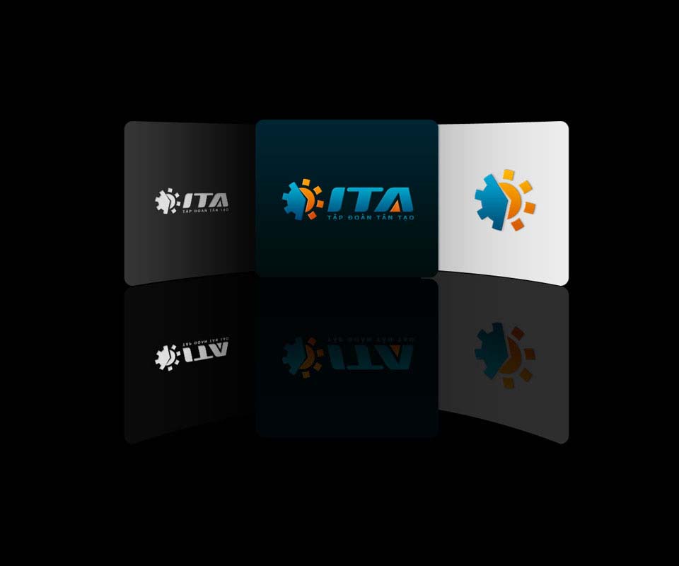
Tan Tao Group (trading name ITACO) started with industrial park and infrastructure investment, then added cement, thermal power and real estate. In 2007 Sinh Vũ redesigned the logo so the whole multi-sector group had one shared symbol, while people who knew it could still recognise the old wheel.
A group that has grown into many sectors
Tan Tao began as an industrial park investment company. The group later added cement plants, thermal power and real estate. The old logo was tied only to the industrial park business, so it no longer said everything the group does.
The client set one condition: keep the familiar industrial wheel, yet show the new fields of business. The difficulty was adding a new idea while letting people used to the old logo still recognise the wheel.
Half wheel, half sun
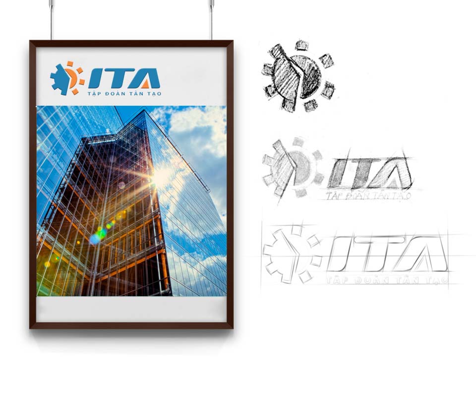
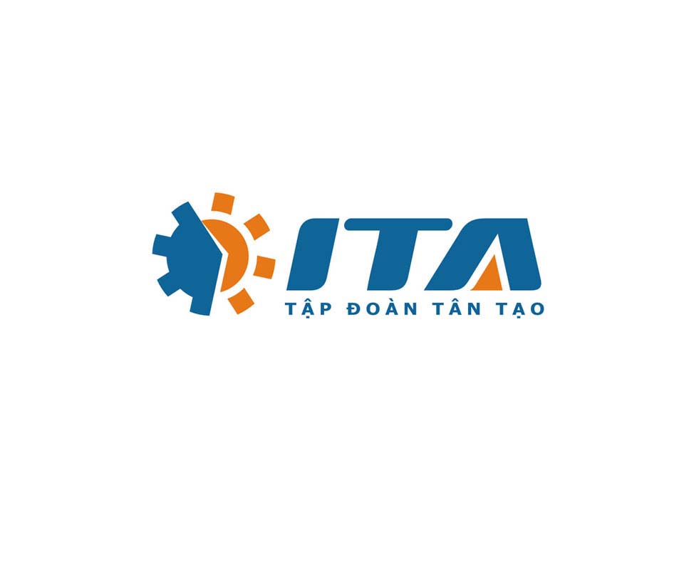
The pencil sketches show Sinh Vũ trying many versions, starting from a toothed cogwheel. In the final version the blue left half keeps the industrial wheel. The orange right half is a rising sun with short rays spreading out, standing for the new fields opening up from the same root.
To the right of the symbol are the three letters ITA in bold italics. The letter A has a small orange patch in the middle, echoing the colour of the sun. The words Tập đoàn Tân Tạo (Tan Tao Group) sit below in capitals, evenly letter-spaced for easy reading.
The logo on stationery, publications and objects
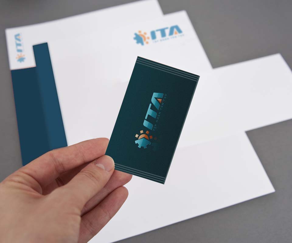
The ITA logo was placed on letterhead, envelopes, document folders, dark navy business cards and publication covers. Each use takes a suitable version: the colour version on white, a single-colour version on publication covers, and the white or colour version on dark grounds.
The value
The group has one shared logo for many sectors. Viewers see the familiar wheel, then the added half sun, and understand that the group now does more than industrial parks.
Sinh Vũ chose to build on the old shape rather than replace it entirely. This helped long-standing staff and partners accept the new logo, because they still see the wheel they know.
The ITA logo on documents and objects