
RingRing: a heart logo for a music-sharing network
RingRing is the first mobile social network in Vietnam for sharing content, part of Vega Corporation. Its users, mostly young people, upload ringtones and give them to one another over 3G phones. Sinh Vũ designed the logo, website interface and stationery set, all built around one idea: sharing the love of music.
The client and the brief
RingRing runs on ringring.vn, a site of Vega Corporation. Vega provides value-added services on digital platforms, that is, extras beyond calls and text messages on a phone, such as ringtones or games.
The brief for the logo was to show young people sharing music with one another on their phones over 3G (the high-speed mobile data network common in Vietnam at the time). In other words, from the logo alone, users should be able to guess what the service is for.
A heart holding the word ring
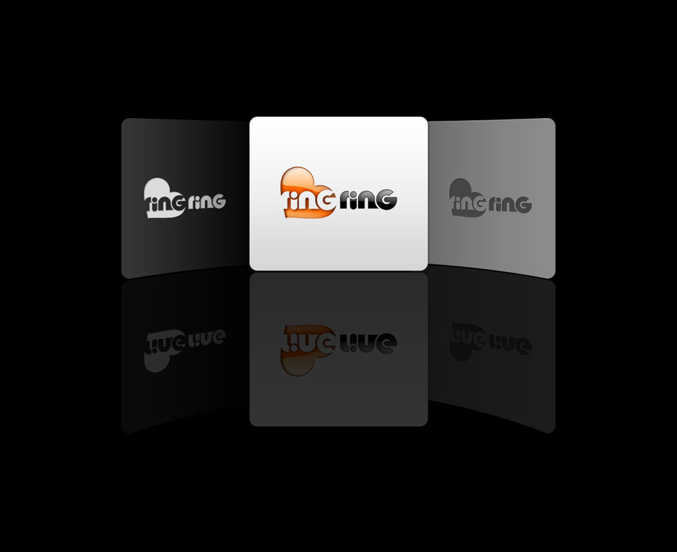
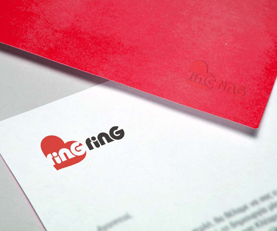
Sinh Vũ drew the logo as a heart. The first "ring" sits inside the heart, drawn in negative: the letters appear through cuts in the heart's solid ground, rather than being placed on top of the shape. The second "ring" stands just to the right, in dark grey. Read together, the two words give the name RingRing.
A heart is a shape everyone reads as "love" or "favourite". With the word inside it, the logo suggests exactly what the client wanted: sharing the love of music, shared tastes and passions. Besides the red version, the logo comes in orange, white on a dark ground and grey, so it stays clear on both light and dark backgrounds.
The web interface
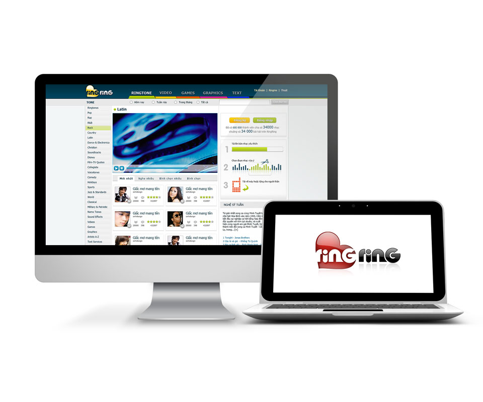
The RingRing website has a dark bar across the top, with the logo at the left. Beside it are the main sections: ringtones, video, games, graphics and text. The left column lists music genres, while the middle holds a preview player and a list of the newest tracks.
The right column sets out three steps for using the service: upload a favourite track, choose the part you like, then download it to your phone or give it to someone close. A newcomer can see where to begin. On the dark header the logo uses the orange heart so that it stands out clearly.
Stationery and folder covers
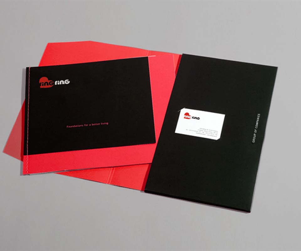
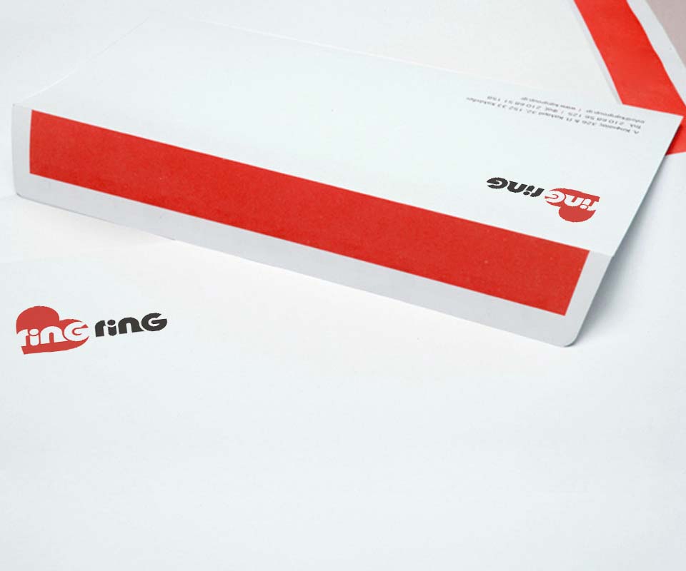
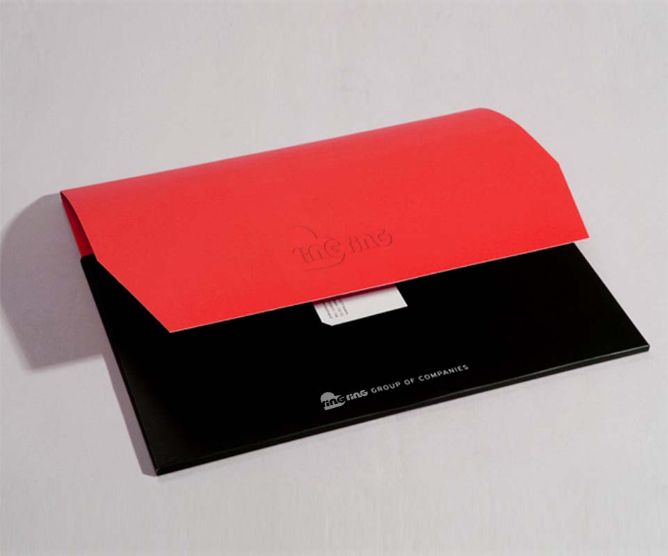
On letterhead, envelopes and business cards, the logo is printed in red on white. The document folder uses two colours, red and black, taken from the logo itself.
On the red folder flap the logo is blind embossed, meaning it is pressed into the paper without ink. It shows through depth and shadow, so the folder stays restrained while whoever holds it still recognises the brand.
The value
RingRing has a logo that conveys the idea of sharing in a single image: a heart, one "ring" inside and one outside. The same logo is used consistently across the web interface and the stationery set, so users meet the same brand wherever they come across it.
The head of the client side described the design as impressive and well suited to young people, the very audience RingRing is aimed at.
A red heart on paper and folders
In their own words
An impressive design that suits young people. The logo, website and stationery all say one thing, sharing a love of music, which is the spirit of RingRing.