
Phúc Linh, Vietnam's four seasons of fruit and flower bloom into a single blossom
Phúc Linh, a Vietnamese fruit and flower gift brand, had its four home seasons named by Sinh Vũ into one identity system: pick it up and you feel home, open it and you feel care.
The problem
Phúc Linh starts from something very Vietnamese: this land is rarely without blossom or fruit in any season. Spring brings apricot and peach blossom, summer brings lychee and lotus, autumn brings young rice and persimmon, winter brings pomelo and orange. A brand wanting to fold that four-season abundance into a gift first has to answer a hard question: what gives a face to something with so many colors, so many scents, so many seasons.
Phúc Linh's difficulty was not a shortage of material but too much of it. Each season's fruit and flower has its own shape and hue, easy ground for a brand to scatter, a different look for every season. Phúc Linh needed a mark concentrated enough to stand in for all of it, Vietnamese enough to speak its roots, and polished enough to sit in a gift basket without being mistaken for market goods.
The approach
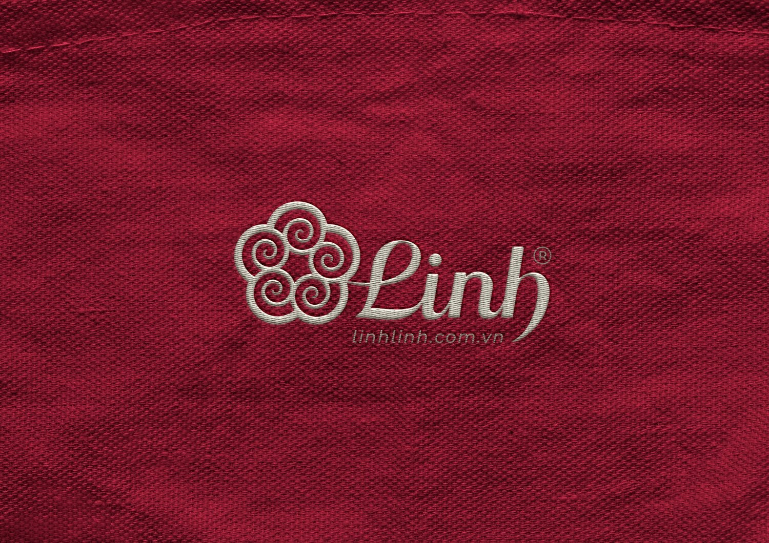
We did not draw any one specific fruit, because choosing one would mean setting the other three seasons aside. Instead, Phúc Linh is told through a five-petal blossom shaped like apricot or plum flower, the bloom that in Vietnamese memory announces a season of plenty. The five petals close into a full circle, evoking the character phúc, whole and round, and a sense of fullness and content.
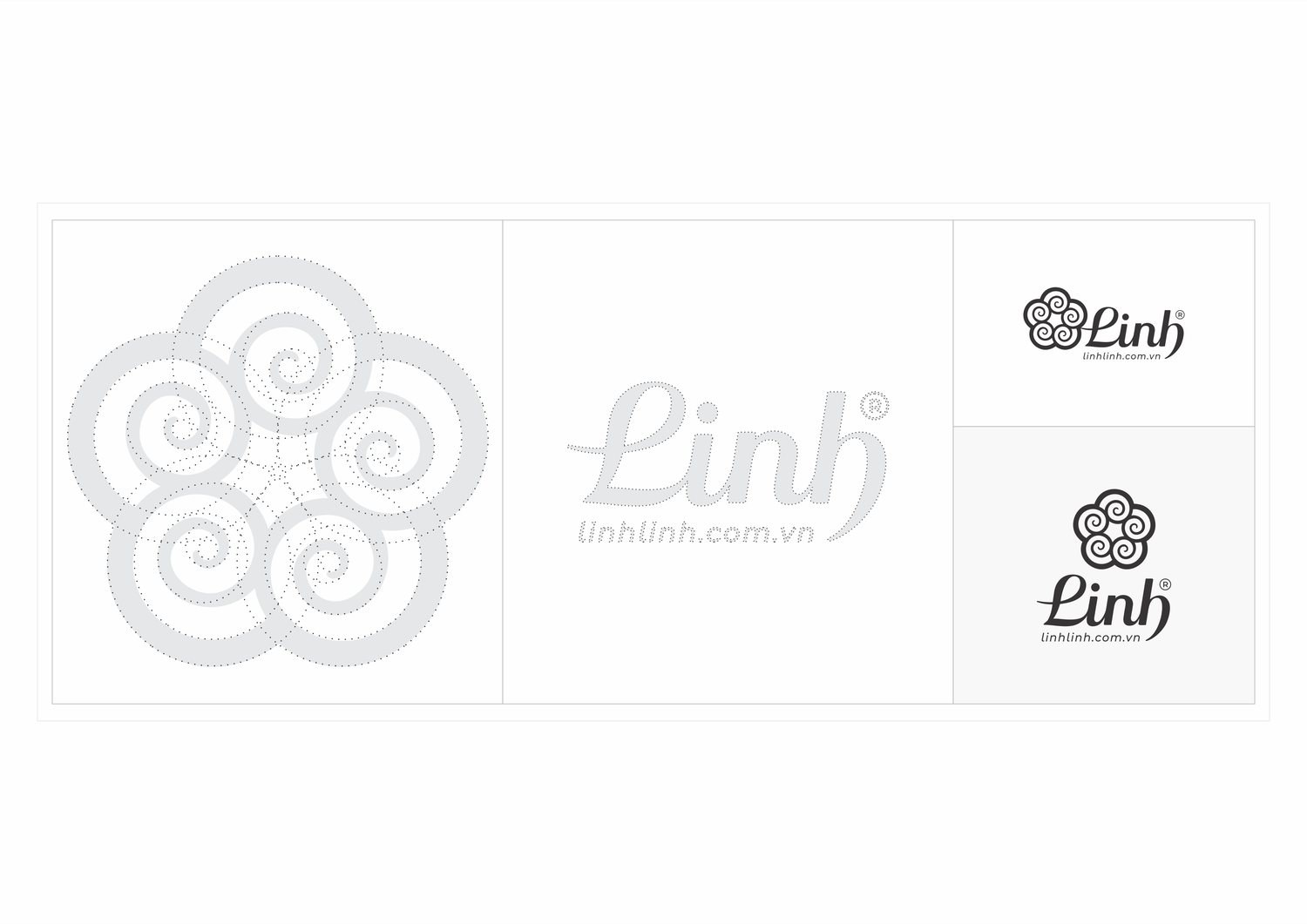
Each petal is in turn built from a scroll line, the same motif that runs from the face of the bronze drum to the clouds carved on Vietnamese temple roofs. This lets the blossom read as both flower and cloud, soft and ancient at once, and set beside the hand-lettered, flowing strokes of the word Linh it becomes a warm, graceful whole. The construction grid shows the blossom was not drawn freehand but built to proportion, so whether shrunk onto a stamp or enlarged on a shop sign, it keeps a single, consistent shape.
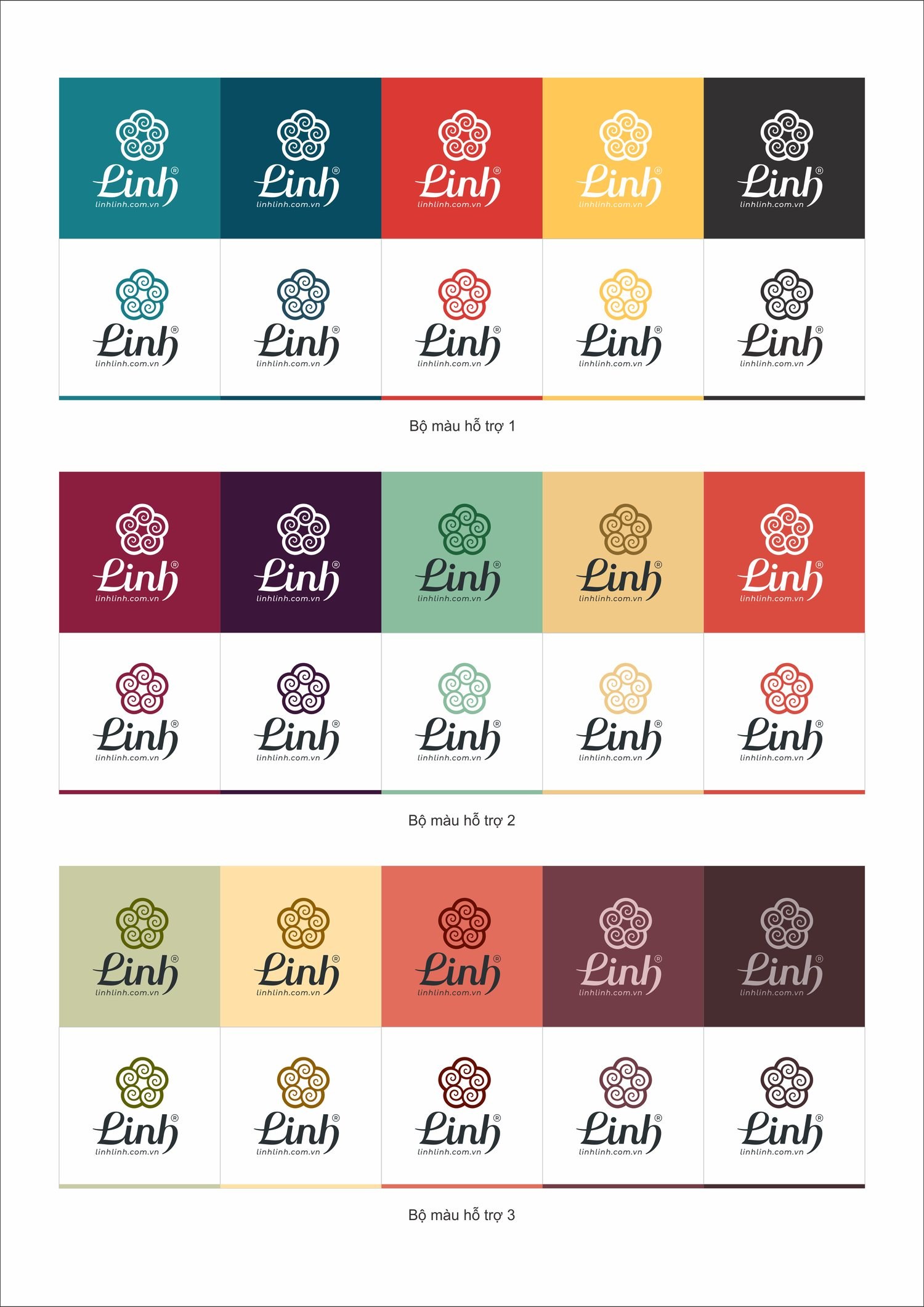
Each season has its own hue, so Phúc Linh does not confine itself to one color. We built an open color system of several palettes, from plum red and turmeric yellow to young leaf green and earth brown. Each palette stands for a season, a product line, but all share the same warm, muted depth so they sit together without clashing. The brand can flex with the harvest calendar without ever losing its shape.
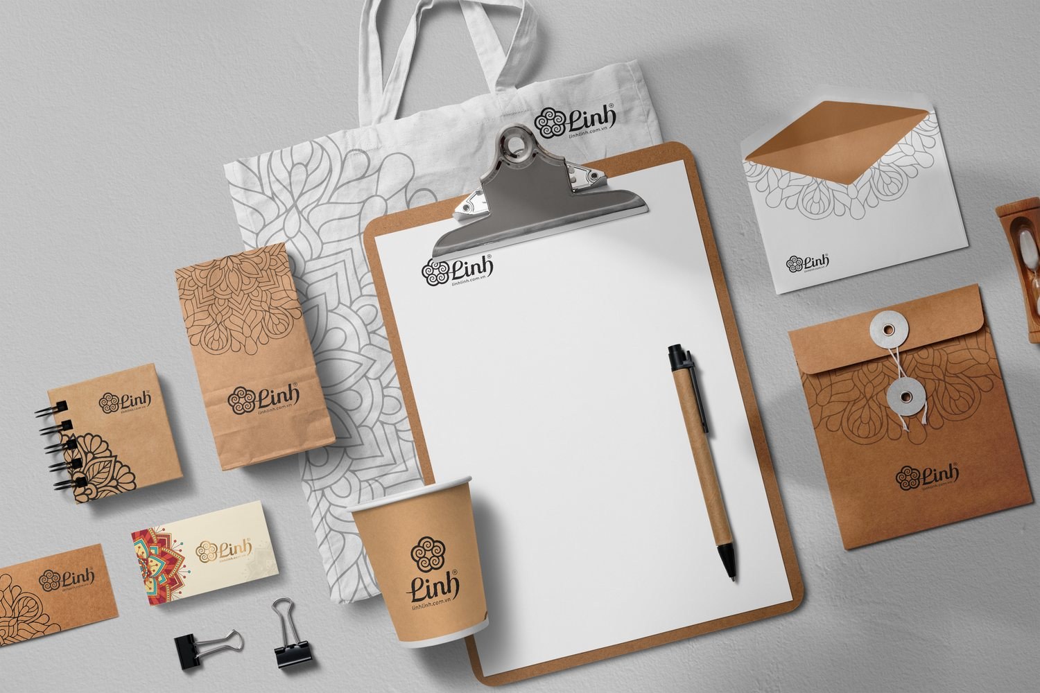
Alongside the color system runs a layer of watercolor pattern, mandala-like petals bleeding softly as if hand-painted. That pattern layer is the brand's soul: it spreads across the business card, the envelope, the bag, turning a flat mark into a small garden. A customer sees the flowers before they read the name, and senses the care before they open the gift.
A gift from home calls for materials that feel real. Phúc Linh's packaging uses raw kraft paper embossed with the mandala pattern, tied with hemp cord instead of sealed with glue, so the recipient opens it by hand, slows down for a moment, the way you would open a gift made at home. The rawness here is not about cost, it is deliberate: it tells you that what is inside was wrapped with care.
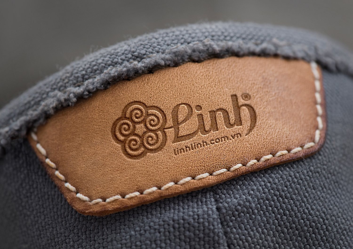
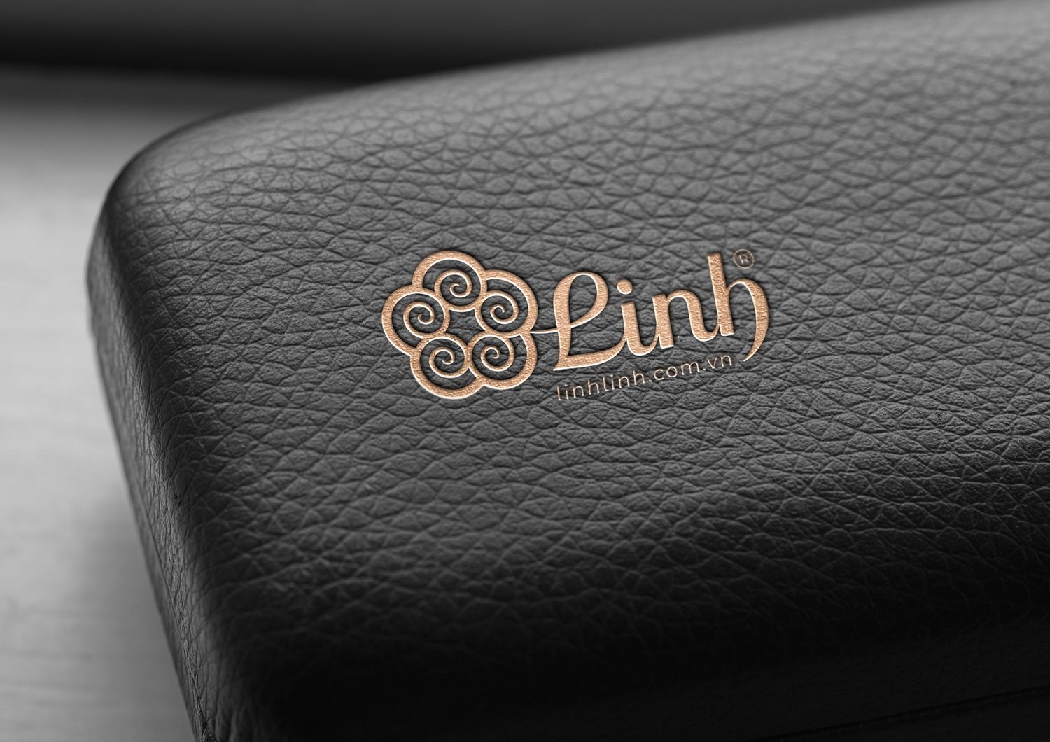
Where the brand needed to be elevated, we placed the blossom mark on real leather, debossed into brown leather stitched with raw thread in one version, copper foil-stamped onto black leather in another. The same blossom reads as homely on paper and elegant on copper-stamped leather. That range of materials lets Phúc Linh move from an everyday gift pack to a premium gift box while staying one and the same brand.
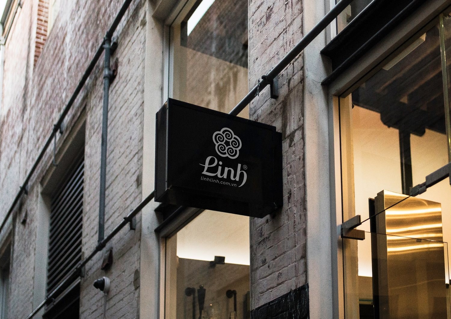
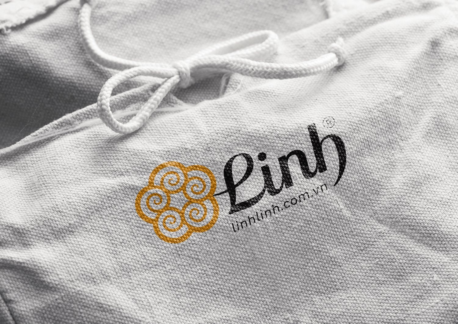
A gift brand lives at many touchpoints: the business card passed hand to hand, the bag carried out the shop door, the staff uniform, the sign hung at the alley entrance. We carried the Linh blossom across all of them, unifying stationery, uniforms and signage, so wherever a customer meets Phúc Linh, they recognize the same face at once.
That consistency does one quiet but important thing: it lets Phúc Linh expand without starting over each time. A new product line, a new shop, the team need only reach for the same blossom, the same color system, the same pattern layer. What once had to be reconsidered every time now follows a ready set of rules.
The result
What Phúc Linh gained was not just a handsome logo, but a way of telling its own story, gathered into a single blossom. Four seasons of fruit and flower that used to scatter now resolve into one mark, one color system, one pattern layer, tight enough to be recognized, open enough to keep growing.
For a brand that lives on trust and warmth, as gifting does, a face that is both Vietnamese and polished is the first word of greeting. It speaks, on the giver's behalf, that this gift was chosen with care, and on Phúc Linh's behalf, that behind the blossom stands real attention to detail.
One blossom, many forms
Is your challenge like Phúc Linh's?
Tell Sinh Vũ what is on your mind about your brand. Sinh Vũ will point you to the right direction right away.