
Ola: a logo for ringtones and ringback tones for young people
Ola is the ringtone and ringback tone website of Vega Corporation, a company providing value-added services (extras on top of calls, such as ringback tones and ringtones) on digital platforms. Sinh Vũ designed the logo for Ola, aimed at young people who use mobile phones.
A service for young people on their phones
Ola.ringring.vn is a website of Vega Corporation where users choose ringtones and ringback tones (the music a caller hears while waiting for the phone to be answered) for their phones. Ola's main users are young people.
The brief set two requirements for the logo: it had to be recognisable at a glance as a mobile service, and it had to suit young people. Because the logo would appear often on phone screens, Sinh Vũ kept the shape very compact so that it stays clear when made small.
From a telephone handset to two linked circles
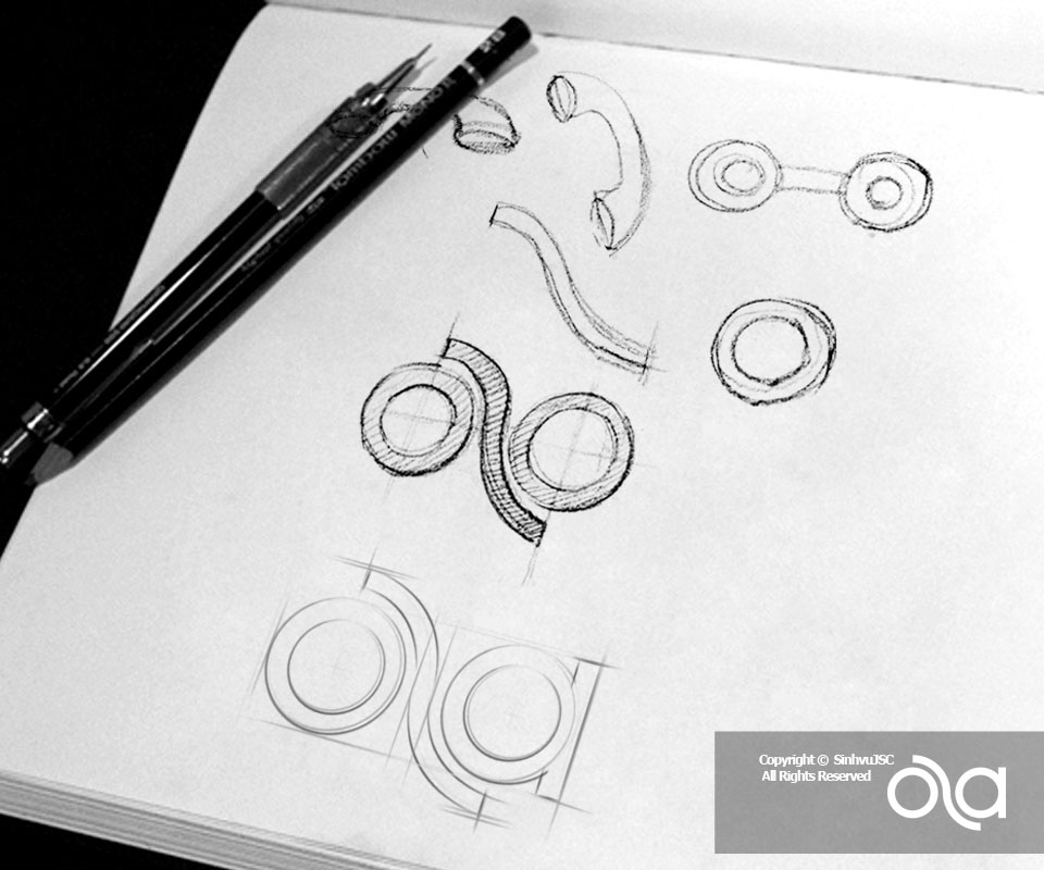
The pencil sketch page (a rough drawing in pencil) shows how Sinh Vũ found the shape of the logo. The first strokes drew a telephone handset, a curved band and some circles. Then two circles were placed side by side and joined by a curved stroke. Finally the logo was built on a grid (lines that help measure and align every stroke) so that all the curves fit together.
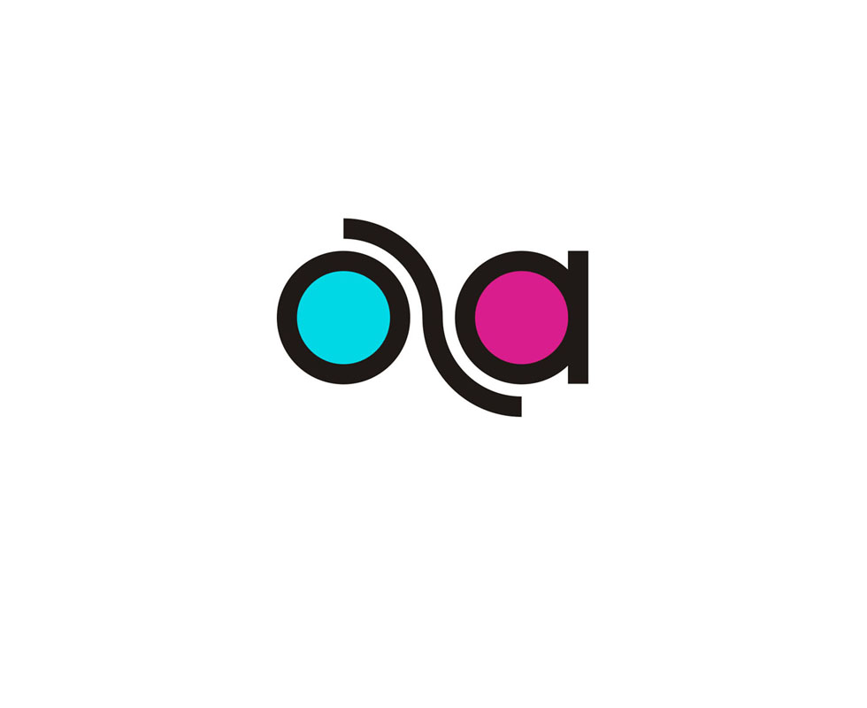
The two circles are the o and the a in the name Ola. The curve between them stands in for the l and links the two letters. So the logo reads as the name and also shows the connection the service is about.
Jade green and pink, with a black outline to keep it neat
The finished logo uses two colours: jade green for the left circle and deep pink for the right. The outline and the joining stroke are black. Two bright colours side by side stand out strongly, in keeping with the youthful, bold spirit that young people like.
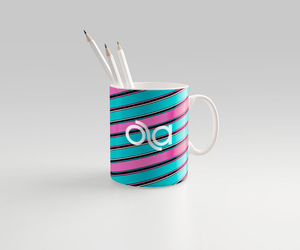
The black outline keeps the logo's shape clear when it is made small. There is also a single-colour white version to place on busy backgrounds, as on the cup with blue-green and pink stripes.
The value
Ola has a logo that is easy to recognise: two linked coloured circles that read as the name Ola and express the connection the service aims for.
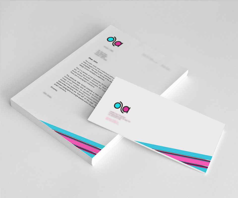
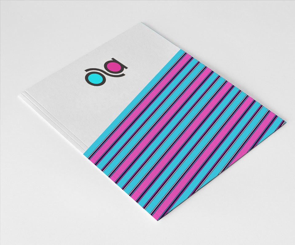
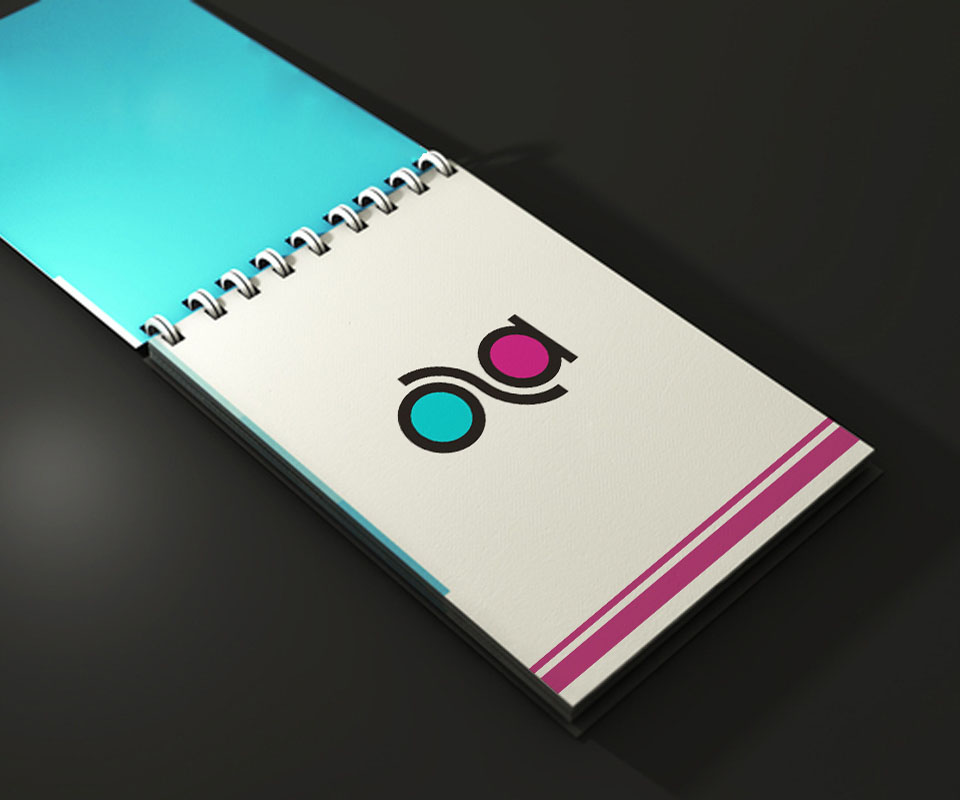
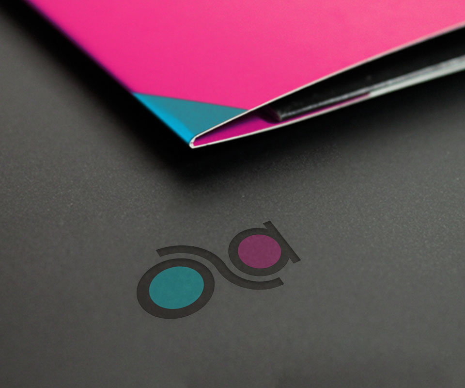
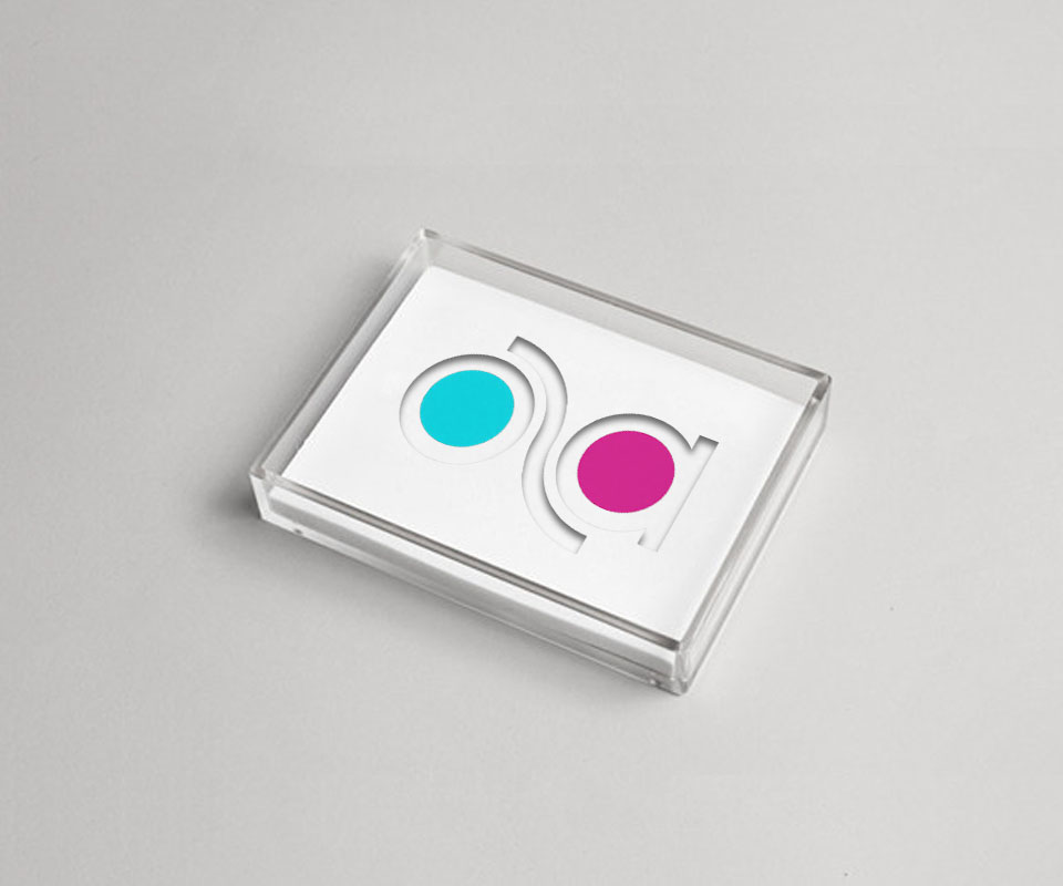
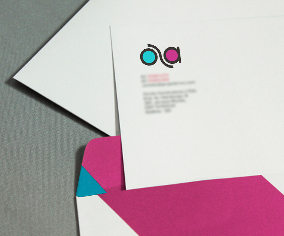
Sinh Vũ tried the logo together with the diagonal two-colour stripes on office stationery, a document folder, a notebook and a clear acrylic box. This lets the client see in advance how the logo appears on many materials and at many sizes.
Two linked circles on documents and objects
In their own words
A youthful design that fits the young mobile users Ola is built for. After launch, we also received good feedback from customers about the new logo.