
Hoa Phượng Furniture: HP in muted, luxurious colours
Hoa Phượng Furniture makes solid-wood and engineered-wood furniture for apartments, townhouses and offices. Sinh Vũ designed the HP logo and a brand identity (the logo, colours and way of presenting shared across every document and printed piece) in muted colours, so the company looks luxurious to the customers it aims for.
A woodworking maker aiming at customers who like luxury
Hoa Phượng Furniture makes solid-wood and engineered-wood furniture. Engineered wood is board made by pressing wood chips or wood powder together and covering the surface with another material. Hoa Phượng uses An Cường MFC board (chipboard with a ready-made decorative resin face), laminate-faced board (a thin plastic layer glued onto the board) and acrylic-faced board (a glossy plastic layer over the board). The company's furniture goes into apartments, townhouses, offices and even workshops.
The customers the company wants to reach are people who like luxury. So the logo and identity had to give a high-end feeling the moment they saw a folder or a brochure, before they even looked at a product.
The letters HP are both the initials and the accent
HP stands for Hoa Phượng, and Sinh Vũ used these two letters as the shape of the logo. A white H and P sit inside a block of dark grey. The lower right corner of the block is drawn like a folded page corner, coloured orange-yellow, giving the logo a single accent colour.
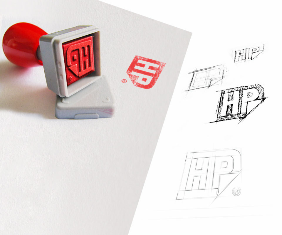
Photographs of pencil sketches show the letters drawn many times, the thickness and spacing of the strokes adjusted bit by bit. The logo was also carved into a stamp. Pressed in red ink on paper, the HP shape stays clear because the form is simple with few small details.
A bronze gold logo on black paper
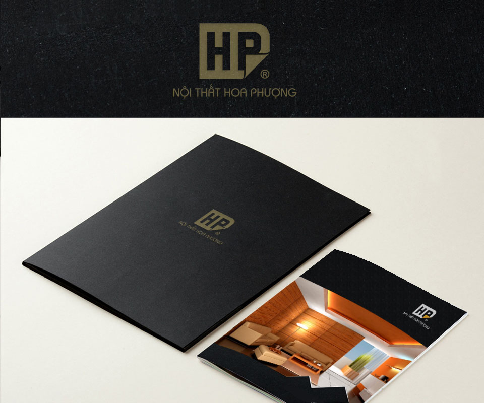
The identity uses muted colours (dark grey, black and bronze gold) to create trust and a high-end feeling. On the document folder, the logo is printed in bronze gold on matte black paper, with the name Hoa Phượng Furniture directly beneath it in small, widely spaced letters.
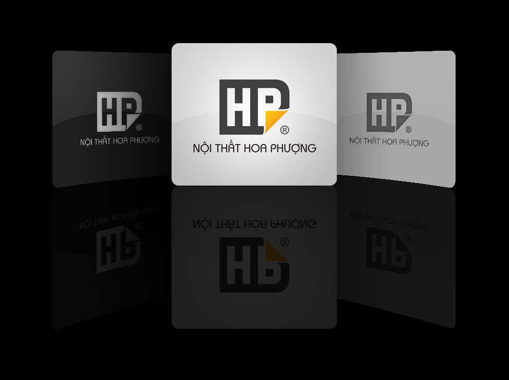
On black, the whole logo uses just one bronze gold, even the folded corner that is orange-yellow in the colour version. The logo is simple enough that it is still recognised at once when printed in a single colour.
One cut line shared across the printed pieces
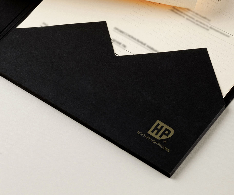
The pocket of the document folder is cut in a V-shaped zigzag. The same cut repeats on the CD sleeve and on the edge of the brochure. Repeating one cut line makes the pieces look like a set, recognisable as Hoa Phượng at a glance.
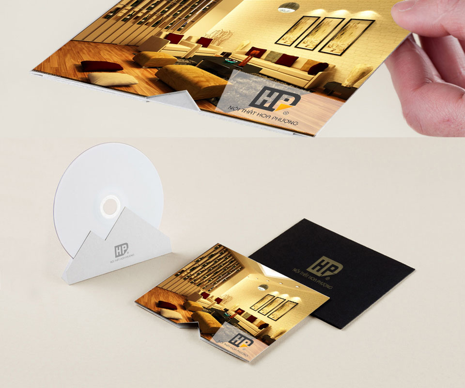
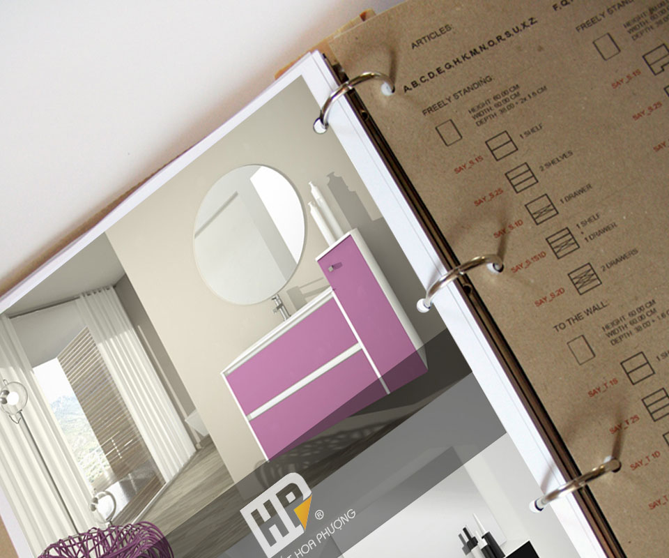
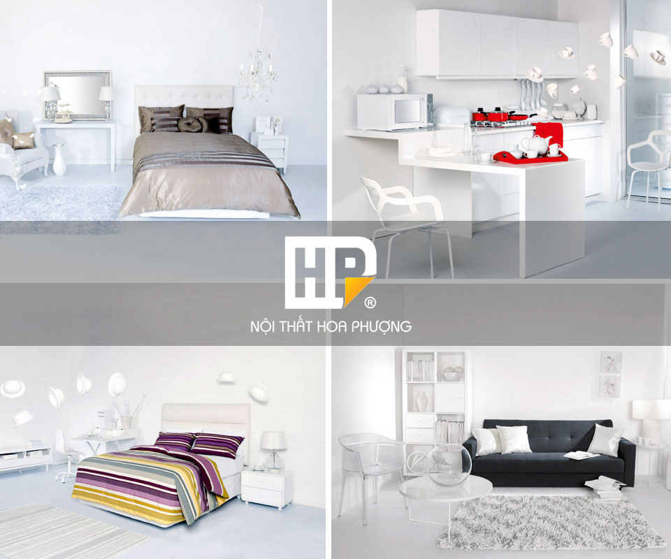
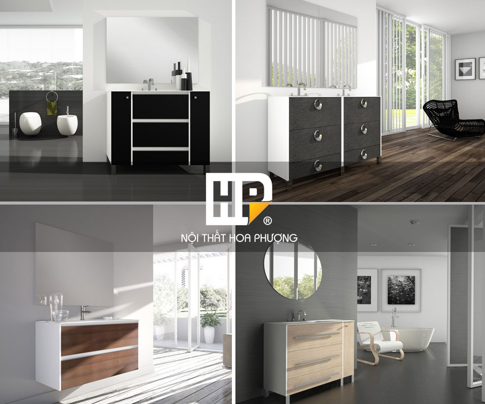
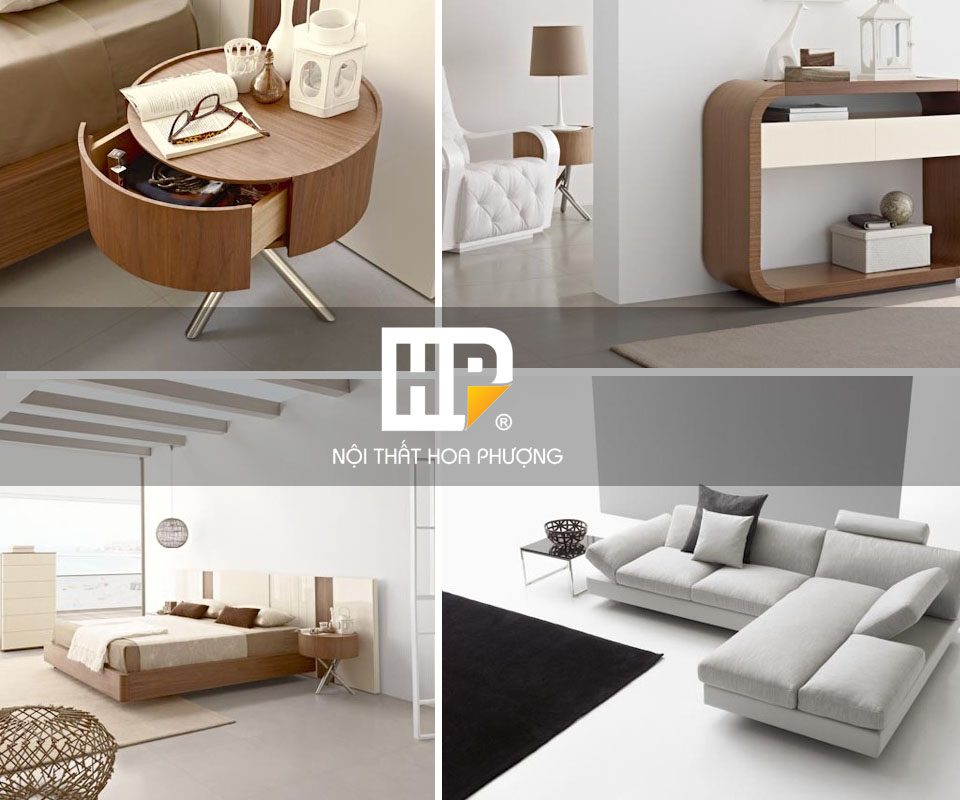
In the catalogue (the book introducing the products), furniture photographs fill almost the whole page, and the logo sits on a grey band across the picture. The product photos are what customers want to see; the logo only needs to be in the right place so they know whose goods these are.
The value
Hoa Phượng has a compact HP logo that works on white, grey and black grounds. The same logo travels from the stamp to the folder, the disc sleeve and the catalogue page and is still recognised.
The company director said the design was very beautiful and suited HP's furniture products. For a furniture maker, a logo that fits the products matters, because customers always see the logo beside the piece in every brochure.
HP on light and dark grounds
In their own words
Thank you, Sinh Vũ, for your dedicated support. The HP lettermark and the deep-toned identity are beautiful, suit Hoa Phượng's wooden furniture, and make the company look refined to our customers.