Mzone: a logo shaped like a phone keypad
Mzone is Moore Corp's ringback tone service for basic mobile phones. A ringback tone is a short piece of music the caller hears while waiting for an answer, in place of the usual beeping. Sinh Vũ designed the logo so that anyone can tell at a glance what the service does.
Moore Corp needed a logo for its ringback tone service
Moore Corp is an advertising company that sets out to make advertising deliver results. It has three main areas: advertising on digital media (the internet and mobile phones), digital communications and digital solutions. Its clients come from more than ten countries and territories, including Vietnam, Japan, China, the United States, the United Kingdom and South Korea.
When Moore Corp commissioned the project, ringback tones on basic phones (the kind with a number keypad and no touchscreen) were very popular. Moore Corp's directors asked Sinh Vũ to design a logo for the service. The brief: the logo had to show that the service supplies short pieces of music as ringback tones for common phone models.
A number keypad where the O would be
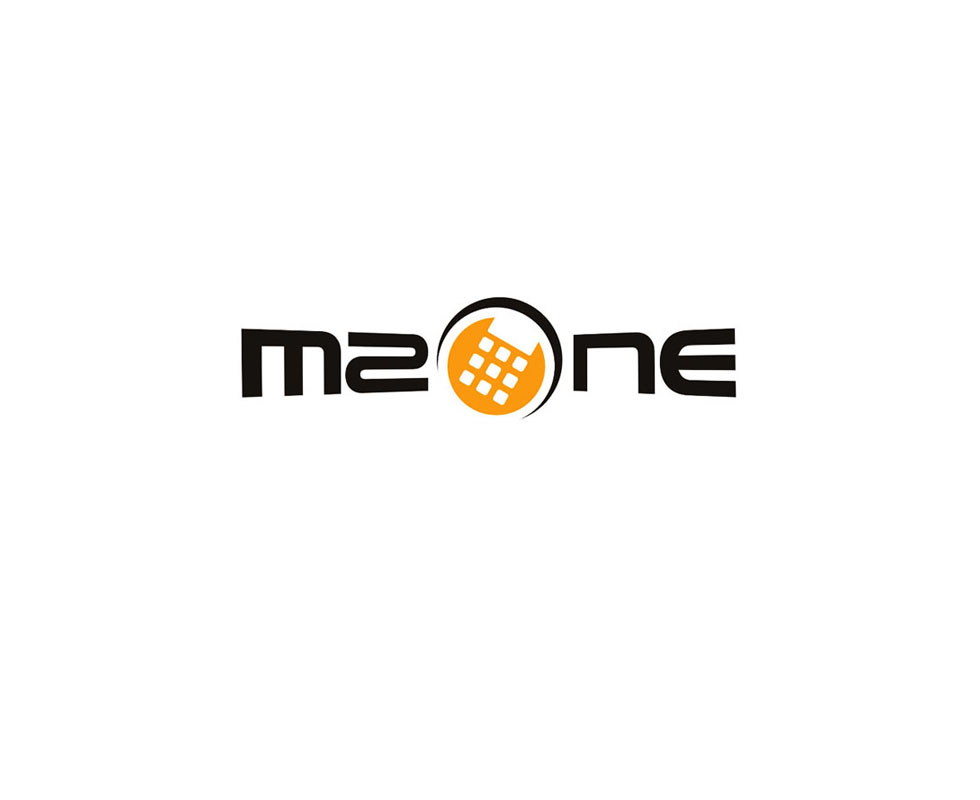
Sinh Vũ took the image users know best: the T9 number keypad of older phones, where each key carries a few letters for typing messages. Rounded square keys are arranged inside an orange dot, standing in for the O in the name Mzone. A curved black line wraps around the dot.
The black lettering is squeezed and stretched to follow a sound spectrum (the row of tall and short bars that appears when a device plays music). So the logo says two things at once: this is a service on the phone, and it is a music service. The drawing aims at young customers who subscribe to ringtones and ringback tones, so that it makes an impression the moment they see it.
The logo on office stationery
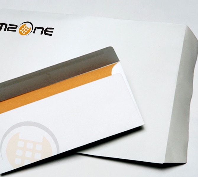
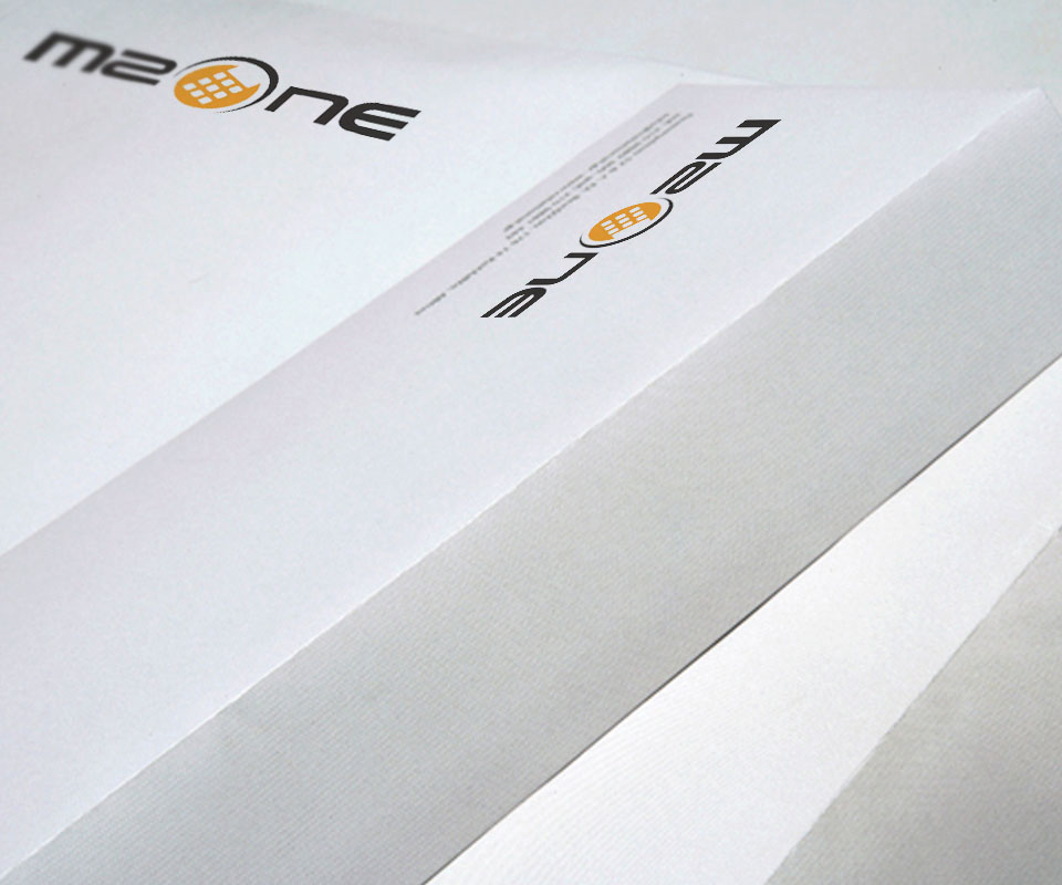
Sinh Vũ placed the logo on Mzone's office stationery: letterhead (paper pre-printed with the logo and company details, used for letters and printed documents), envelopes and document covers. On the letterhead and envelopes, the logo is printed in both black and orange.
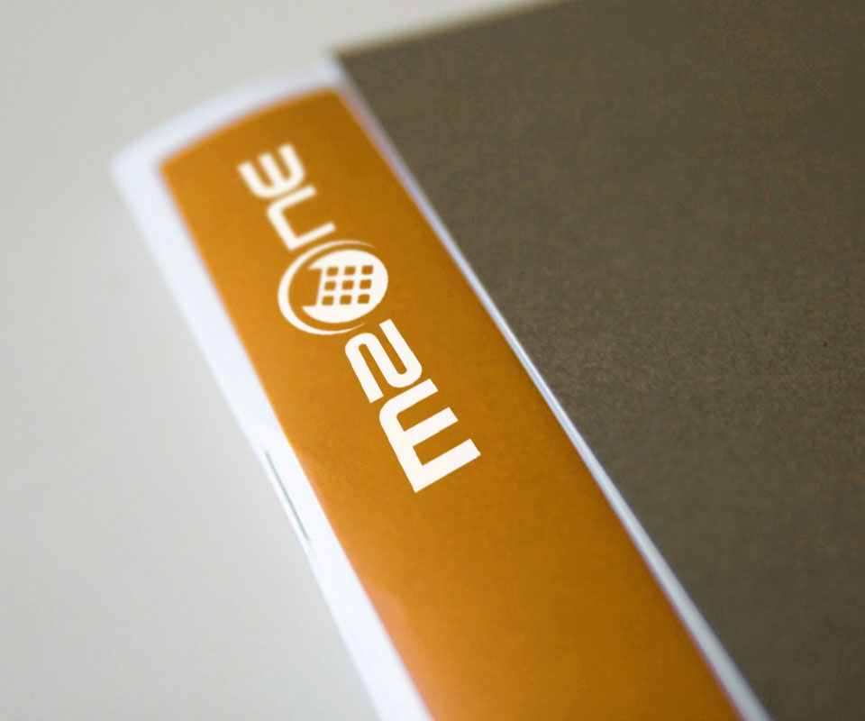
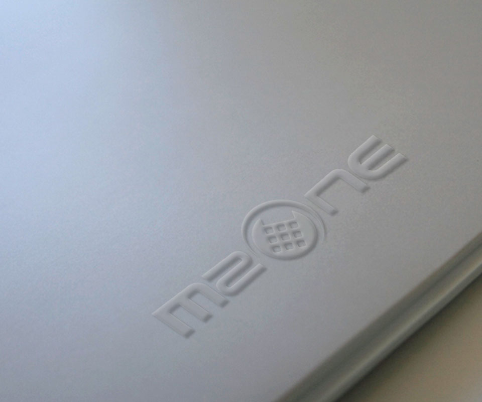
On the pale grey cover the logo is embossed, that is, the paper is pressed so the shape rises without any ink. Even with no colour, viewers still recognise the name Mzone and the keypad from the raised lines. On the orange band along the edge of the cover, the logo is printed in white only. However it is printed, the dot with its keypad keeps its shape, so the logo stays easy to recognise.
The value
The Mzone logo packs the service's two ideas into one shape: a number keypad for the phone, and lettering that bends with a sound wave for music. Viewers can guess that the service has to do with phones and music without reading any introduction.
The dot with its keypad can also be used on its own, apart from the lettering. On the envelope, it is printed faintly on the inside as a background pattern.
The Mzone logo on office stationery