
MyCredit: a logo for a credit scoring service
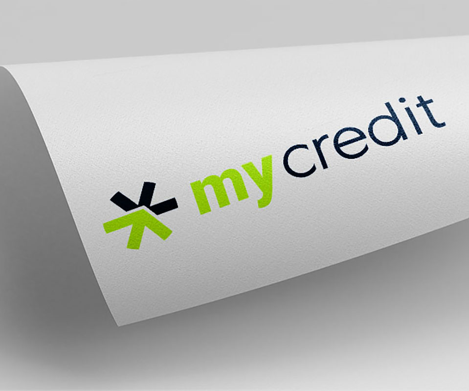
MyCredit helps people work out their own credit score, a number showing how trustworthy a person is when borrowing money. Sinh Vũ designed the logo so that people see at once that this is a financial service, where money is lent and repaid in both directions.
A financial service needs a logo that shows money moving
MyCredit scores credit for free. Users enter details of their credit history, meaning the loans they have taken and repaid. The system uses algorithms, big data, machine learning and artificial intelligence to calculate a score. The score shows how trustworthy that person is.
MyCredit set three requirements for the logo. First, it must look like a financial service at a glance. Second, it must show the circulation of money. Third, the symbol part of the logo must stand alone so it can serve as a mobile app icon.
A star split into two arrows
Sinh Vũ chose a star shape with many points as the symbol. The star is cut into two halves, and each half is an arrow. The two arrows point opposite ways: the green one up, the dark blue one down. Together they suggest money going out and coming back, which is the circulation the client asked for.
The lettering is a sans serif, a typeface whose strokes have no small hooks at their ends, with a rounded shape. The two halves of the name are treated differently: my is bold and credit is light. The star is drawn to stay clear on its own, meeting the need for an app icon.
One logo, many ways to show it
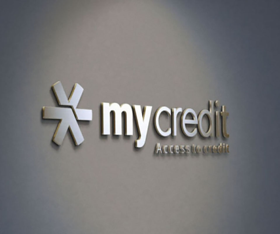
The logo comes in a green and dark blue version for light grounds, a white version for dark grounds, and raised silver letters for walls. The small line under the logo changes with where it is used: on the wall it reads Access to credit, and on the blackboard it reads Your score. Your wealth.
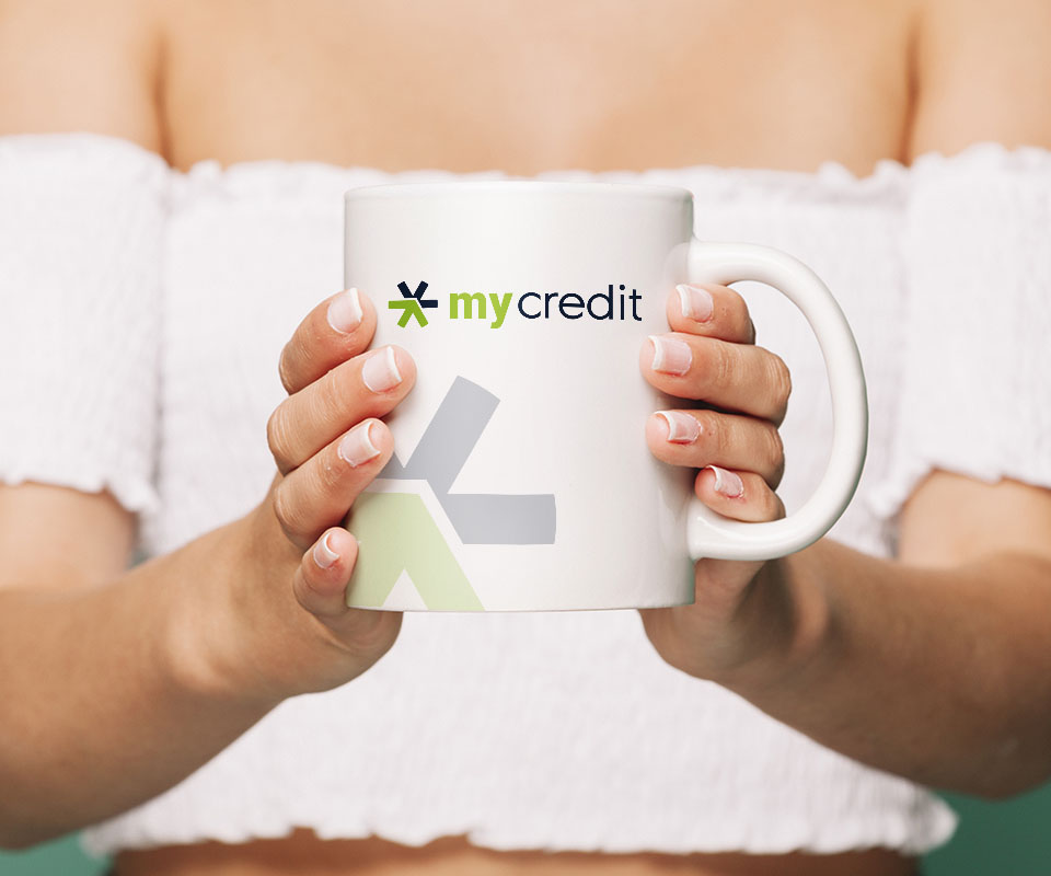
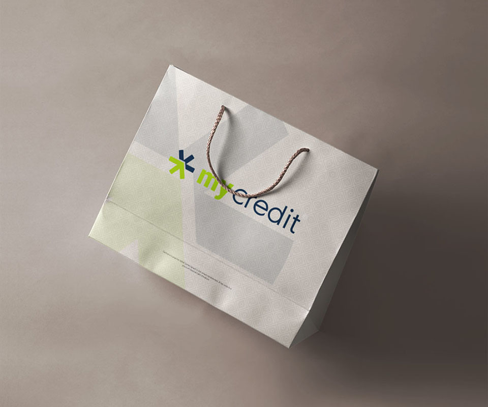
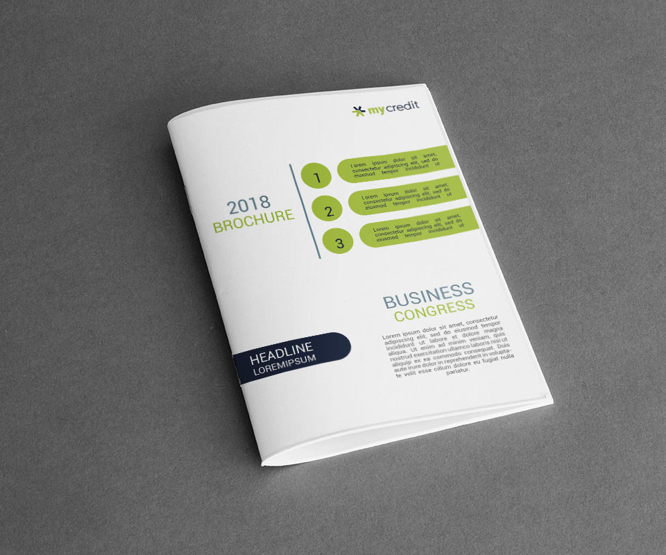
To see whether the logo holds up on real objects, Sinh Vũ built mockups, images that place the design on a real object, on a ceramic mug, a paper bag and a brochure. On the mug and the bag the star is enlarged and printed faintly as a background pattern, while the full logo is printed on the object and still reads clearly.
The value
MyCredit has a simple symbol that shows movement at a glance. The logo works large on a wall and small on a mug and a brochure cover.
MyCredit's chief executive commented: "A beautiful design, approved straight away."
A two-arrow star on everyday objects
In their own words
A beautiful design, approved straight away. The rosette mark tells people at once that MyCredit is a financial service where money is lent and repaid, exactly what we needed.