MyWork: finding a job right on your phone
MyWork began as a job-search website and now has a phone app too. Sinh Vũ designed the interface (how the screens appear and how users tap through them) for both iOS on the iPhone and Android. In the app, users search for jobs, follow companies and top up their account right from the phone.
Moving a whole website onto the phone
MyWork began as a job-search website with many features. It wanted to bring those features into a phone app and add new services for its target users. The market already had many job-search apps, so the UI and UX demands were high. UI is the interface, the part users see. UX is the user experience, meaning whether using the app feels natural.
The hardest part was doing two things at once: fitting many website features onto the small phone screen, and adding the new services. Sinh Vũ's team of 5 worked for 3 months to deliver on schedule and to the quality set.
Open the app and choose a role straight away
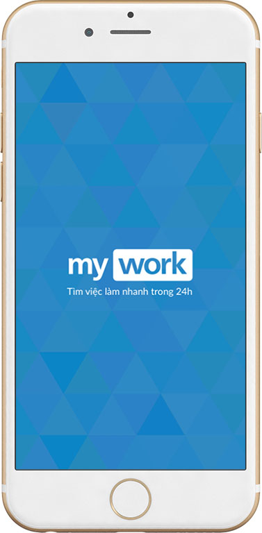
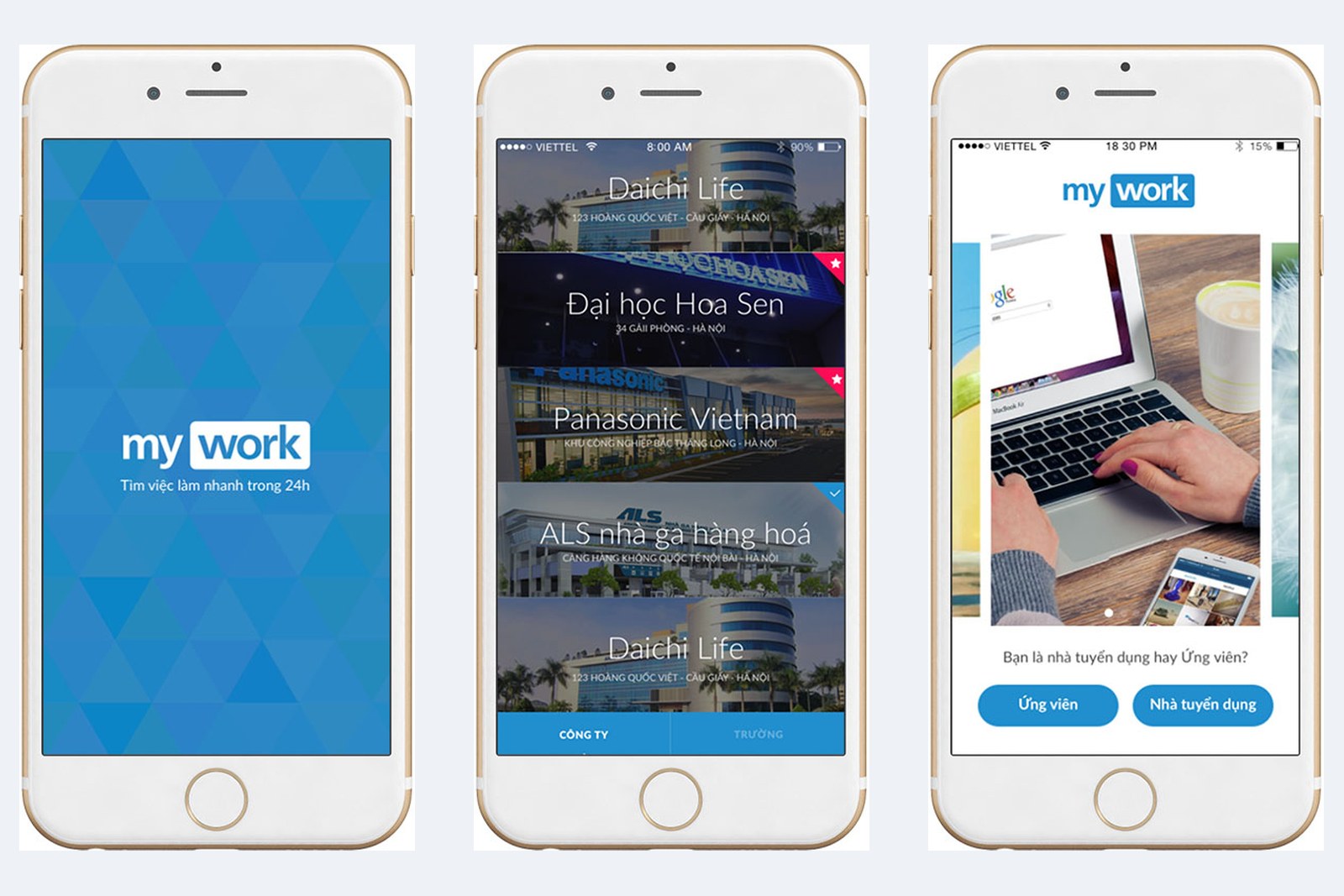
The MyWork launch screen has a blue background and the line "Find a job fast in 24h". The next screen asks just one question: is the user an employer or a candidate, with two large buttons to choose from.
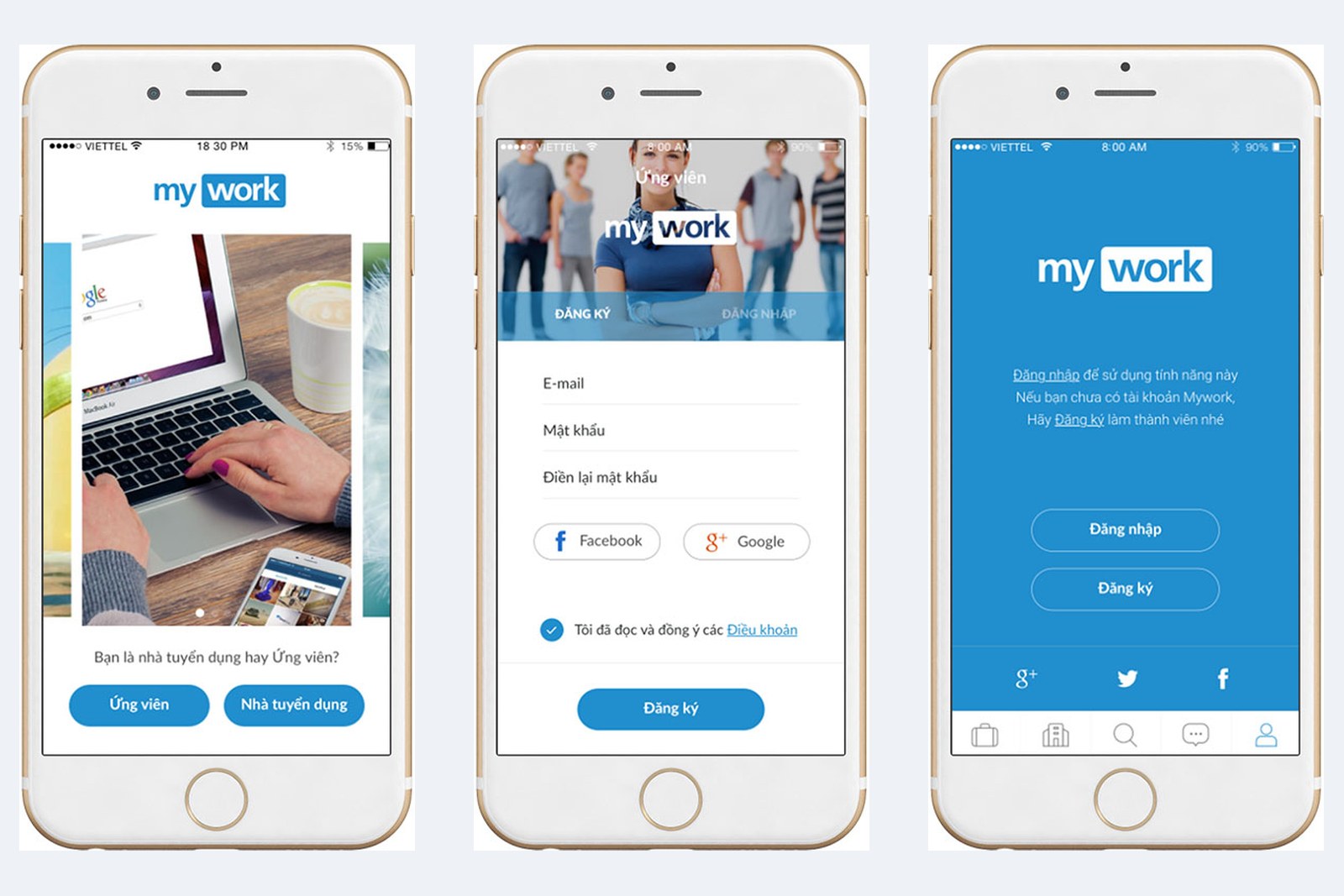
Signing up needs only an email address and a password, or an existing Facebook or Google account. At the bottom of the screen is a bar of five icons: jobs, companies, search, messages, profile. The icon of the open section is filled in blue, so users know where they are.
Finding companies, following jobs
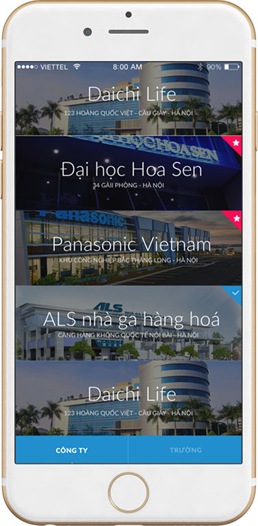
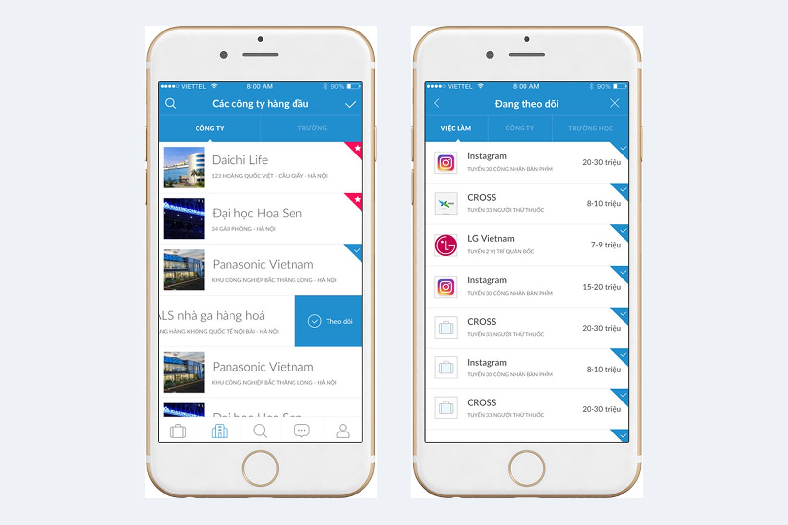
The company list is arranged in rows, each with a photo of the head office, a name and an address. At the right corner of some rows is a red star or a green tick. Swiping a row to the left reveals a "Follow" button, so following a company takes a single swipe.
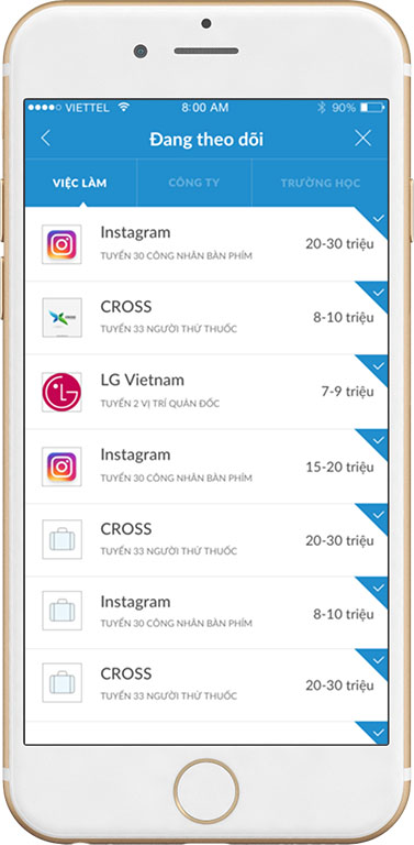
The "Following" section has three tabs to switch between: jobs, companies, schools. Each line gives the employer, the role being hired and the salary. Users can compare jobs at a glance.
Topping up an account in three steps
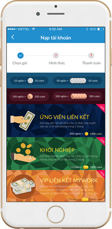
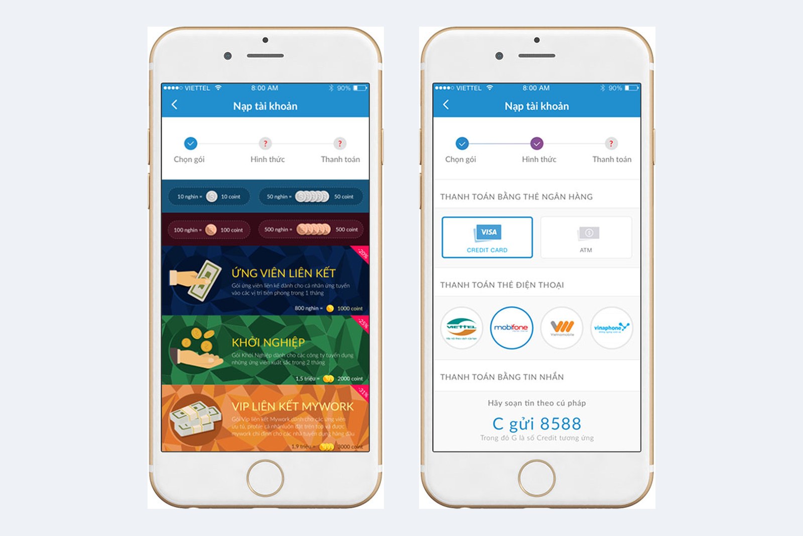
MyWork has paid plans, so the top-up screen has to be clear to put users at ease. Sinh Vũ split topping up into three steps: choose a plan, choose a method, pay. The bar at the top shows which step the user is on.
Each plan has its own background colour, such as dark blue, green and orange, with the discount shown in the corner. Some plans are for candidates, others for recruiting companies. Payment methods include bank cards, mobile phone scratch cards from the network operators, and text messages, each in its own panel.
What Sinh Vũ held to in the design
MyWork has one set of screens shared by iOS and Android: the same blue, the same logo, the same arrangement of sections. Candidates and employers meet the same MyWork whichever phone they use.
MyWork required the app to leave room for new services later. So the screens follow one common layout, and when MyWork adds a service, the new screen still fits the existing ones.
Every screen of the app