
My House: the house in a click
My House sells smart-home devices and solutions, meaning devices that let owners control the lights, doors and appliances in their home from afar. Sinh Vũ designed the logo so that viewers understand at once: the owner only needs to click to control their own house.
A logo for a smart-home brand
My House is a smart-home device and solutions brand owned by the Tân Phong company. The client commissioned Sinh Vũ to design the logo for it.
The logo had to show viewers two things. First, the house belongs to each owner alone. Second, controlling that house is as simple as a mouse click.
A house with a button
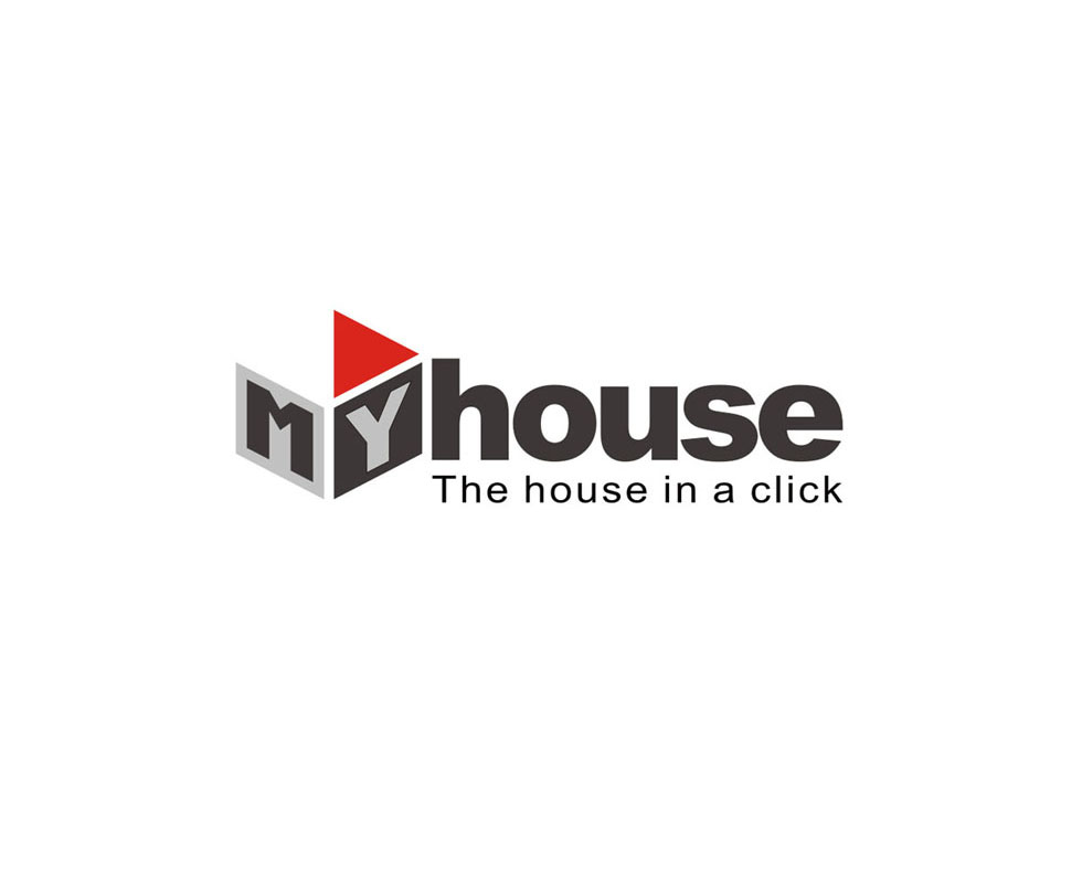
Sinh Vũ placed the letters M and Y on two faces of a box shape, suggesting a house. The two letters read together as "MY", meaning "belonging to me": the house is each person's own.
On top of the box, where the roof would be, sits a red triangle. It resembles a play button, the triangular button on a music player or video viewer. Viewers understand at once: click once, and the house does as you wish.
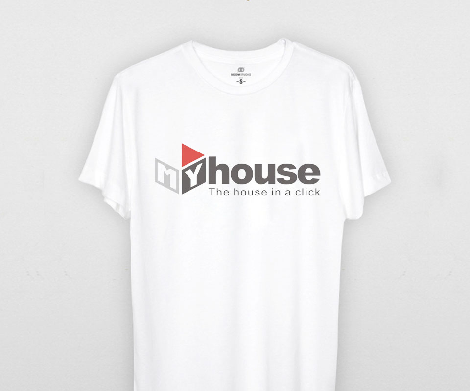
The word "house" is set in bold charcoal grey, close against the box. Beneath it is the slogan "The house in a click". The whole logo carries just one patch of red, so the eye lands exactly on the button.
Three logo versions for three kinds of ground
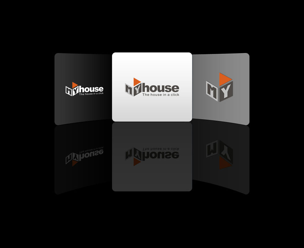
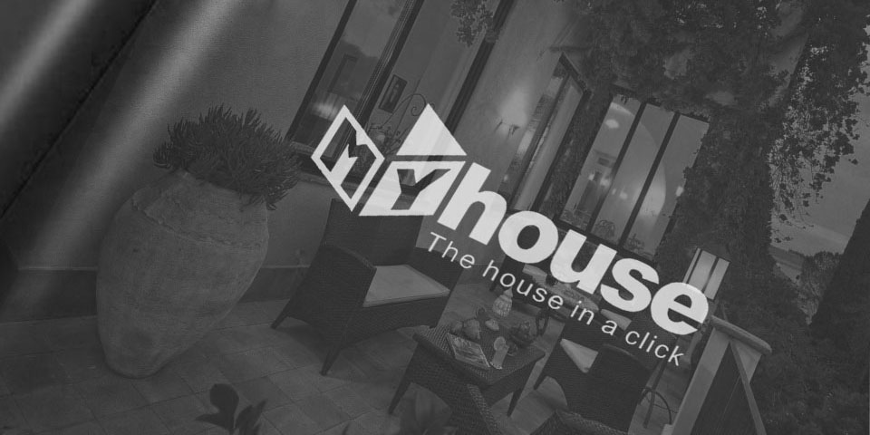
A logo must read clearly on many different backgrounds. Sinh Vũ made three versions: white lettering for dark grounds, grey lettering for light grounds, and a reduced version with only the MY box and triangle, for places too small to read the whole line.
In all three, the box and triangle keep the same shape and position, so viewers still recognise one brand.
The logo on paper
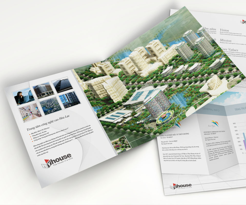
Sinh Vũ placed the logo on a multi-page brochure. On the inside page the logo sits in the lower corner, leaving the middle for a rendering of an urban development. The logo returns on other pages, so whichever page readers turn to, they see the name My House.
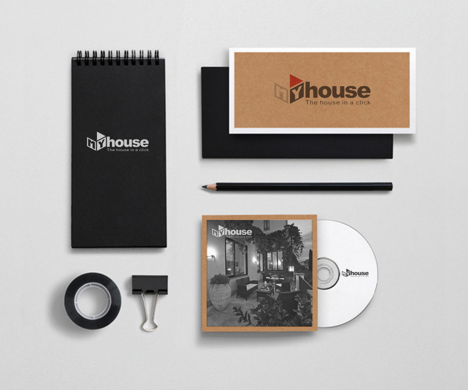
The stationery set includes a spiral notebook, a kraft paper card (brown paper, not bleached white), a CD and a disc sleeve. The logo changes colour with the ground: white on black paper, brown on kraft, dark grey on the white disc. The shape of the logo stays the same.
The value
My House has a logo that says at once what the company does: a house, belonging to each person, controlled by one click.
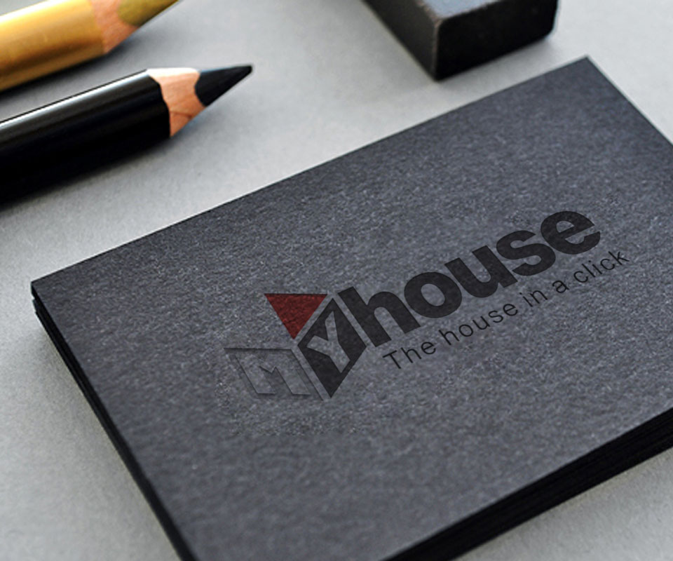
The logo is compact and uses few colours, so it works on shirts, business cards, disc sleeves and brochures without being redrawn. My House's chief executive remarked that Sinh Vũ worked in an organised way, was easy to talk to and made quick changes through each round. The client also said they were very pleased with the result.
The My House logo on every material
In their own words
Working with Sinh Vũ was a pleasure. Everything was well organised, communication was easy, each round of feedback was turned around quickly, and the final result is beautiful. I am very satisfied.