
imuzik, when a ringback tone becomes something you want to hear
imuzik is Metfone's music and ringback service, launched into a market already crowded with music apps. Sinh Vũ designed the experience so a carrier utility could become something people open by choice every day.
The problem
A ringback tone is something people endure rather than choose: the monotonous beeping while waiting for the other end to pick up. Metfone wanted to turn that silence into music, then wrap it in a full music app. But the market was already crowded with familiar apps, each with its own library and its own base of users.
A carrier service easily assumes subscribers will use it because it is convenient, because it comes with free data. But what keeps people is not a promotion, it is how the app feels each time they open it. imuzik had to be good enough that people opened it because they wanted to listen, not because it was already on their phone. Sinh Vũ's problem, then, was not adding one more name to a crowded market, but making the listening experience smooth enough to stand beside the big names.
The approach
Before opening any design tool, the Sinh Vũ team sat and used the popular music apps of the day, writing down every point where users stalled: too many steps to reach a song, screens crowded with information, buttons too small to tap on the move. Those bottlenecks became the list of things to solve.
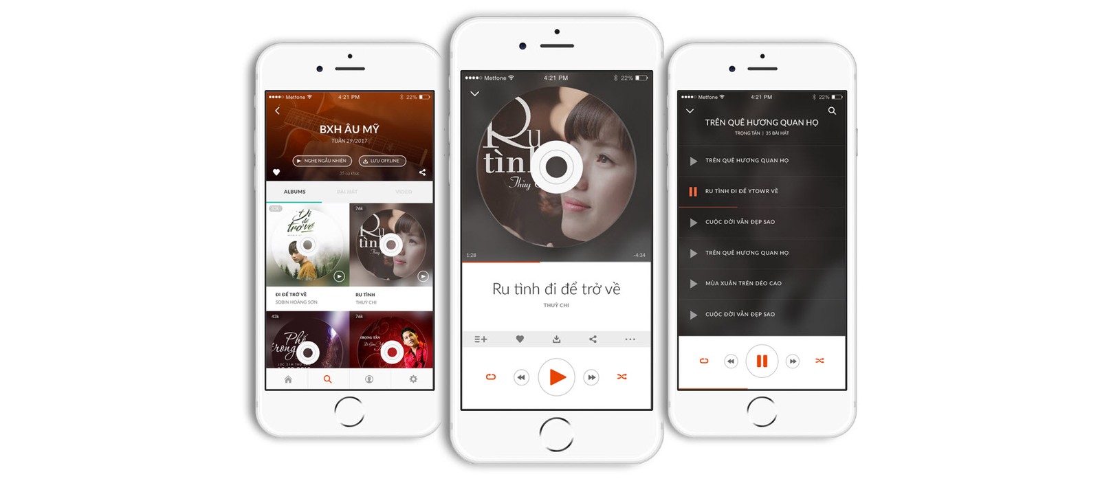
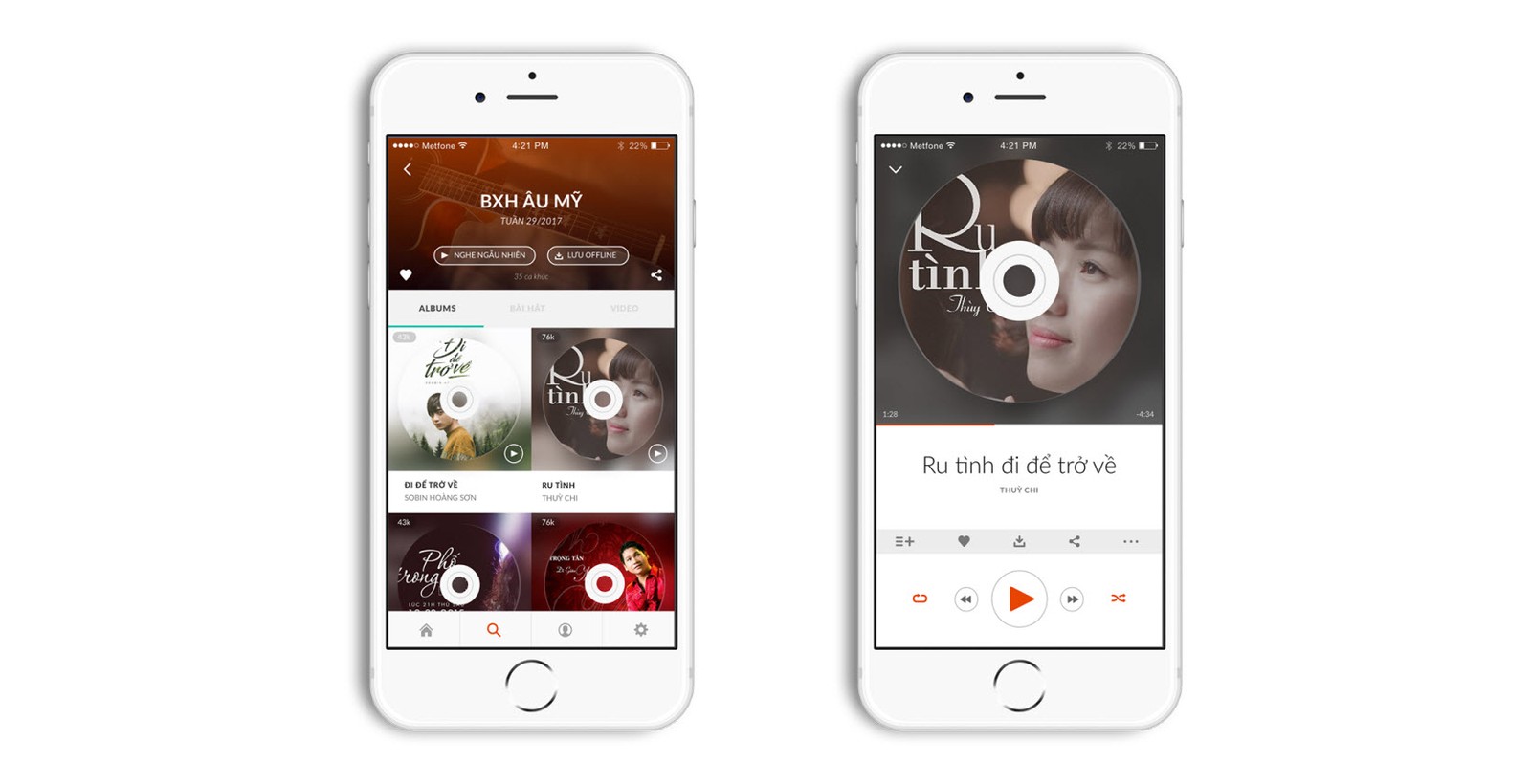
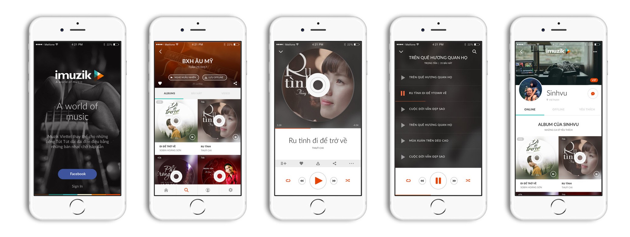
imuzik shortens the path to listening as much as possible: open it and you see the charts and suggestions, tap and it plays. Album art is built as a round record with a hole at its centre, a small detail that gives digital music back the tactile feel of a vinyl disc. The player screen goes dark so the artwork and the song rise to the front, the browse screen stays bright so it reads well in sunlight. Every choice serves one thing: the listener reaches the song they want without having to think.
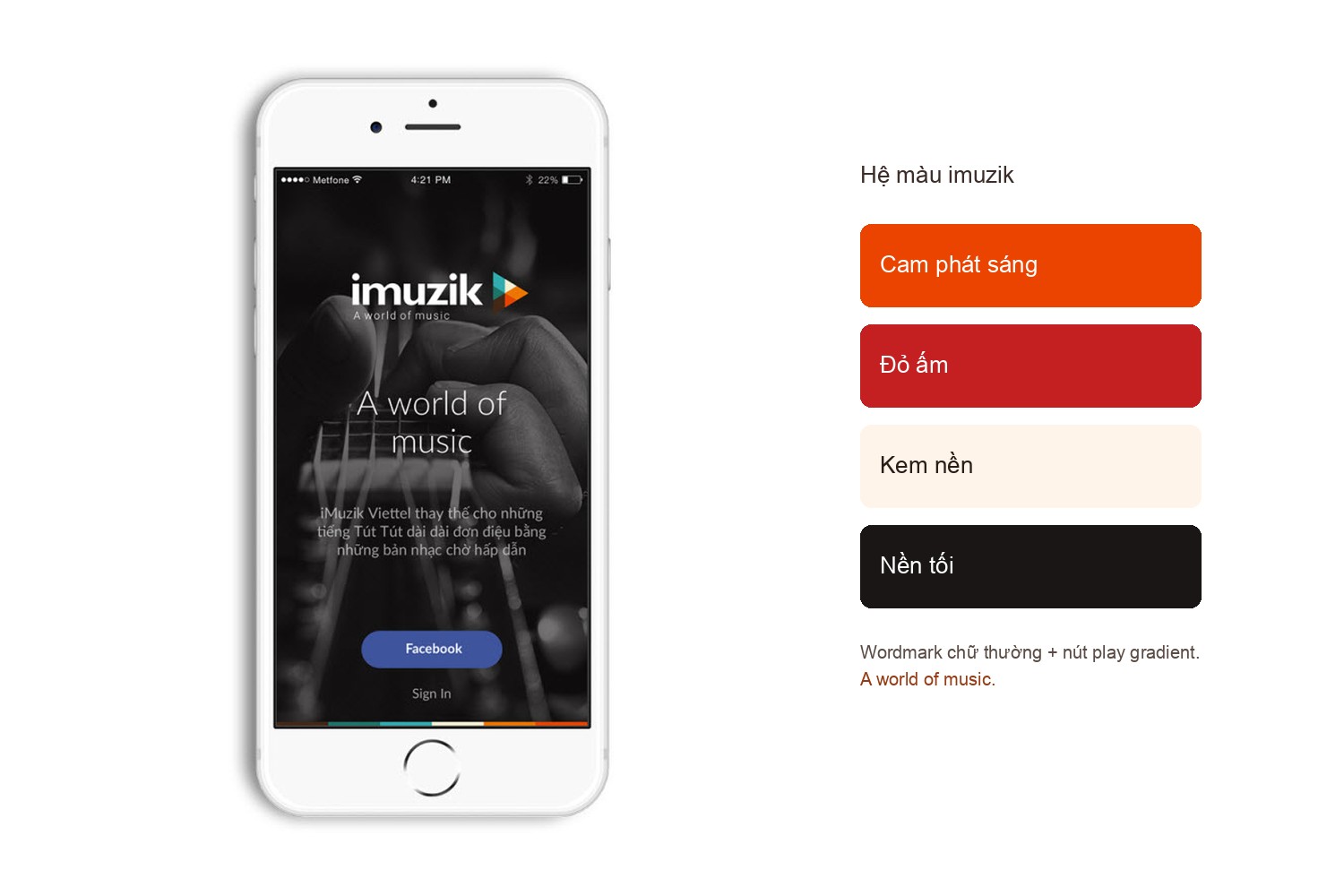
The name imuzik, set lowercase, soft and friendly, stands beside a play triangle shifting from orange to red like a button lit up. It is a sign anyone reads at once: tap here and there is music. The line A world of music alongside it states the service's ambition without needing translation.
That orange-red runs through the whole app, from the play button and progress bar to the accents on dark screens, bright enough to lead the eye without crowding the content. In a market where many music apps choose cold blue or pure black, imuzik's warmth is how it sets itself apart and stays in memory.
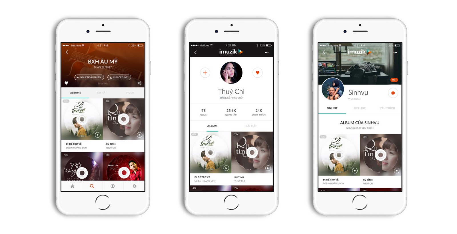
imuzik had to live on both iOS and Android, each with its own set of conventions. Rather than drawing each screen separately, Sinh Vũ built the whole interface as a component system in Sketch: buttons, song cards, the player bar, icons, each defined once and reused everywhere.
Because of it, when the development team took over, they received something coherent to build from rather than a pile of loose images to guess at. Change one component and it updates everywhere, add a new screen and nothing falls out of rhythm. For a service that would keep updating, this is the quiet work that keeps a product consistent across every version.
Before downloading the app, users and partners meet imuzik on the website. The site is built bright and compact, leading straight to what matters: what the service does, how it sounds, where to download it. It shares the app's identity, so anyone who has seen the logo on their phone meets the same face again on the web.
For a carrier product, the website is also where Metfone introduces the service to units and partners. A polished page, in sync with the app, says on its own that this is a service taken seriously, not a utility bundled in for the sake of it.
The result
What imuzik gained was not a pretty interface, but an experience seamless enough for a carrier service to stand on equal footing with dedicated music apps. Identity, app, design system and website run in one voice, so whether people meet imuzik on a call's waiting screen, in the app or on the web, they see the same carefully made product.
And the system built in Sketch leaves a value longer than the launch itself: it gives Metfone a foundation to update, extend and hand over without redrawing from scratch each time. For a digital service that lives through a chain of successive versions, that is what truly matters.
The whole listening journey, in the palm of your hand
The main screens of the imuzik app
Is your problem similar to imuzik?
Tell Sinh Vũ what's on your mind about your digital product. Sinh Vũ will point you to the right direction right away.