
IkonLED: the logo in the three colours of LED light
IkonLED is an LED matrix lighting brand (lights made of many small points of light set in a grid, joined into a large screen) from Tân Phong company. Sinh Vũ designed the logo and prepared the print artwork (getting files ready so the printer reproduces the right colours and sizes) so the brand works on paper, on signs and on large screens.
One logo that works in many places
IkonLED sells LED matrix lighting. Its logo appears on brochures, on indoor and outdoor signs, on gifts for customers, and on large LED screens.
So IkonLED needed a logo that says LED lighting at a glance. It had to keep its shape printed on paper, engraved on objects or shown on a screen, large or small.
Three colours taken from the light of an LED
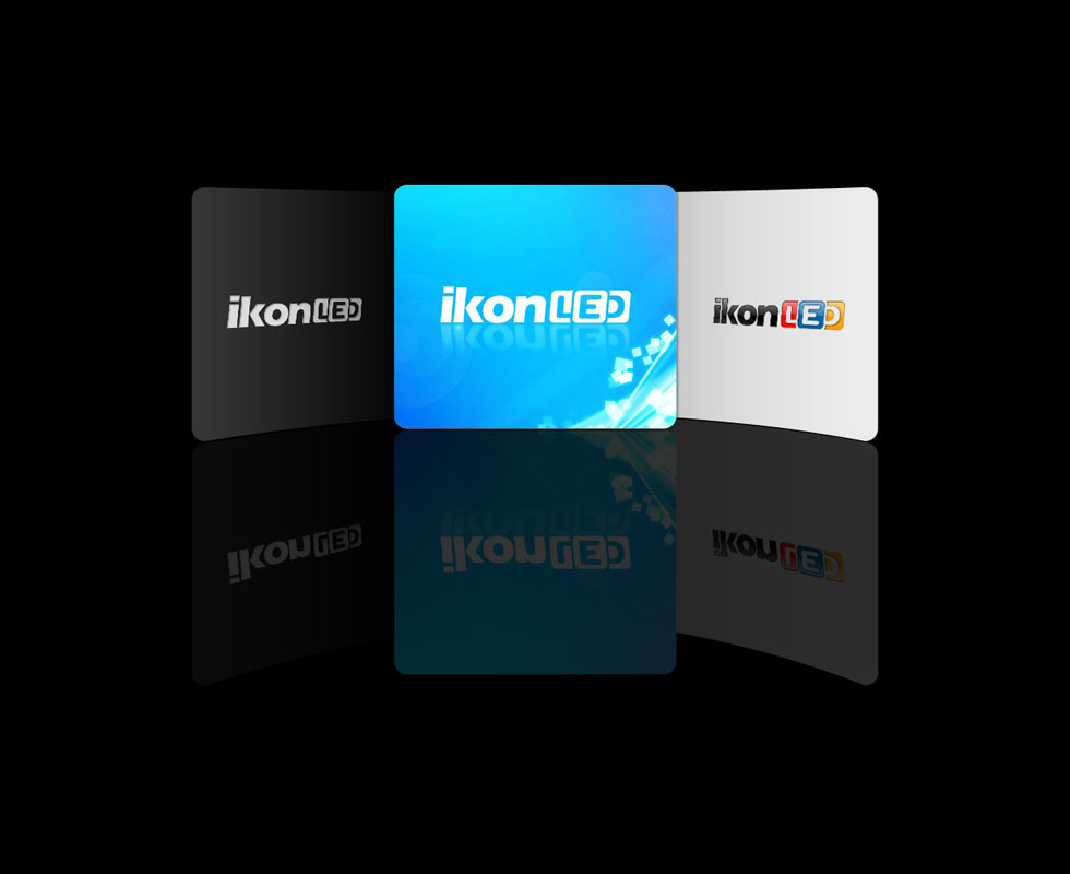
The word ikon is set in bold, angular letters, black or white depending on the ground. The LED part is drawn as three rounded squares, each in its own colour, like three points of light on a panel. The three colours come from RGB, the system of three colours of light: red, green and blue. An LED mixes those three to make every other colour.
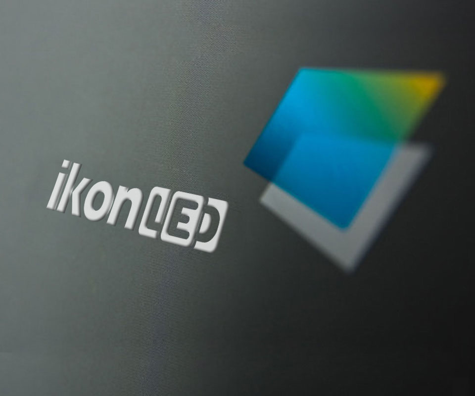
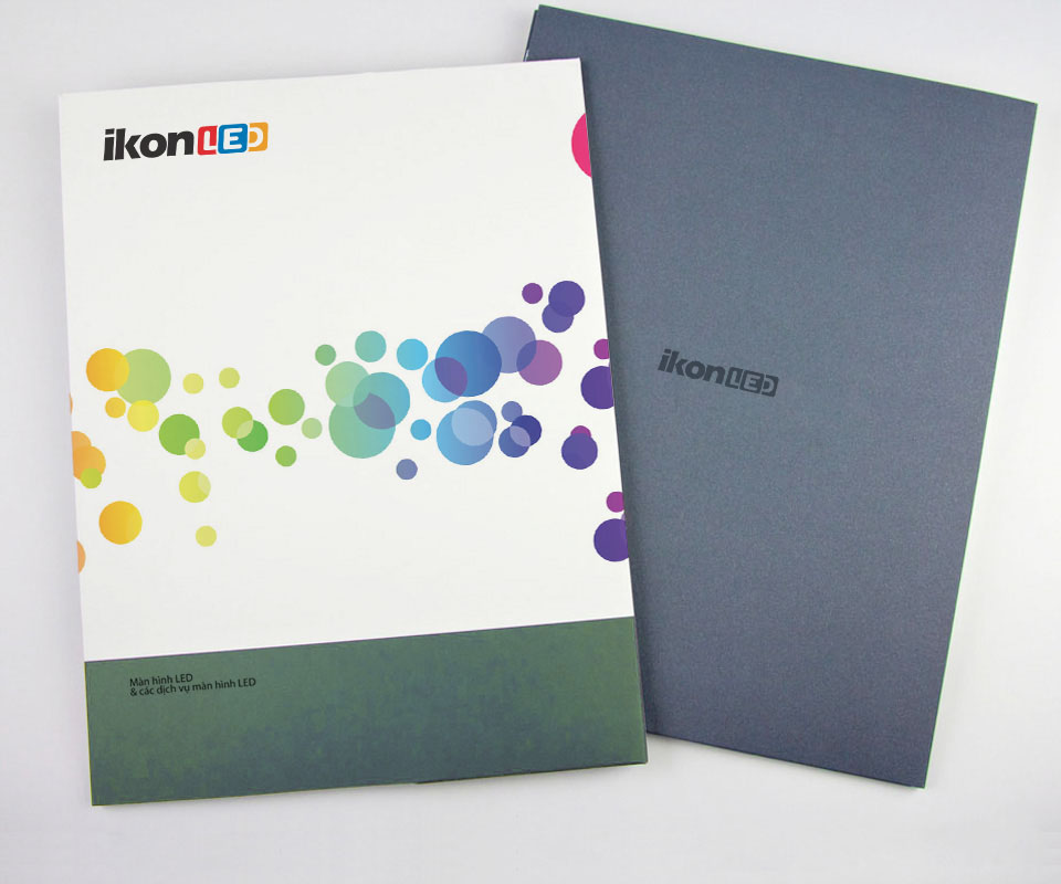
The logo comes in a multicolour version, a white version for blue grounds and a single-colour version. The single-colour version is for places that cannot print many colours, such as embossing or engraving on objects. The picture shows the white logo embossed on a grey surface.
Multicoloured dots on the printed pieces
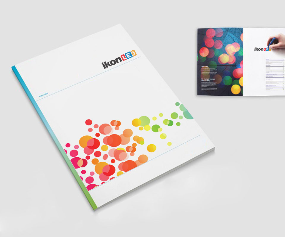
Sinh Vũ prepared the print files for the brochure and the file cover. The background is made of translucent round dots laid over one another, recalling spots of light. On the brochure the dot colours run from red through orange and yellow to green.
On the file cover, a band of dots shifts towards blue and purple across the middle of the page. Below it is the line "LED screens and LED screen services" on a moss green ground. The outer cover is blue-grey and carries only the logo in the same tone, to keep it tidy.
From print to gifts
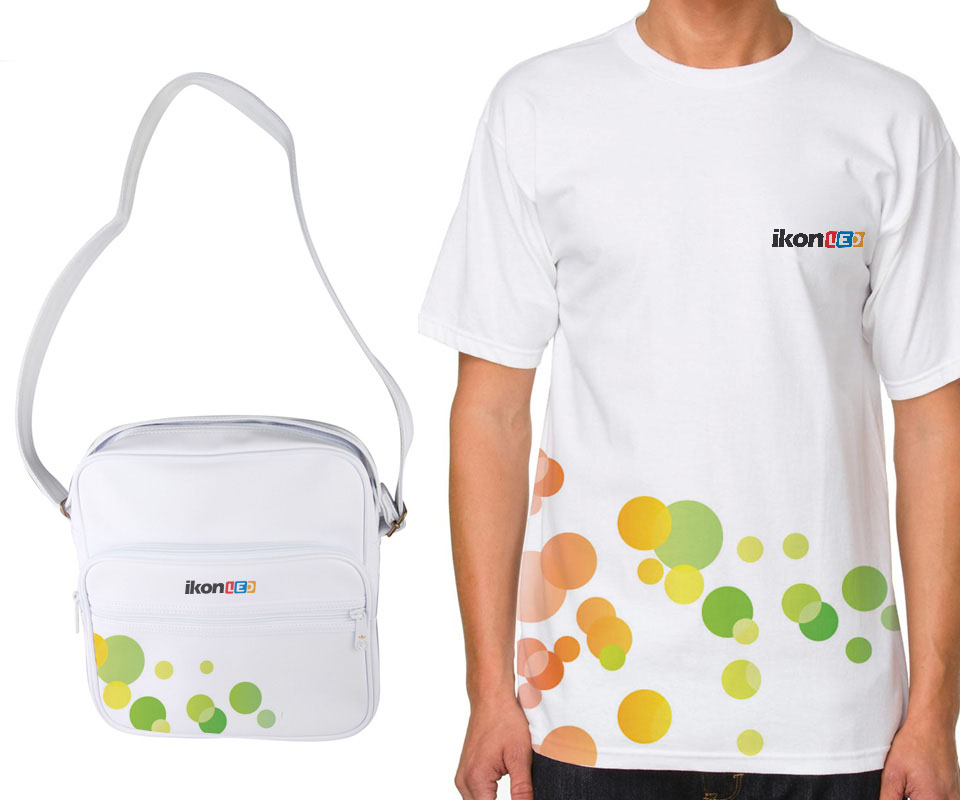
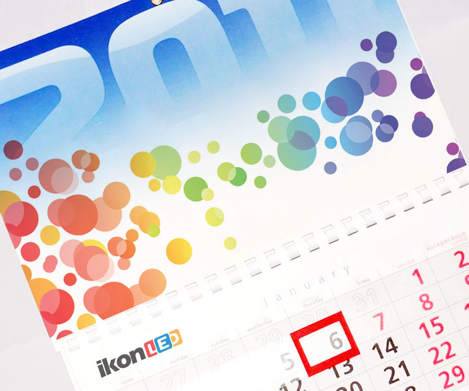
The same set of dots is carried onto T-shirts, shoulder bags and wall calendars. The logo sits on the chest of a shirt or the face of a bag, while the dots sit below it and never overlap the lettering.
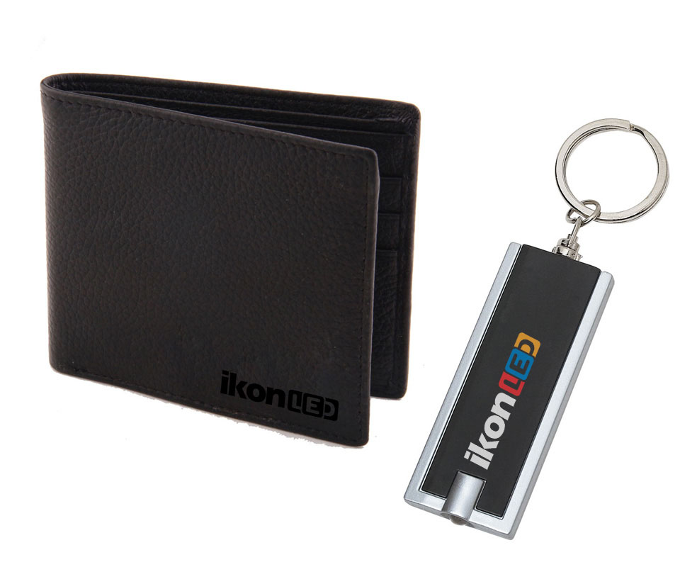
On the black leather wallet the logo uses the single-colour version. On the black torch keyring it uses the version with white ikon lettering and three coloured squares, so it still stands out on a dark ground.
What IkonLED received
IkonLED has a logo that clearly says LED lighting, and an identity set (logo, colours and dots used consistently everywhere) for paperwork, gifts and screens. A customer meeting IkonLED on a brochure or on a shirt sees the same set of shapes.
Multicoloured dots on paper and gifts
In their own words
A good design that fits how IkonLED uses its brand every day. With several colour versions, the logo reads clearly on paper, on signs and on large LED screens, and our printed materials come out in the right colours and sizes.