
Freewifi: an app for sharing wifi signal
Freewifi is an app from a start-up in the United States. It lets households rent out their own home wifi, while people who need a connection pay to use it. Sinh Vũ designed the logo and interface for both platforms: iOS (the operating system of the iPhone) and Android (the operating system of many other phone makers).
Two sides, one app
Freewifi connects two groups of people. On one side are households with wifi at home who want to rent it out. On the other are people who need a connection and are willing to pay for the time they use.
So the app has to serve both sides. Someone who needs a connection must find a nearby wifi point very quickly. Someone renting out wifi must be able to see who has used it and how much they have earned.
A logo from the wifi wave
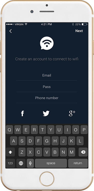
The client's brief was a simple logo that conveyed a network for sharing wifi signal. Sinh Vũ placed the wifi wave symbol inside a speech bubble: the wifi wave stands for the network, and the speech bubble stands for exchange and sharing between people.
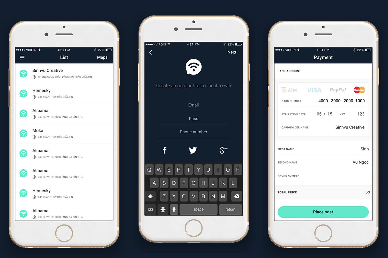
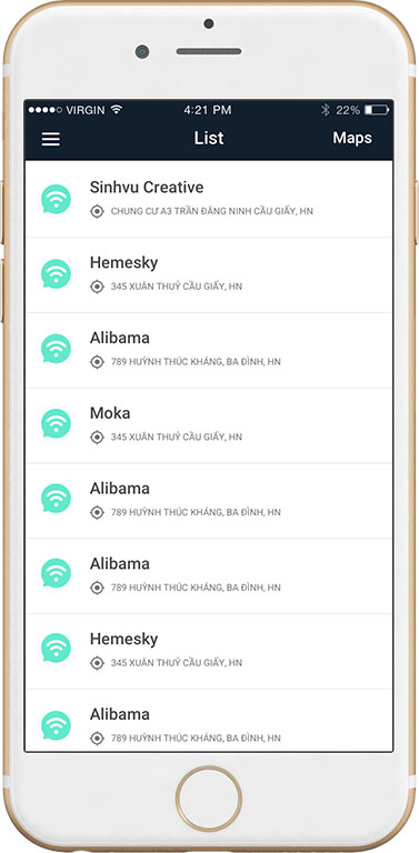
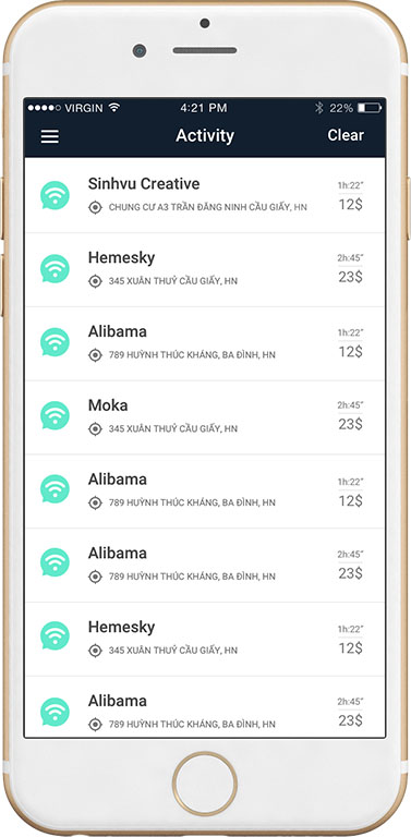
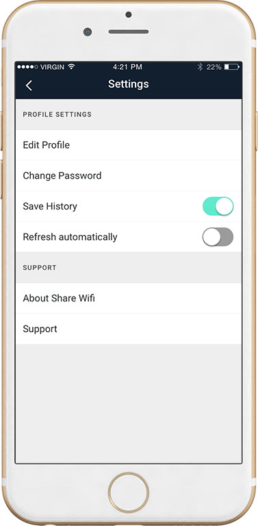
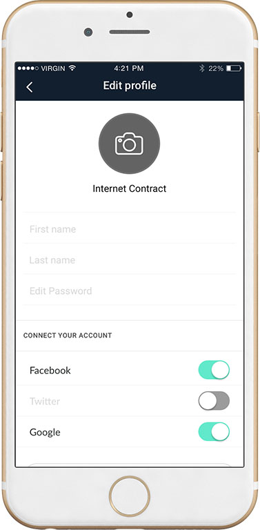
The interface uses two main colours. A deep blue-black is used for the title bar and the sign-up screen. A mint green is used for icons and buttons. A small version of the logo icon repeats at the start of each line in the list, so users recognise a wifi point at a glance.
From choosing a point to paying
Users open the map to see wifi points within a circle around their location, or switch to a list view. Choosing a point leads to the connection screen, where they pick how long to use it: 1 hour, 3 hours, 5 hours, 1 month or 3 months, each with its price shown.
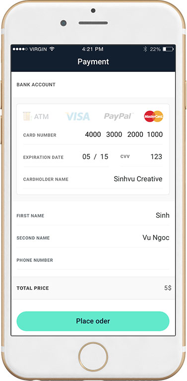
Each step has a single large green button at the bottom of the screen, such as "Proceed to payment" and then "Place order". Sinh Vũ did this so users always know where to tap next, even on their first use.
The side of the person renting out
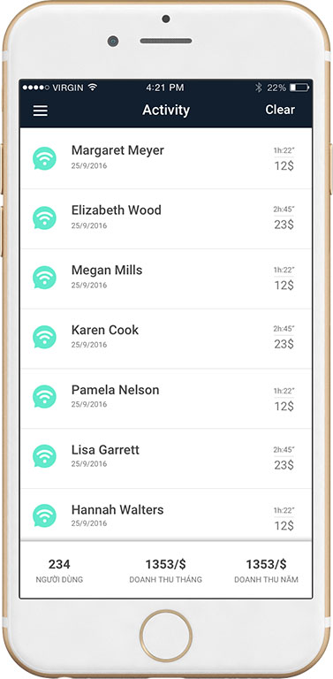
People renting out wifi have their own screen listing each session: the user's name, the date, the time used and the amount paid. A strip at the bottom of the screen gathers the three figures they need most: number of users, monthly revenue and yearly revenue.
The client wanted an interface and experience that suited the habits of users in each region. Sinh Vũ studied this closely and chose a lean presentation: little text, even spacing and fewer decorative details, so every screen can be read quickly.
The value
Freewifi has a simple, easily recognised logo and a set of screens that share colours and layout across both iPhone and Android. Freewifi's own verdict was that the product was very good, consistent and professional.
In an app where users pay money, the interface has to build trust from the first screen. Sinh Vũ kept the screens consistent and the buttons clear, so users feel at ease paying to use the wifi of a household they do not know.
Every screen, one mint green
In their own words
Thank you, Sinh. The logo and interface are consistent and professional on both iPhone and Android. Thanks to that, our app launched with one unified look from day one.