
Foodbook: find a place, book a table, order food in one app
Foodbook is iPOS's mobile app, helping users book tables, buy discounted dishes and order food quickly. Sinh Vũ designed the handwritten logo and the app interface, from the opening screen to the bill.
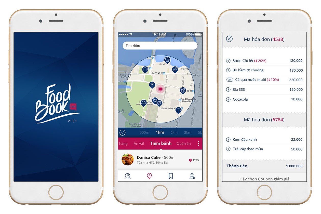
The brief: easy to use, easy to approach
iPOS makes software and management equipment for restaurants and cafés. Foodbook is iPOS's mobile app, where users find places, book tables, buy discounted dishes and order food.
iPOS gave Sinh Vũ two tasks: designing the logo, and designing the interface and user experience (UI UX: how the screens look and whether they are comfortable to use). The app had to be easy to use and approachable, in flat design (flat colours, no shadows, no imitation of raised surfaces). The logo needed a free, light stroke that is easy to remember.
Before drawing, Sinh Vũ studied the interfaces of existing food-ordering and booking apps closely. From that, Sinh Vũ improved how the app is used to suit young, active users, Foodbook's main audience.
A handwritten logo in iPOS blue
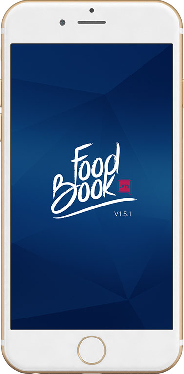
The Foodbook logo is the words Food and Book written by hand, the letters joined, with a long curved stroke underneath. White letters sit on a deep blue ground. Beside the letters is a small deep pink box reading .vn.
Sinh Vũ chose blue so the logo matches the colour used across iPOS's promotional materials. On the screens, deep pink appears on buttons, discounts and the bar for choosing a type of place, so users see at once where to tap.
Finding places nearby
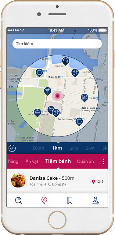
The search screen draws a circle on the map around where the user stands. The user chooses a radius from 500 metres to 5 kilometres. Places inside the circle appear as small pins, each with an icon for its type, such as café, cakes or beer.
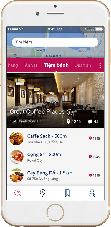
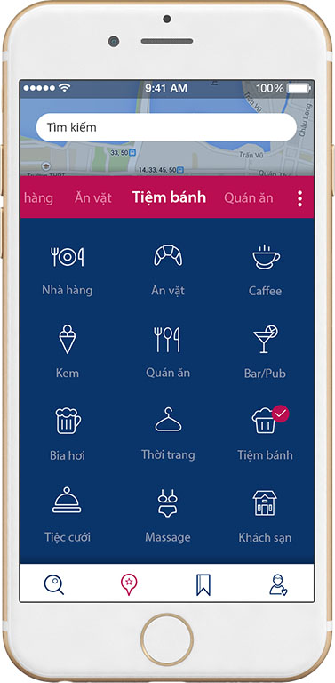
Above the map is a bar for choosing a type of place that scrolls sideways: Restaurants, Snacks, Bakeries, Eateries. To see every type, the user opens a panel of thin white line icons on blue. The type currently chosen has a pink tick.
From choosing a dish to the bill
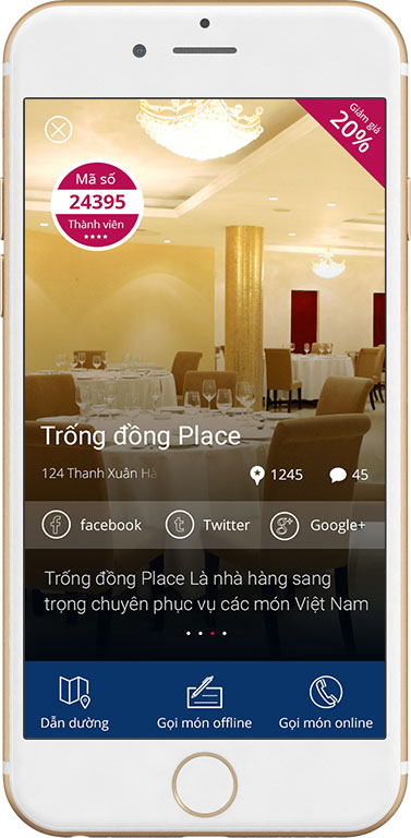
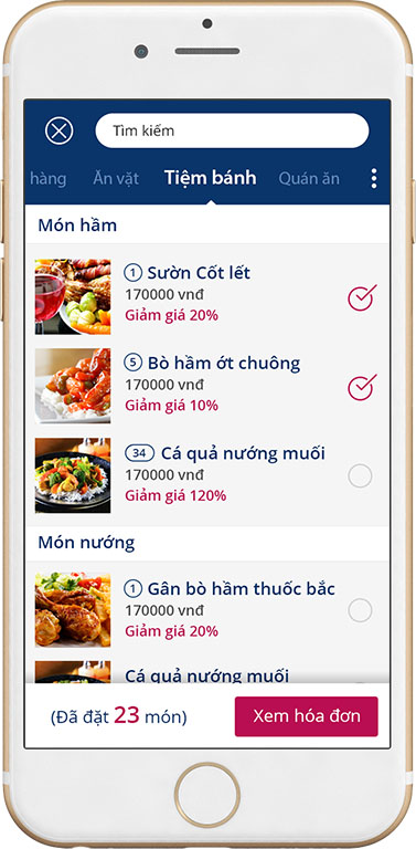
Once a place is chosen, the user sees three buttons at the bottom of the screen: Directions, Order offline (ordering at the venue) and Order online (ordering over the internet). The ordering screen is grouped by section, such as Stews and Grills. Each dish has a photo, a price and a discount printed in pink so it is easy to see.
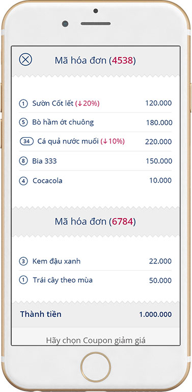
The bottom bar shows how many dishes have been ordered, with a View bill button. The bill is laid out like a receipt with a serrated edge, listing each dish, the discount and the total.
The value
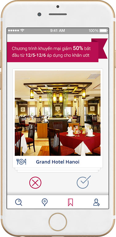
Every Foodbook screen shares one arrangement: a search box at the top, a pink bar for the type of place, a toolbar at the bottom. A user who knows one screen can use all the others.
The whole interface was built in Sketch (interface design software). According to feedback from the client, this made it easier for those who continue the work to take over the design files, and eased the load on the development team.
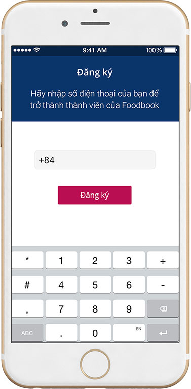
The screens of Foodbook
In their own words
Thank you, Sinh Vũ, for working wholeheartedly with the iPOS team. From the handwritten logo to every screen for finding a venue, ordering and the bill, Foodbook has an interface that young users find easy. The design files were handed over clearly, so our developers built it smoothly.