
EggFlow, a seed grown into a flow
EggFlow is a marketing automation platform for ecommerce sellers. Sinh Vũ built that software a living mark, an egg carrying a flow, so something invisible could become visible and memorable.
Software you cannot hold
Marketing automation is one of the hardest goods to brand. Clients cannot hold it, cannot see it, and only feel it through results after weeks of trial. The whole software category drifts toward the same telling: cold technology blue, abstract geometric marks, growth promises that sound alike. Standing side by side, the products lose the ability to be remembered.
EggFlow walked into that exact space. It is a platform that helps ecommerce sellers nurture customers automatically: capturing, scoring and cultivating every prospect until the sale closes. The product has depth, but before anyone can understand that depth, they have to remember the name and trust it. Sinh Vũ's job was to give that software a form that already carried its own promise.
How we worked
We did not start from the shape, we started from the name. EggFlow packs two ideas into two words. Egg is a seed of life, exactly how an ecommerce product should look at its customers: every prospect is a seed to be nurtured, not rushed to a sale before it is ready. Flow is the automatic current, the quiet mechanism that grows that seed into an order, into revenue.
The insight was that the name already told the strategy, so the identity's job was not to decorate it but to make that logic visible. We kept the brand voice short and direct throughout, so a line describing marketing automation reads as an instant understanding of what is being sold. Read the name and you see the product: nurture a seed, let it flow into growth.
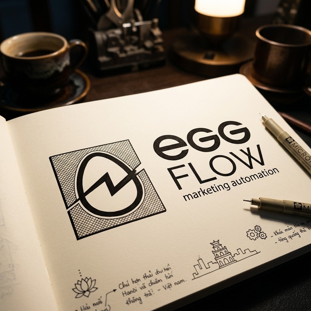
The mark condenses the whole story into just two strokes. An egg sits inside a sturdy square block, and a broken line runs through both the eggshell and the frame, splitting it and joining it back. That line reads on three levels at once: a spark of energy, the rhythm of a rising chart, and the automatic flow the name itself promises. One stroke carries the whole meaning, the still egg speaks of nurturing, the flowing line speaks of motion.
Colour is what pulls EggFlow out of the uniform crowd. The software industry defaults to cold blue, a colour so safe that nothing distinguishes anymore. We kept a deep navy ground for trust and craft, then set it beside a warm yellow, exactly the colour of an egg yolk, to give the brand a living pulse. The type follows the same logic: lowercase egg, rounded and friendly, uppercase FLOW, upright and firm, soft and solid side by side, exactly the nature of a tool that is powerful yet easy to approach.
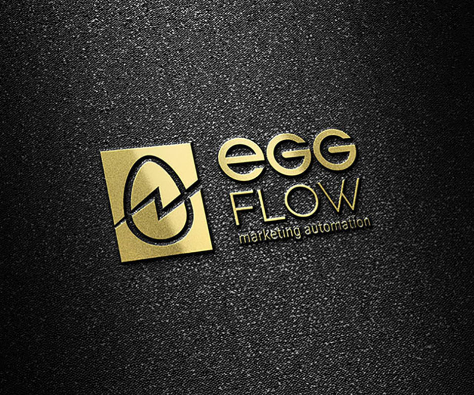
A mark only becomes an asset once it repeats without drifting. We set it into a standard: the minimum clear space around the logo, the ratio between mark and wordmark, placement on light and dark grounds, single-colour variants for engraving, embossing and foiling. Every rule answers a real question the EggFlow team will meet once they use the brand on their own.
With the rules in place, the brand no longer depends on the person who drew it. A new hire, an unfamiliar print shop, or a partner in another market can all apply the mark correctly just by opening the guideline. That is what separates a logo from an identity system: a logo is for looking at, a guideline is for a whole organisation to share without arguing over it.
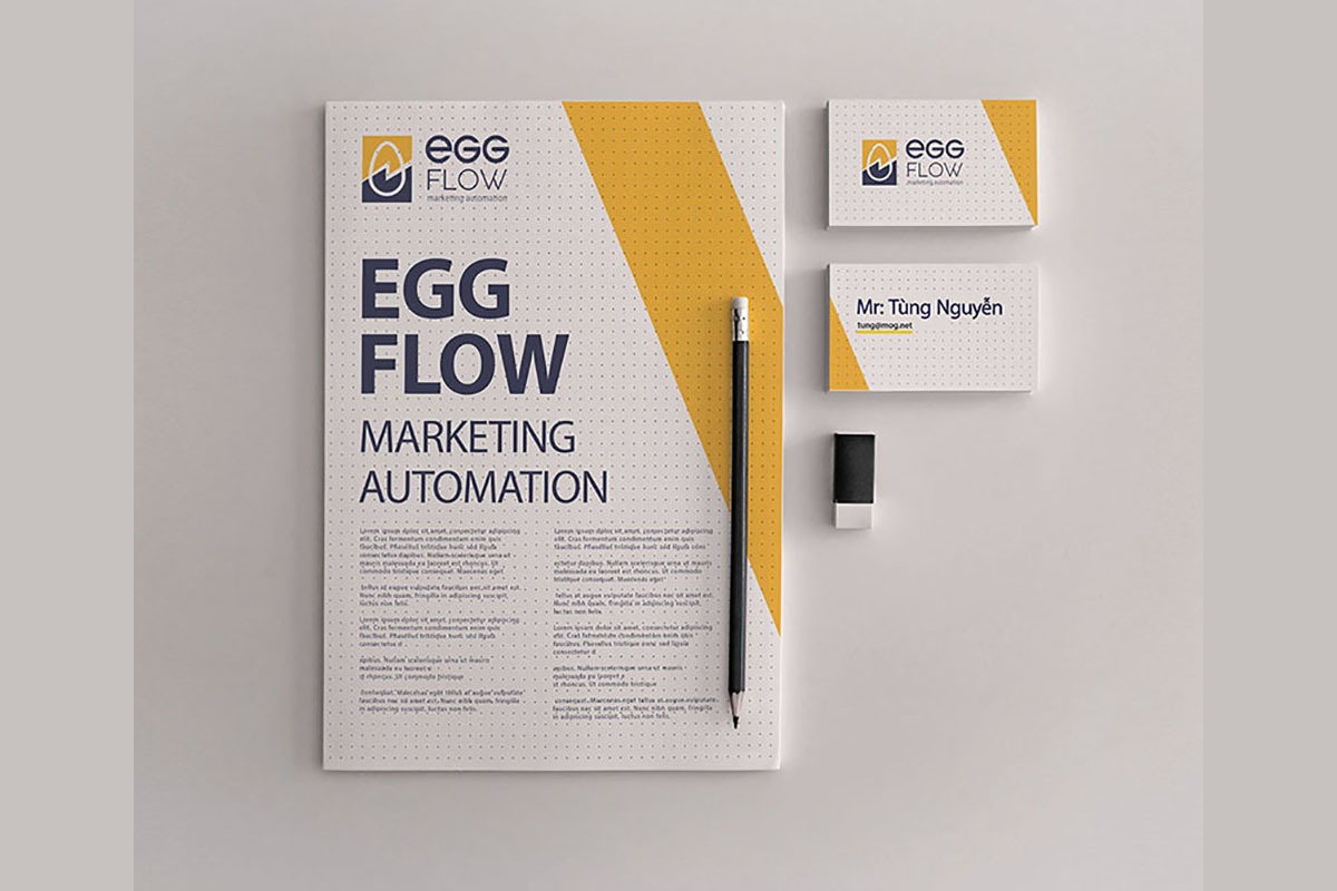
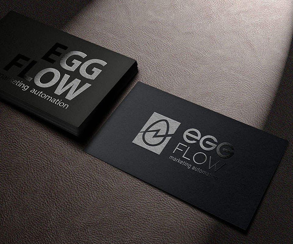
The stationery set is where the brand first meets a real hand. Business cards, letterhead and envelope all share one language: a subtle dotted ground suggesting data and networks, a diagonal gold band echoing the very flow line in the logo, and the wordmark EGG FLOW set large and decisive. Pick up the card and you see the product's character before you even read the title.
We designed the set to feel refined and to hold up in production, formal enough for a partner meeting, simple enough to reprint in batches without colour drift. Small details like the position of the gold band or the white space around the name were calibrated once, so every future print run simply repeats it.
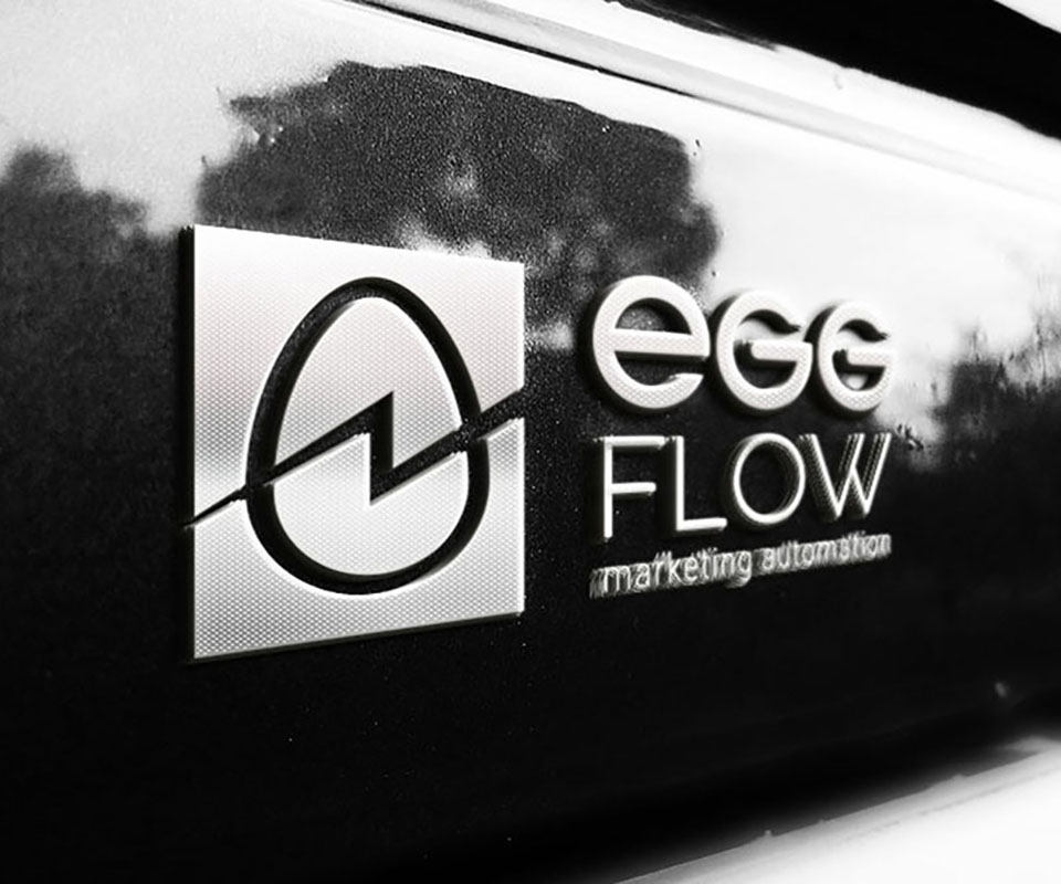
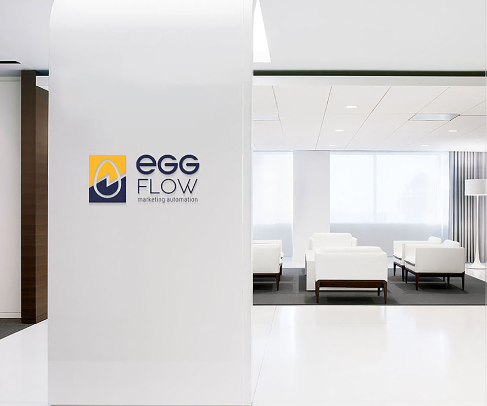
On office signage, the EggFlow mark leaves the screen and takes on architectural scale. This is the harshest test a mark can face: blown up on a wall, every awkward proportion or rough line shows under real light. The mark held its cleanness and balance at that size, exactly as it does resting on a business card.
At that spatial scale, the navy and yellow pair do their job: amid a lobby that is mostly white and grey, the brand stays warm and stands out without shouting. Visitors recognise EggFlow before they even read the name, and that first impression is something an invisible piece of software rarely gets to make.
Process
Reading strategy out of the name
We settled the two core ideas, egg and flow, before drawing anything, so every stroke afterward served one promise: nurturing a customer into a flow of growth.
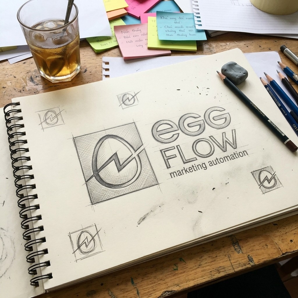
Finding the shape by hand
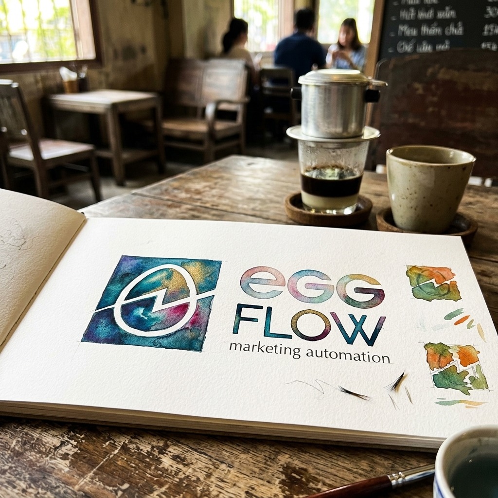
The proportions between egg, flow line and frame were tested in pencil, locked in ink, then checked in watercolour, before the computer ever got involved.
Setting the mark into law
Vectorising and writing the guideline: clear space, ratios, single-colour variants, use on light and dark grounds, so the mark never drifts when it multiplies.
Living on every surface
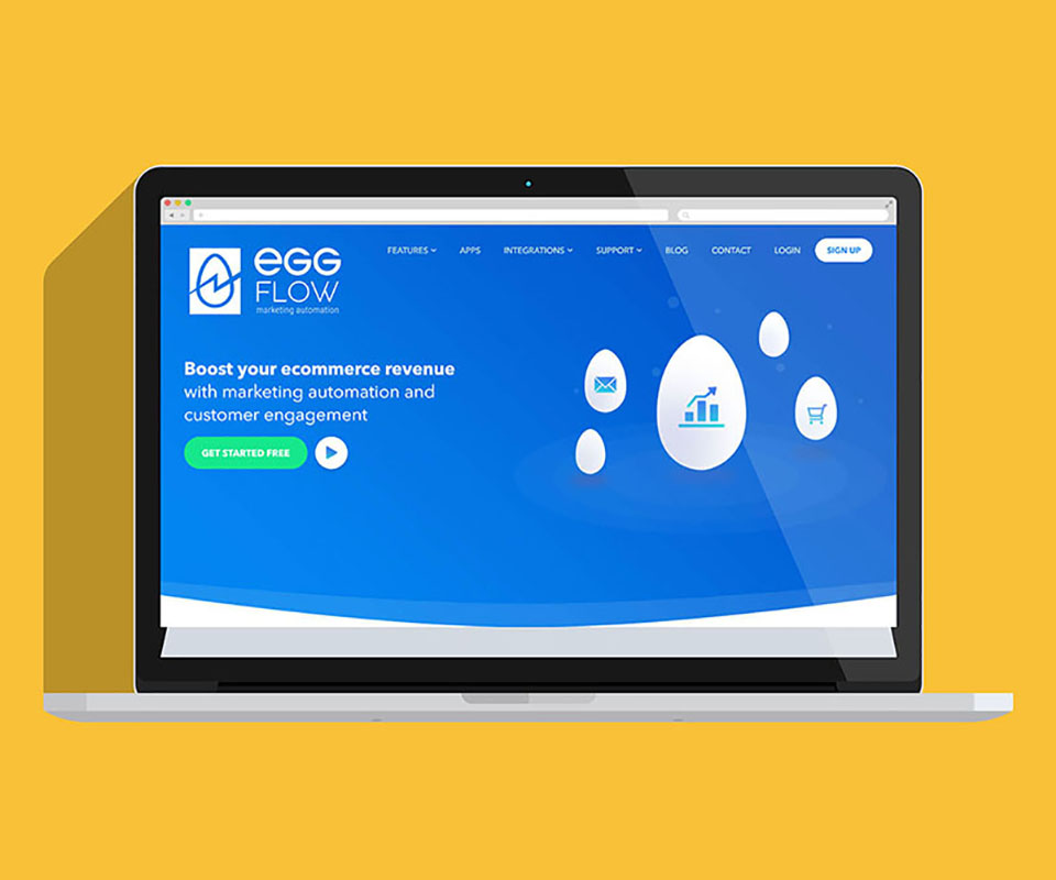
Applying the identity to business cards, letterhead, envelope, signage, foil finishes and the product screen, together with a rulebook for EggFlow to extend on its own.
Result
What EggFlow gained was not a good-looking logo, it was an asset. In a software category where every product is invisible and looks the same, there is now a name with its own face, one that tells its own story through a single mark and a single pair of colours. Clients remember it before they even understand every feature, and remembering is the first step toward trust.
More importantly, it is an open system, and a living one. EggFlow keeps operating, keeps adding features and entering new markets, without redrawing the brand each time, simply placing that familiar signal onto a new surface. That is the difference between a one-off design hire and an identity built to last for years, sturdy enough for a growing technology product to grow alongside it.
The whole system, seen at a glance
From pencil sketch, ink line and watercolour test, to foil finish, signage and the product screen, the entire EggFlow identity in one frame.
Does your product feel like EggFlow?
An invisible piece of software or service still needs a face for clients to remember and trust. Tell Sinh Vũ what you are selling, and we will suggest a direction.