
Clip.vn: a logo of colour drops for a video-sharing site
Clip.vn is Vietnam's first online video-sharing site, once rated the largest in the country. Sinh Vũ shaped the brand strategy (who Clip.vn speaks to and what it says), then designed the logo, identity, printed items and web interface for Clip.vn, using bright colours and simple shapes to suit young users.
A video site for young people
Clip.vn is a place where anyone can post and watch video online. The users it aims at are young people.
Clip.vn needed three things: a logo, a brand identity (a set of rules for colour, lettering and imagery so that everything bearing the Clip.vn name looks like one household) and a web interface. All three had to feel fresh and energetic, true to the users the site wanted to attract.
The logo: the word Clip and four drops of colour
The logo is the word Clip in black, with simple rounded strokes. The bowl of the p is filled with blue. Beside the letters are three drops in orange, yellow and lime, and one small blue dot. Underneath sit the address Clip.vn and the line "Sharing moments of happiness".
Sinh Vũ's chosen direction was bright colour with simple shapes. The bright colour shows the youthfulness the client asked for. The simple shapes are easy to recognise and work on many materials, from screens to T-shirts.
From the logo to a whole set of printed items
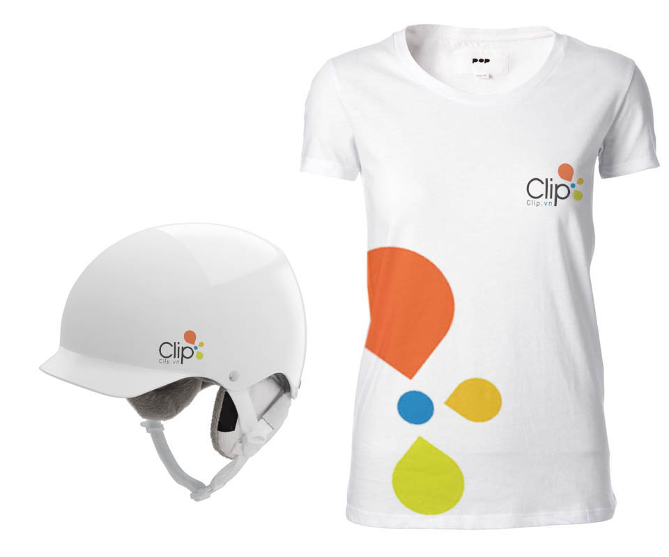
Sinh Vũ enlarged the drops of colour in the logo to use as a pattern (a decorative design printed on objects). On the white T-shirt, a large orange drop sits on the body, smaller drops line up beneath it, and a small logo goes on the chest. The white helmet carries only a small logo on the side.
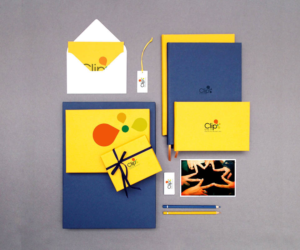
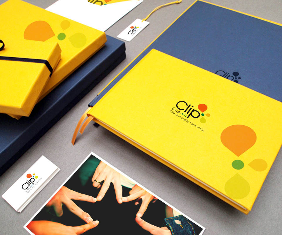
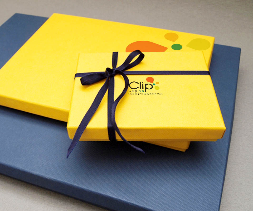
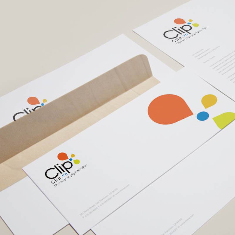
The stationery uses two main colours, yellow and navy blue. The envelope, hardback notebook, ribboned gift box, business cards and pencils all follow this pair. Set side by side, they are seen at once to be one brand.
A web interface that reuses the logo's imagery
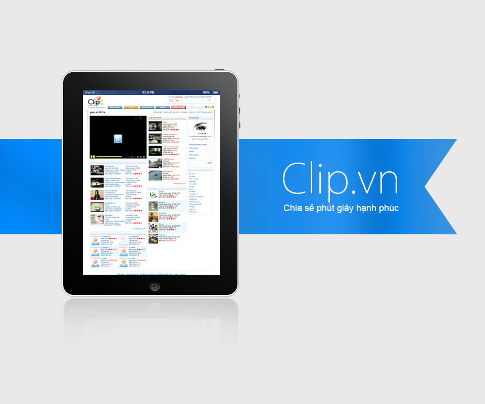
The Clip.vn home page puts the video player at the top left, with a list of clips below. The middle column shows new clips, each with a view count and a star rating. The Clip.vn logo sits at the very top corner.
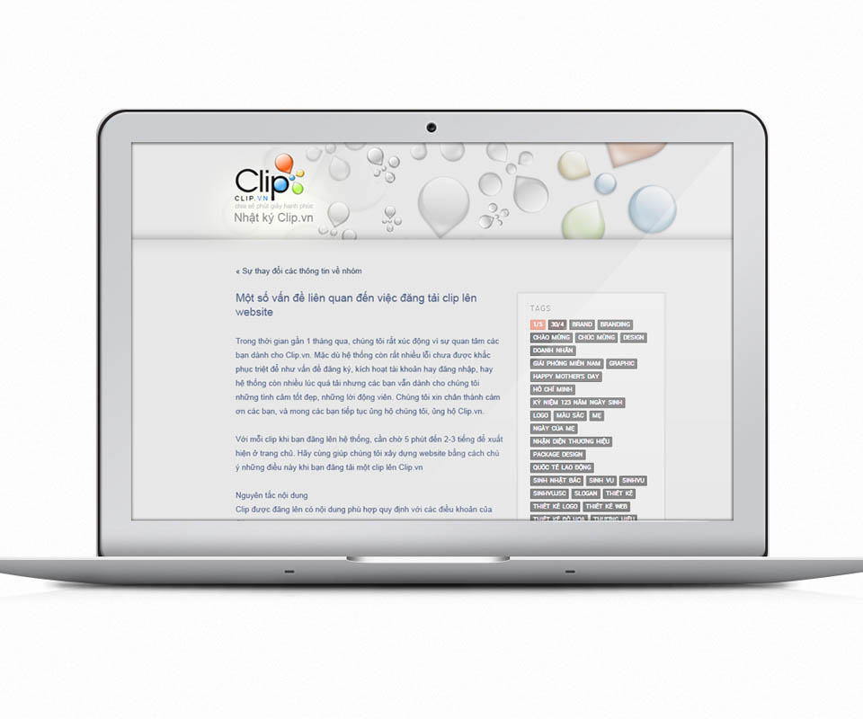
The Clip.vn Diary page uses a picture of clear water drops as its header background, with the logo on the left. The drop shape from the logo is reused on the web, so users recognise the same brand on every page.
What Clip.vn received
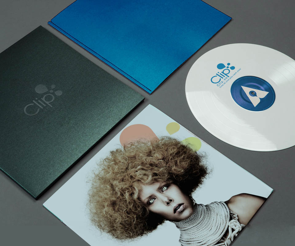
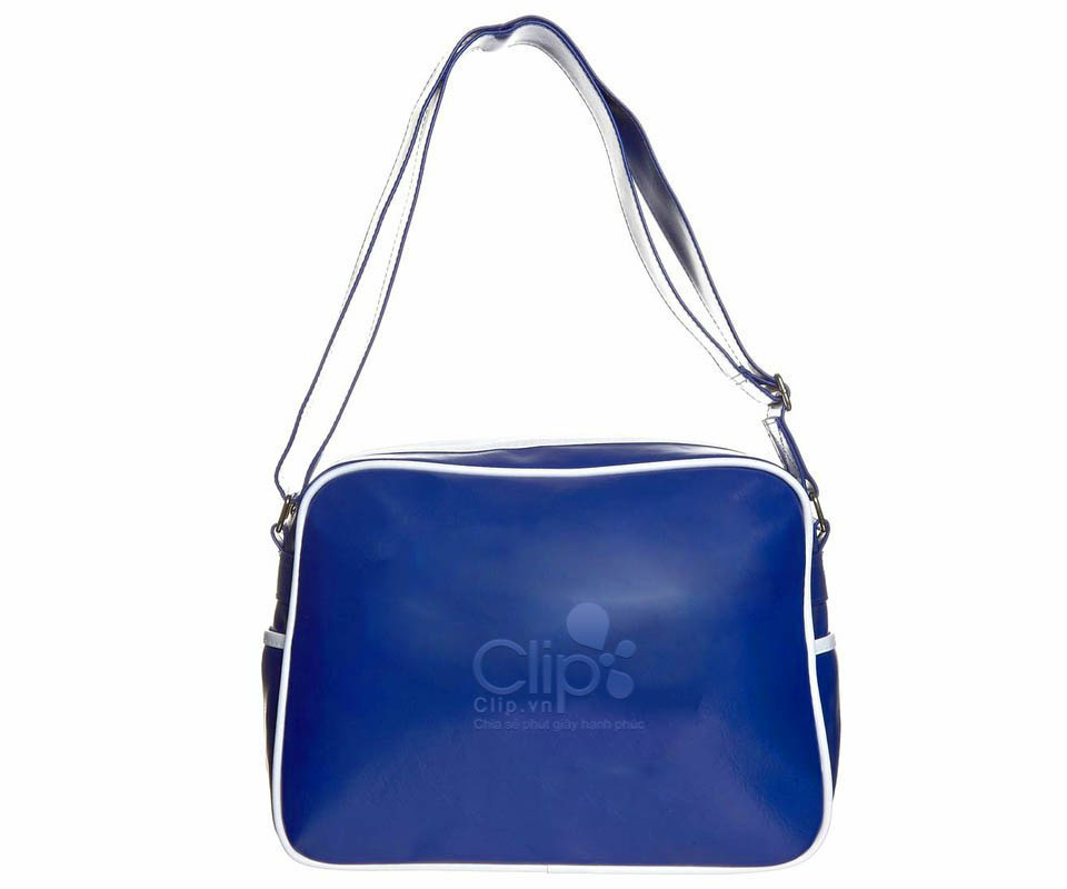
Clip.vn has one logo and one set of colours used across both screens and print: the website, office papers, notebooks, gift boxes, T-shirts and shoulder bags. Wherever users meet Clip.vn, they see the same drops of colour.
Sinh Vũ kept the shapes simple on purpose. A video-sharing site is always full of images from users' videos, so the identity needed to stay light and not compete with the video for space.
Drops of colour on paper, fabric and screen
In their own words
I value the way Sinh and his studio work: professional, determined and thorough to the end. From strategy to the logo and identity of Clip.vn, Sinh Vũ stood with Vega from 2005 to 2009. Our leadership will long remember that contribution.