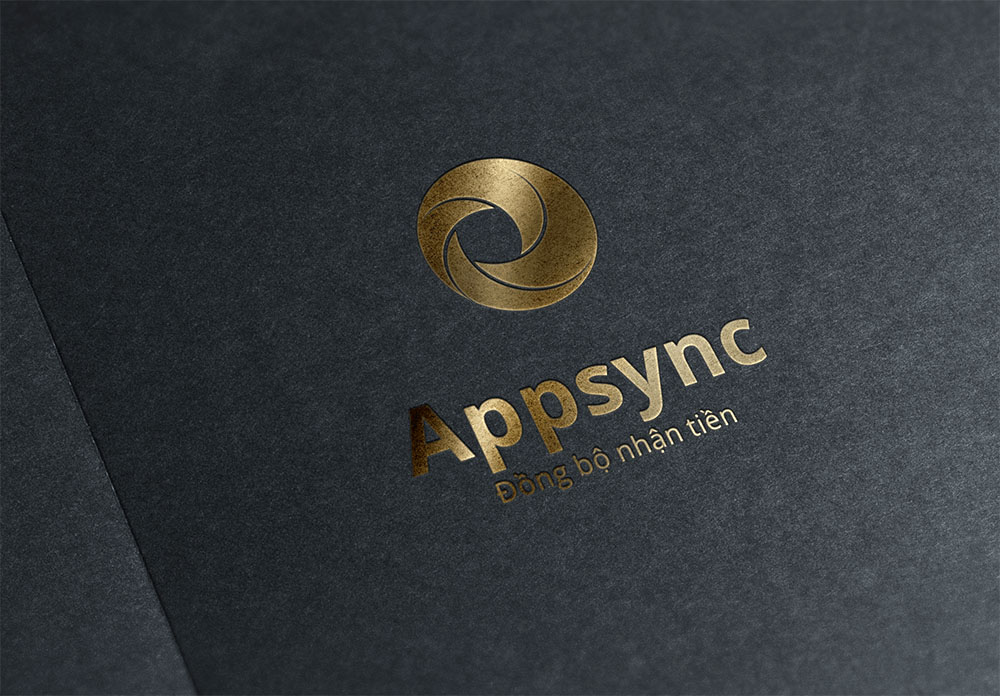
Appsync: a logo swirling into sync
Appsync is Vietnamese software that connects an iPhone to a computer, so users can sync and back up apps, contacts and data between the two. Sinh Vũ designed its logo around the idea of syncing: four patches of colour swirl into the centre, like data from many places gathered into one.

The brief: a logo for a data sync app
Appsync connects an iPhone to a computer and helps users manage and back up the apps, contacts and data on their phones. Backing up means copying data to another place so it is not lost when a phone breaks or is replaced. Syncing means keeping copies of data in several places matching one another.
Appsync asked Sinh Vũ to design the product logo. It had to show synchronisation and movement, look professional, and tie in with the software's main feature, syncing data.
Four patches of colour swirling into one centre
Sinh Vũ built the logo from abstract shapes, none of which points in a single fixed direction. A circle is divided unevenly into four patches that swirl into one centre, set slightly to the left. The division echoes what the software does: data from many places gathered into one, quickly and in order.
In the colour version the patches are yellow, orange and red, joined into a circle that looks as if it is turning. Only a thin pale line is left between the patches, enough to see each one while the whole shape still reads as one block.
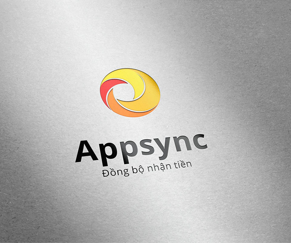
The product name and the one-colour version
The name Appsync sits directly below the shape, set in a bold typeface with simple strokes that is easy to read. Under it is a small line, "Sync, get paid", which appears on every version of the logo.
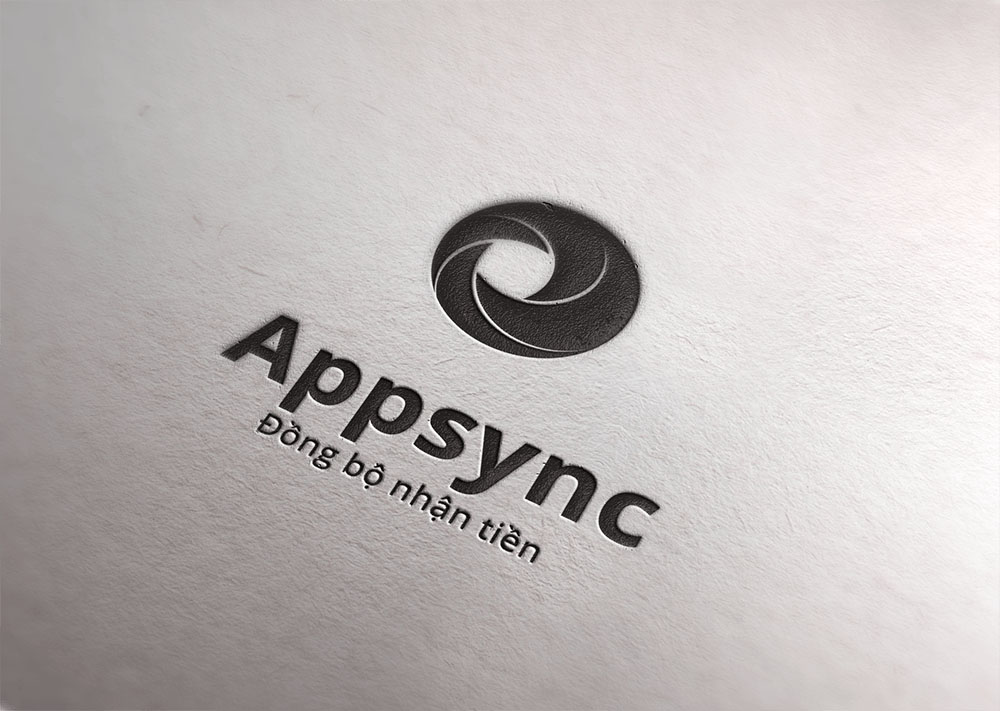
The black one-colour version shows that the logo is still recognisable without colour, for example in black and white printing or blind embossing (pressing the shape into the paper). The lines between the patches stay clear enough that the swirl does not blur into a solid circle.
What Appsync gained
Appsync gained a logo tied to exactly what the software does: a circle swirling into one centre suggests gathering and syncing data. The logo comes in colour and one-colour versions, so it can be used on many materials without being redrawn.
The comment from Appsync's chief executive is at the foot of the page.
One logo, many materials
The images below are mockups (staged images) placing the logo on paper and a wall to show how it looks on each material: colour print, blind embossing, foil stamping (laying a metallic foil onto paper) and raised letters fixed to a wall.