
AAA: a logo from the boomerang
AAA is a training and consulting company founded by experts with standing and experience. Sinh Vũ designed its logo and a basic identity (how the logo is used, and colours kept consistent across stationery and printed pieces). The starting shape is the boomerang of Australia's Aboriginal peoples, redrawn as three joined letter As.
Trust before profit
AAA is a professional training and consulting company in Vietnam. Its leaders believe clients' trust comes from the quality of the service and the attitude of the people delivering it. For them trust is the final value, higher even than profit.
The company wanted its logo and basic identity to show this. AAA shares the trust it holds with clients, partners and staff, so that each side doubles the value AAA receives.
From a boomerang to three As
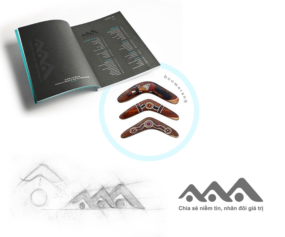
Sinh Vũ took its idea from the boomerang of Australia's Aboriginal peoples, a curved wooden stick that is thrown and flies back to the thrower's hand. Its two curved arms were redrawn as the two slanting strokes of the letter A, and three As were set side by side, joined.
Under each A sits a round dot. The pencil sketch shows the shape moving from a single A to three joined letters. The slogan "Share trust, double the value" sits directly beneath the shape, so the logo both names the company and repeats its message.
One logo, several background colours
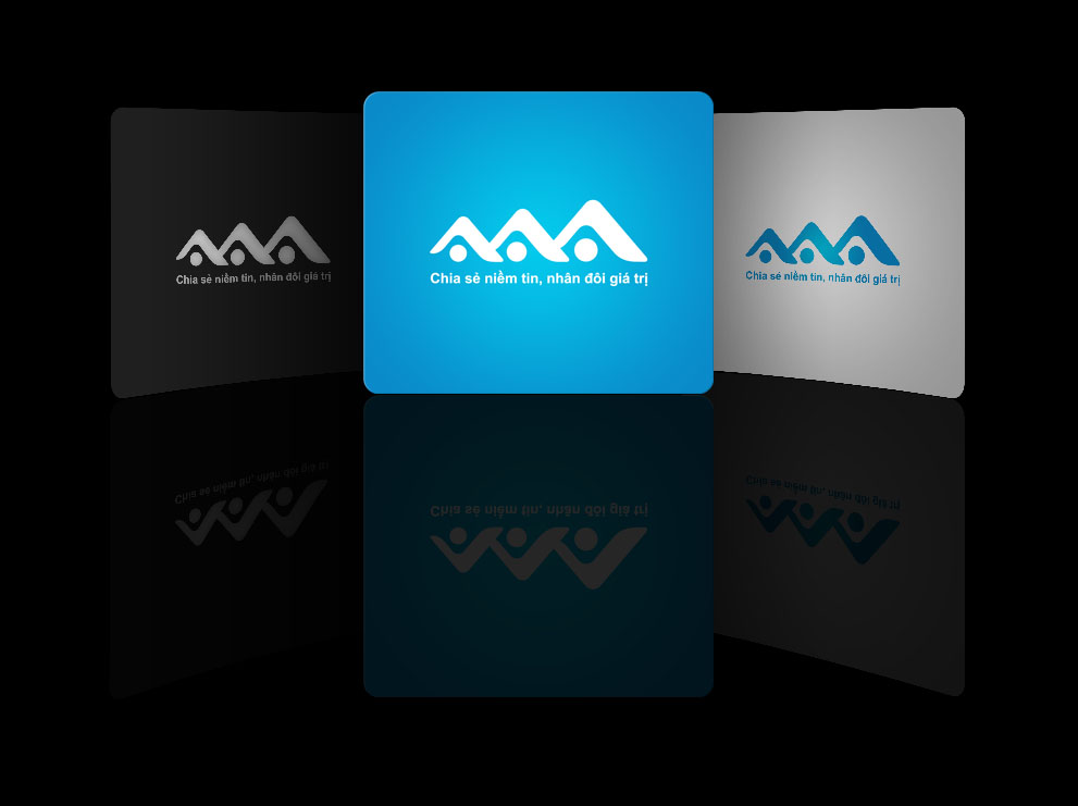
The logo comes in three colour versions for three kinds of background: white on blue, blue on light grey, and silver on black. The shape stays the same; only the colour changes to suit each background.
This lets AAA place the logo on light paper, dark paper or coloured surfaces and still be recognised at once.
The logo on a notebook and a box
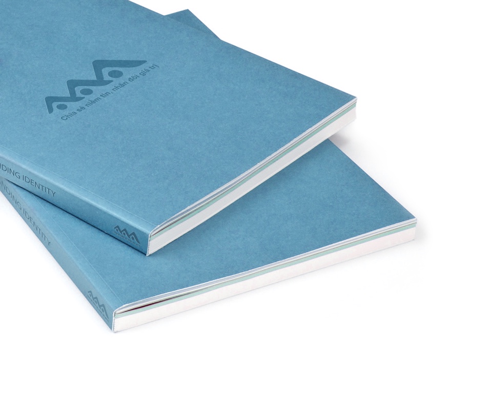
Sinh Vũ built mock-up images of the logo on real objects so the company could see how it would look in print. On the blue notebook cover the logo is blind embossed, pressed into the paper without ink, and a smaller logo sits on the spine.
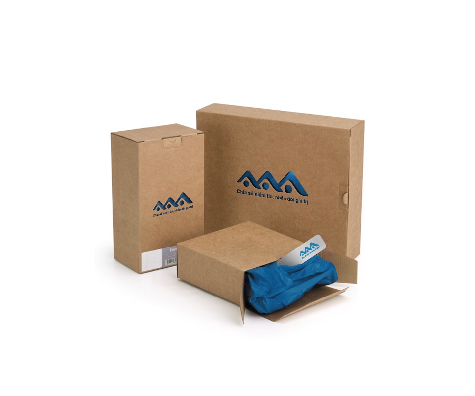
On the brown rigid box the logo is printed in deep blue and stays crisp. The tissue paper inside the box is also blue, matching the logo.
The value
AAA has a logo that carries the company's own message: share trust to double the value. The three letters are drawn as one shape with a story of its own, easy to retell to clients.
The client noted that the consistency from the logo to every printed item created the professionalism the company asked for.
AAA on notebook, box and colour grounds
In their own words
We are fully satisfied with the identity Sinh Vũ created for AAA. Three linked A's, redrawn from a boomerang, give the company a distinctive and memorable mark. From the logo to our stationery and printed materials, everything is consistent and as professional as we asked for.