Gonext, speed you can trust
Gonext started out in 2005 in the express courier trade, running both domestic and international routes. Sinh Vũ built the identity, guidelines and document set to turn Gonext's promise of speed into something clients see and believe.
A trade where everyone claims to be fast
Courier is a trade where every company promises the same thing: fast. The word is easy to say, easy to print on a van, easy to paste on a signboard, but no one can prove it just by looking. When the whole market shouts the same word, the word loses its value, and clients lose any way to tell companies apart, so they fall back on comparing shipping rates.
Gonext entered that field in 2005 with a different ambition: fast, but also precise and trustworthy. A young company, though, had nothing to be trusted on yet besides its name. Our job was to give that ambition a face, one that reads as speed at first glance, and reads as the reliability standing behind that speed too.
Reading the name again
We started from the name itself. Gonext is go next: always taking the next step, always facing forward. Gonext's speed does not sit in rushing, it sits in never standing still, finishing one point of delivery and moving straight to the next.
So we anchored the positioning in forward, rather than in fast. Fast is a state everyone claims for themselves; forward is a direction, one with discipline and a destination. That ruler decided every visual choice that followed: every line had to lean ahead, none allowed to stand calm and upright.
Turning the letters into an arrow
The solution was not to bolt an arrow onto the edge of the letters, it was to make the letters themselves the arrow. The name condensed into a tight GONEX letterform, its upright strokes cut at an angle and tilted slightly right, so the whole block reads as if it is surging forward. The O contracts into a solid red dot, both an accent and the arrowhead, the destination that the speed is aimed at.
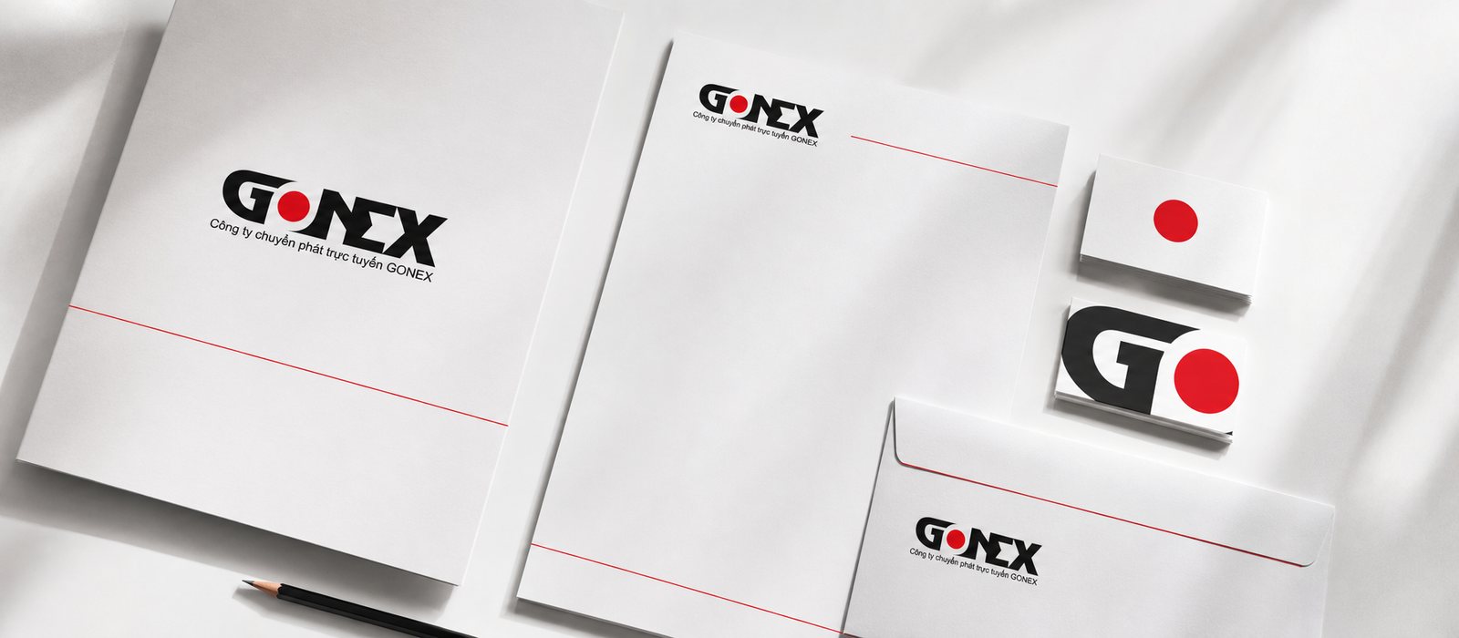
That red dot is the real signal, the piece that repeats, unlike a logo meant to be seen once and moved past. It breaks free of the letters and lives on its own, on the company seal, the letterhead, the corner of the envelope, becoming a familiar mark the eye catches before it even reads the name. Red speaks energy and decisiveness, black speaks strength and trust, and the palette stops there, adding no further color to dilute the message.
Guidelines to move fast without falling apart
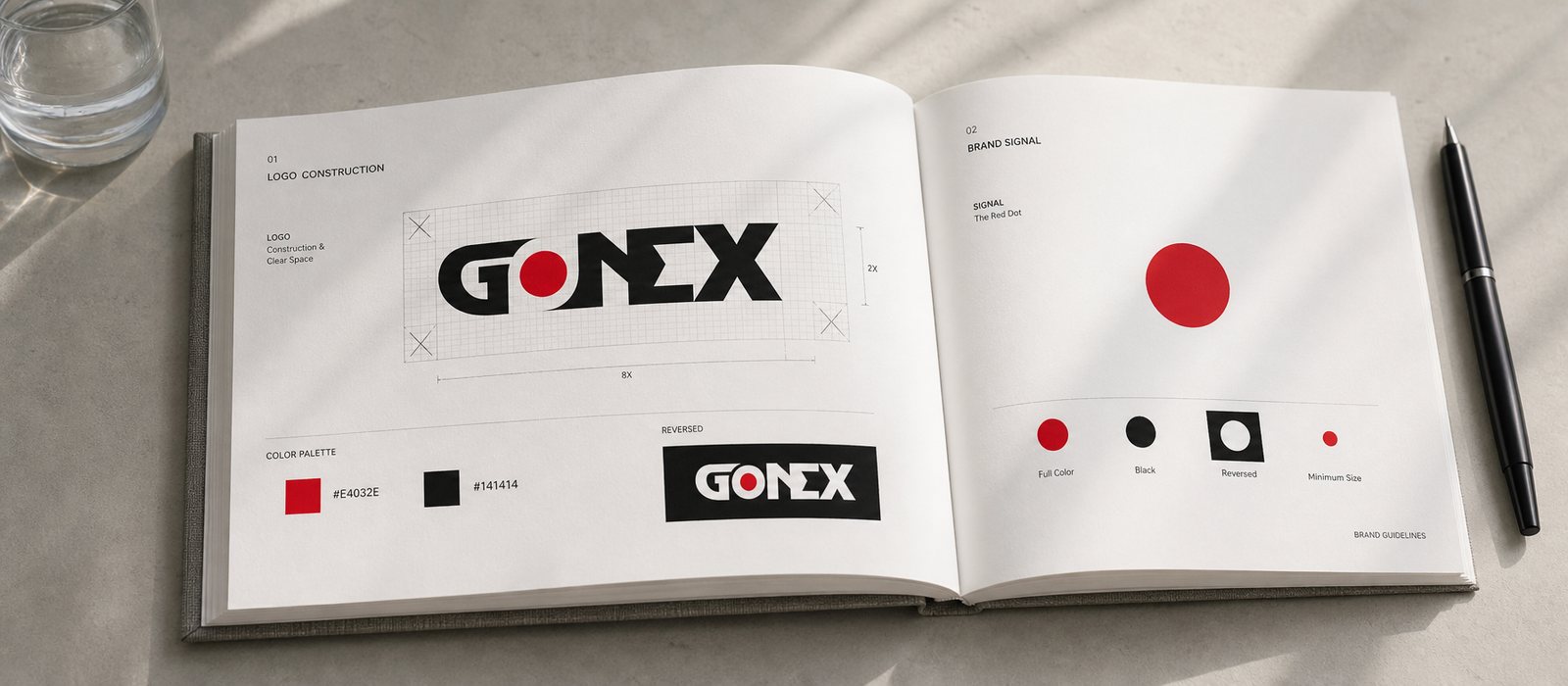
Fast easily turns sloppy once everyone applies the logo their own way. So we wrote the guidelines: the breathing space around the letters, the smallest size still legible, how the red dot is placed, the reversed version on a black background, and everything that must never be done. That rulebook lets Gonext move fast without the formation breaking.
Guidelines are not a document meant to sit in a drawer, they are a tool so the tenth person, the hundredth person, who touches the brand still produces the same Gonext. As the company opens new routes, adds delivery points, brings on new staff, the mark still appears consistently, because the answers to the situations that come up most often are already written down.
A face to bring to the partner's table
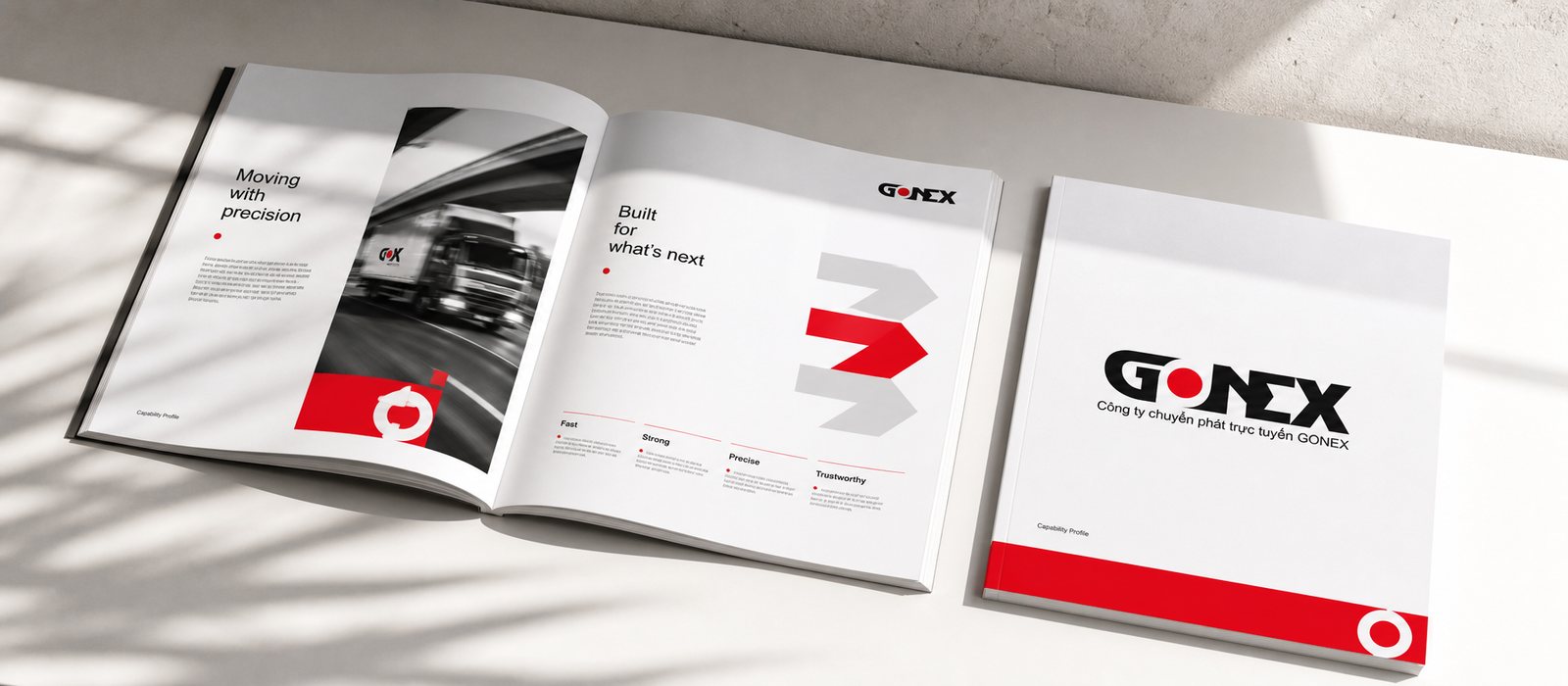
International courier work means sitting across from partners who have never heard the name Gonext. There, the corporate profile and the document set do the introducing. The catalog spread, the company profile, the office stationery, all speak in the same polished voice so a young company reads as steady as one that has been standing for years.
Before we settled on the visuals, we sat down with the Gonext team in a consultation session to agree on what they wanted to be remembered for. An identity that looks good but whose owner does not understand why it looks that way ends up misused sooner or later. That session meant Gonext received not just a set of visuals, but the thinking behind them too.
Value
What Gonext received was not a logo, it was standing that can be trusted. In a trade where everyone claims to be fast, Gonext has a face that speaks to both speed and reliability, and a rulebook to keep that face intact as the company grows. Each time it adds a route, adds a delivery point, the company does not have to rebuild its brand, it only places the familiar signal down once more. That is the difference between hiring a one-off design job and owning a brand asset that keeps working for years.
Where the brand introduces itself
For a courier heading into international work, a polished corporate profile speaks on the company's behalf before anyone has had the chance to learn the name Gonext.