
Sinh Vũ, its own proof
Brand identity studio Sinh Vũ becomes its own toughest client, rebuilding its identity from strategy to studio space and the operating system behind it.
The problem
Sinh Vũ's craft is shaping identity for other people. For seventeen years, we have sat beside hundreds of businesses, asking where they wanted to stand in their customers' minds, then bending that answer into a face and a system. But there was one client we kept putting off, and the hardest one of all: ourselves. A studio that builds identity for others while its own identity stays scattered loses the very thing it sells, the right to be trusted.
The problem was never a missing pretty logo. It was that we had never held ourselves to the same measure we hold our clients to: a clear position, a distinct mark, a set of rules so every touchpoint speaks in one voice. So we did what should have been done long ago, sat in the seat of our own toughest client and rebuilt Sinh Vũ from the ground up.
The approach
Before drawing a single line, we asked ourselves the question we still ask every client: what sets Sinh Vũ apart from a workshop that just polishes logos. The answer was never in craft alone, since craft can always be matched, but in how we practice the craft. Sinh Vũ does not stop at a handsome identity, it builds the system that lets that brand keep running after handover.
From there, we settled on a position held in three words: strategy, creativity, system. Strategy so every decision has roots, creativity so the brand has soul, system so that soul does not thin out as the business grows. These three words later became our own measure, whenever we wavered between two paths, we asked which one served all three, not just one.
A clear position steadied everything that followed. Once we knew we were a studio that builds both identity and the operating system behind it, we stopped drawing from scattered inspiration and let everything else grow from a single answer.
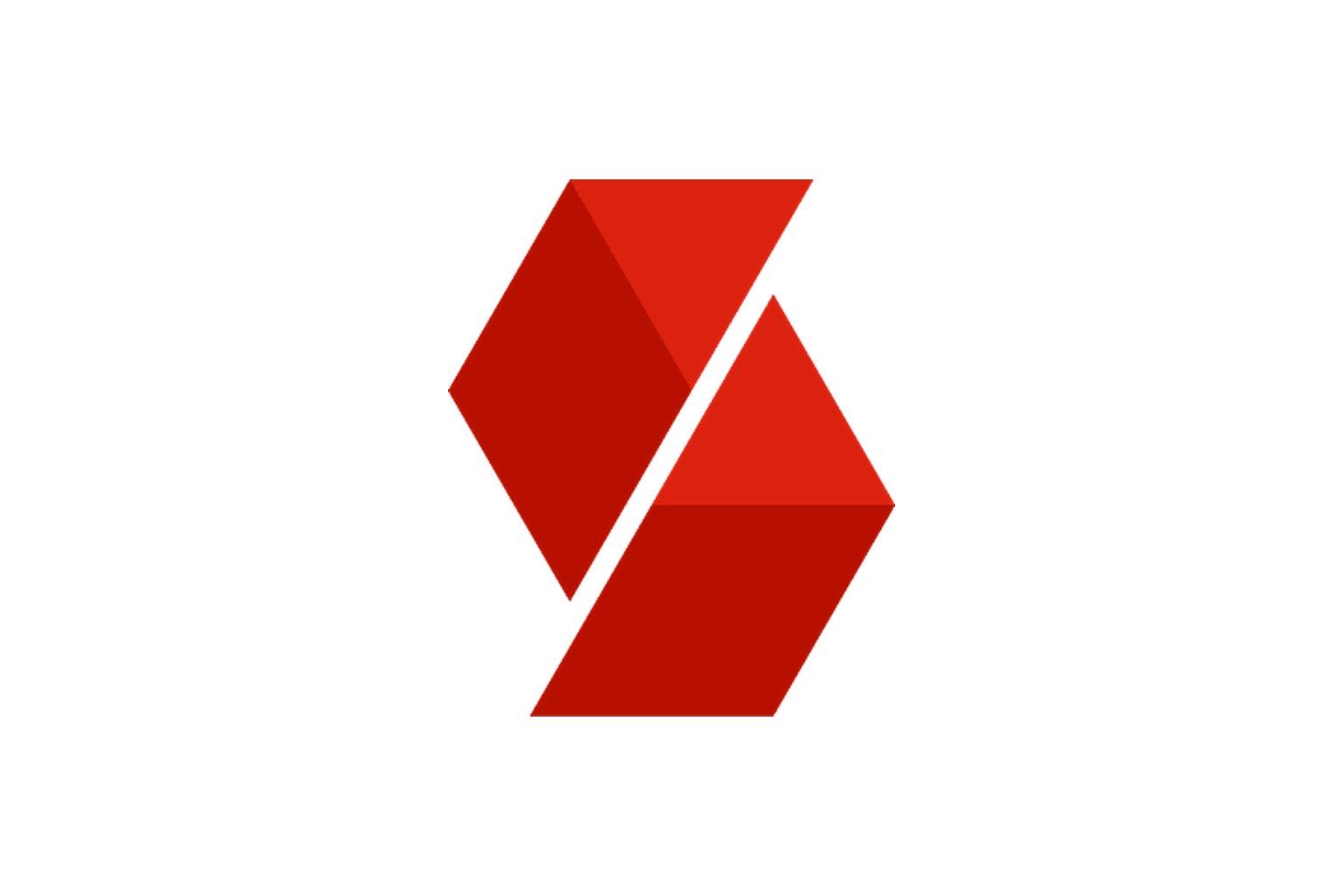
The first touchpoint of a design studio has to name its own craft. So the Sinh Vũ symbol did not go looking for a strange shape to catch the eye, it looked for a shape that told exactly what we do, which is give things form. We distilled the brand into an S mark built from folded planes, like a strip of material being bent into a solid.
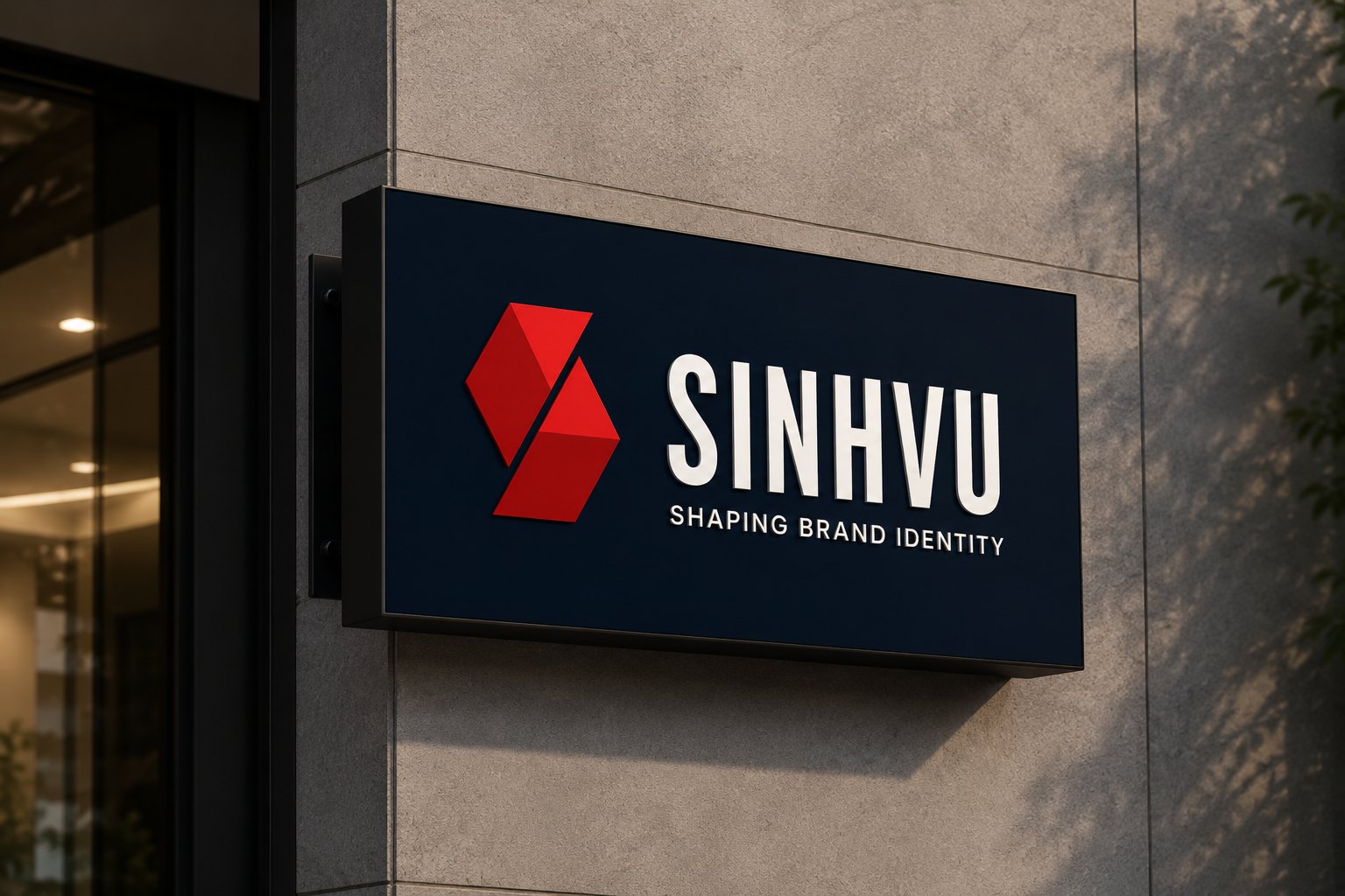
That mark carries two meanings at once. It is the first letter of Sinh Vũ, and it is the motion of folding a flat plane into shape, which is exactly what shaping an identity means. Sharp, decisive edges speak of precision, and the signal red speaks of a studio willing to commit. We built it in four colourways, red as the lead, navy, brass gold and a monochrome version, so the mark holds its character whether it sits on a large storefront sign or shrinks into a small icon on a screen.
A symbol does its job when people read the owner's craft before reading a single line of introduction. Looking at a mark mid-fold, a viewer immediately senses this is a place that bends the abstract into the visible. That is what a good logo does for you, it speaks for the craft before words have a chance to.
Colour is what people feel before they think, so we chose ourselves a disciplined palette rather than a merely pleasant one. Fiesta holds five colours: navy as the ground of trust, deep blue for shadow, wine for a quiet mark, signal red for the accent, and a cream tone to keep the warmth.
The discipline lies in how the colours are used, not in how many there are. Red is a precise accent rather than an environment, so it appears rarely and costs more when it does, just enough to stop the eye exactly where it should. Navy carries most of the surface so everything reads calm and trustworthy. That restraint is itself a statement: a studio that knows when to stay quiet so the accent can carry.
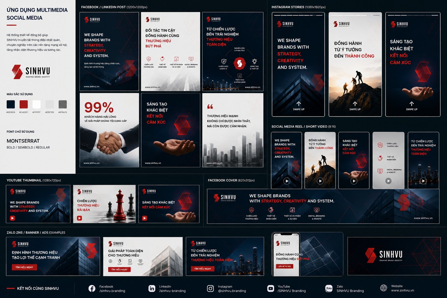
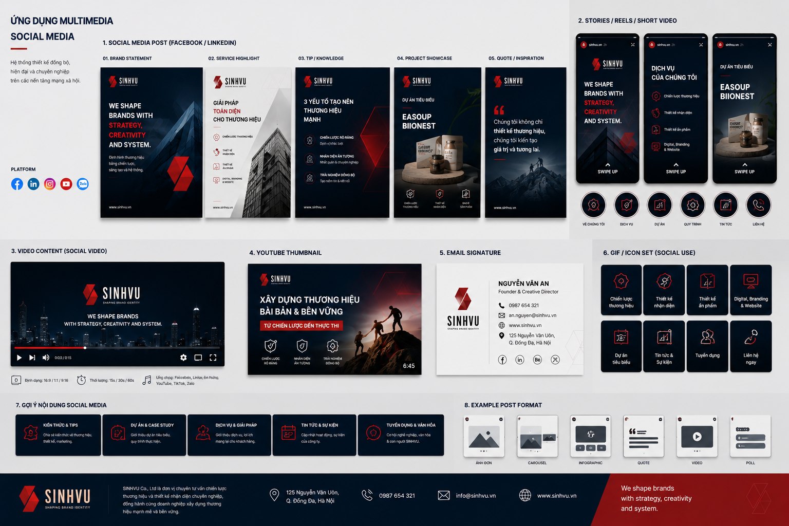
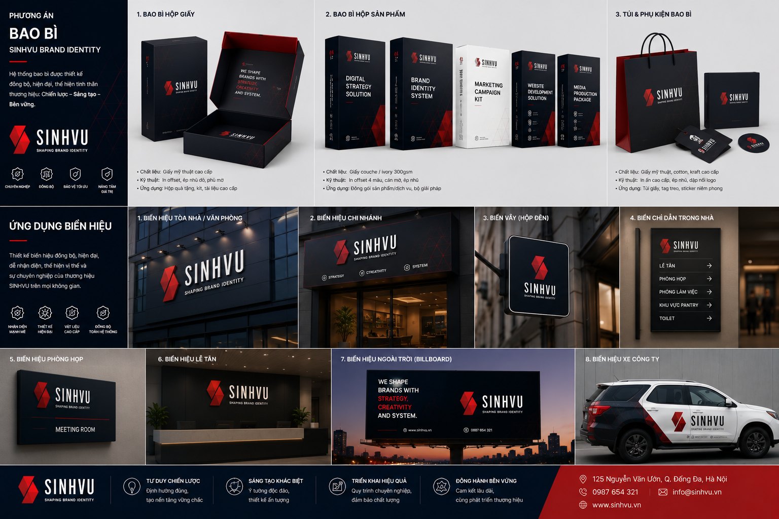
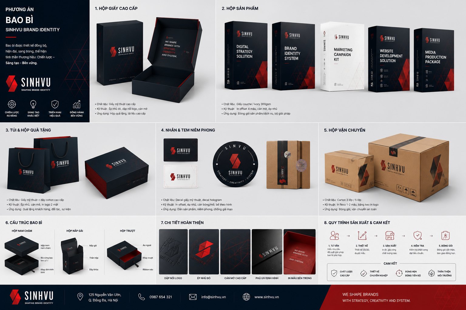
Because the colour rules were set from the ground up, every piece that came after simply followed them and still stayed consistent. The business card, the box, the social media frame all carry the same red on the same navy, so placed side by side they instantly read as one family.

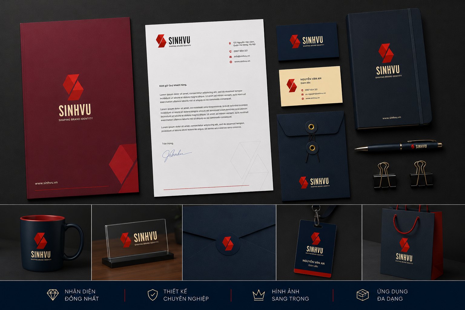
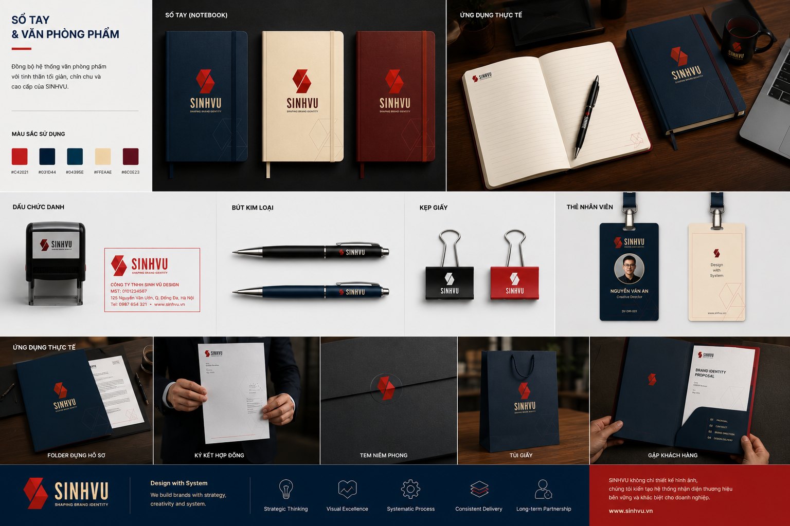
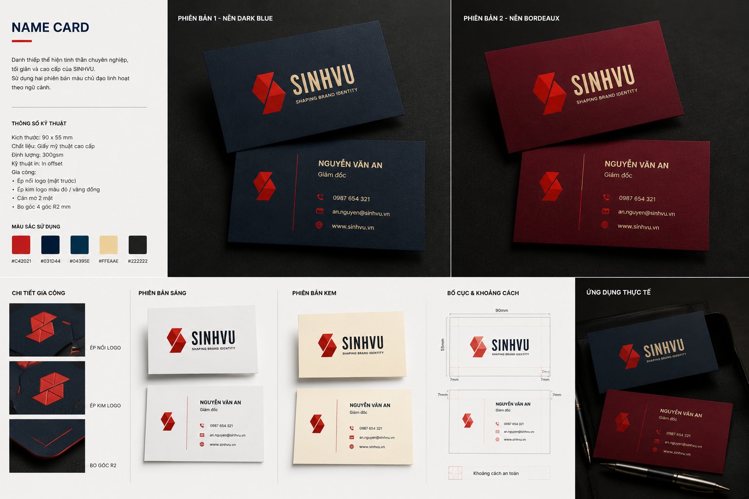
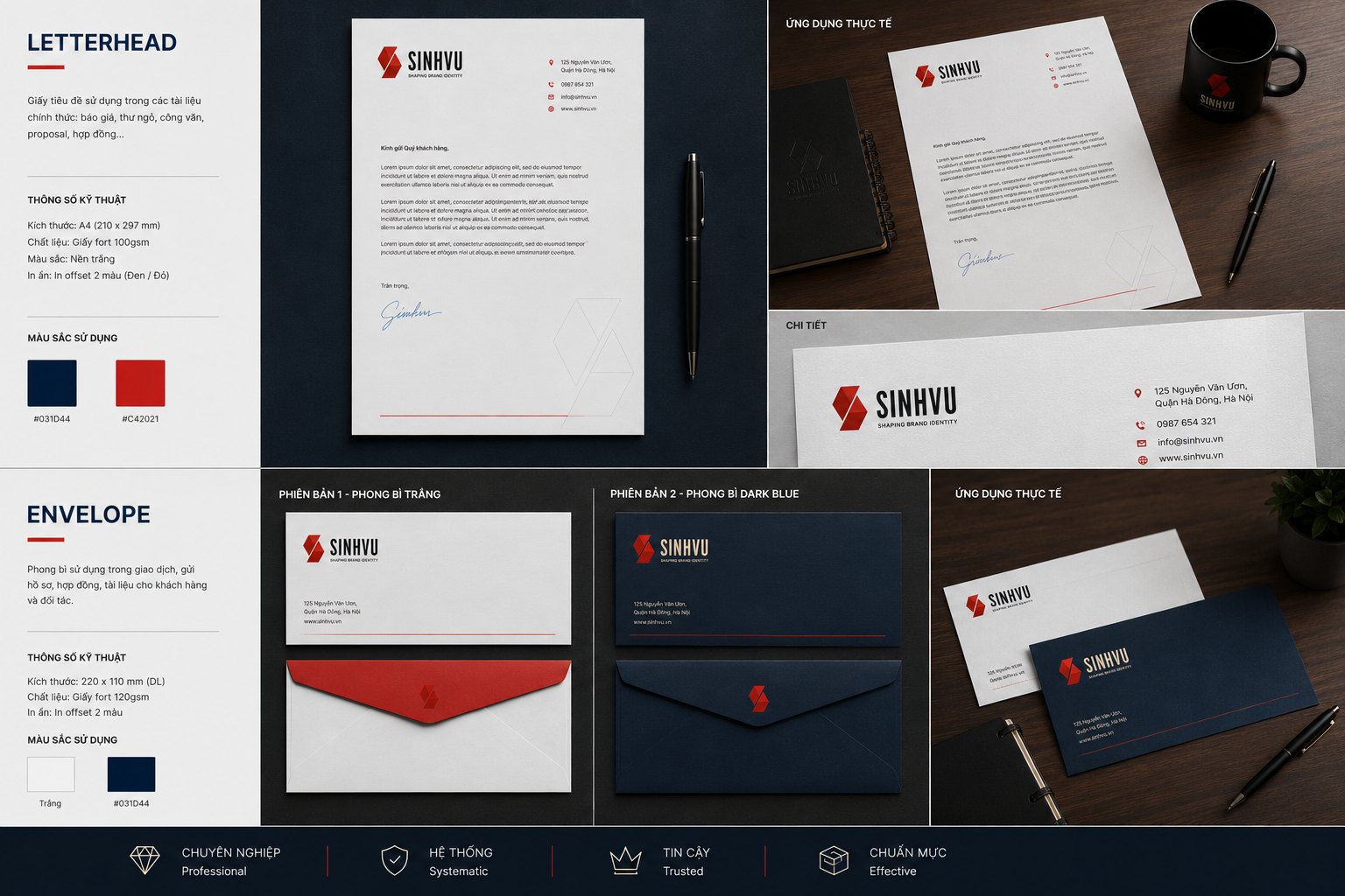
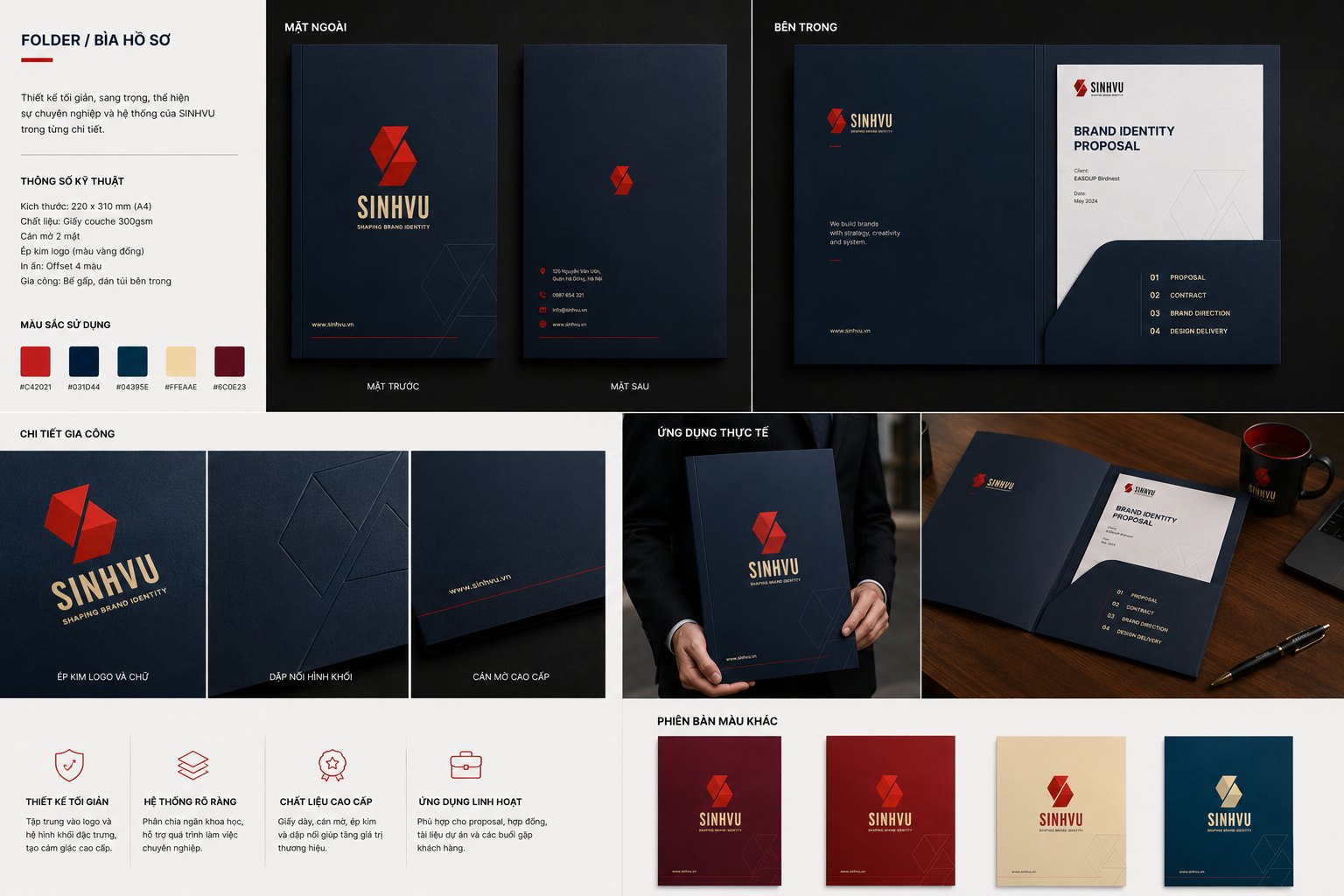
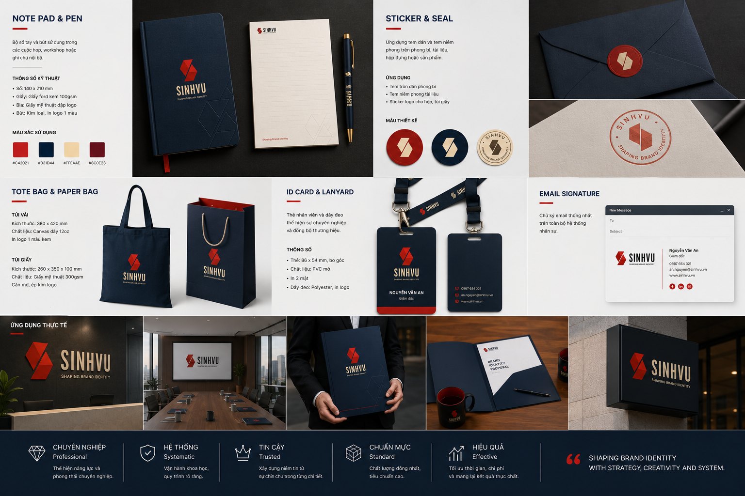
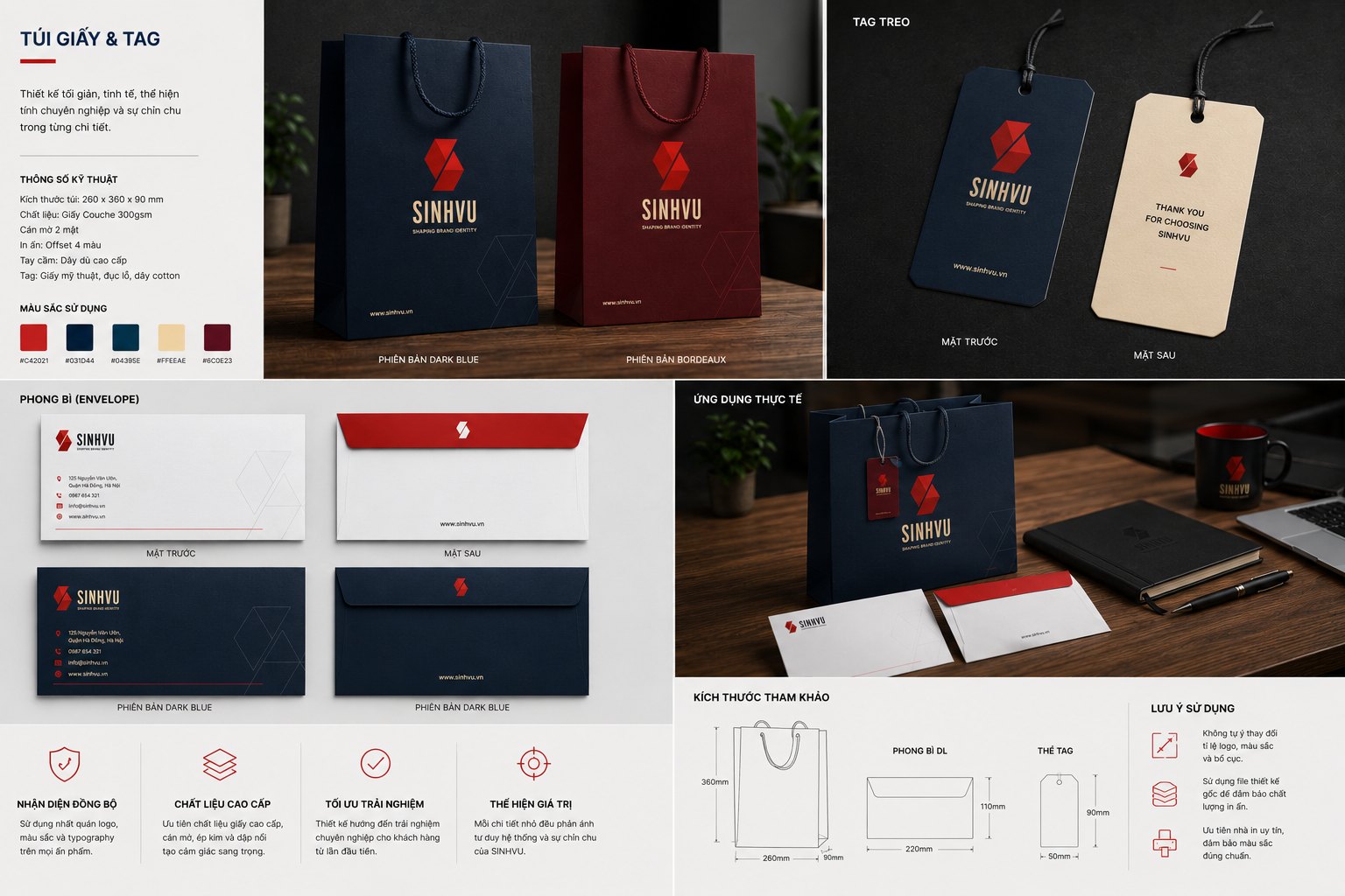
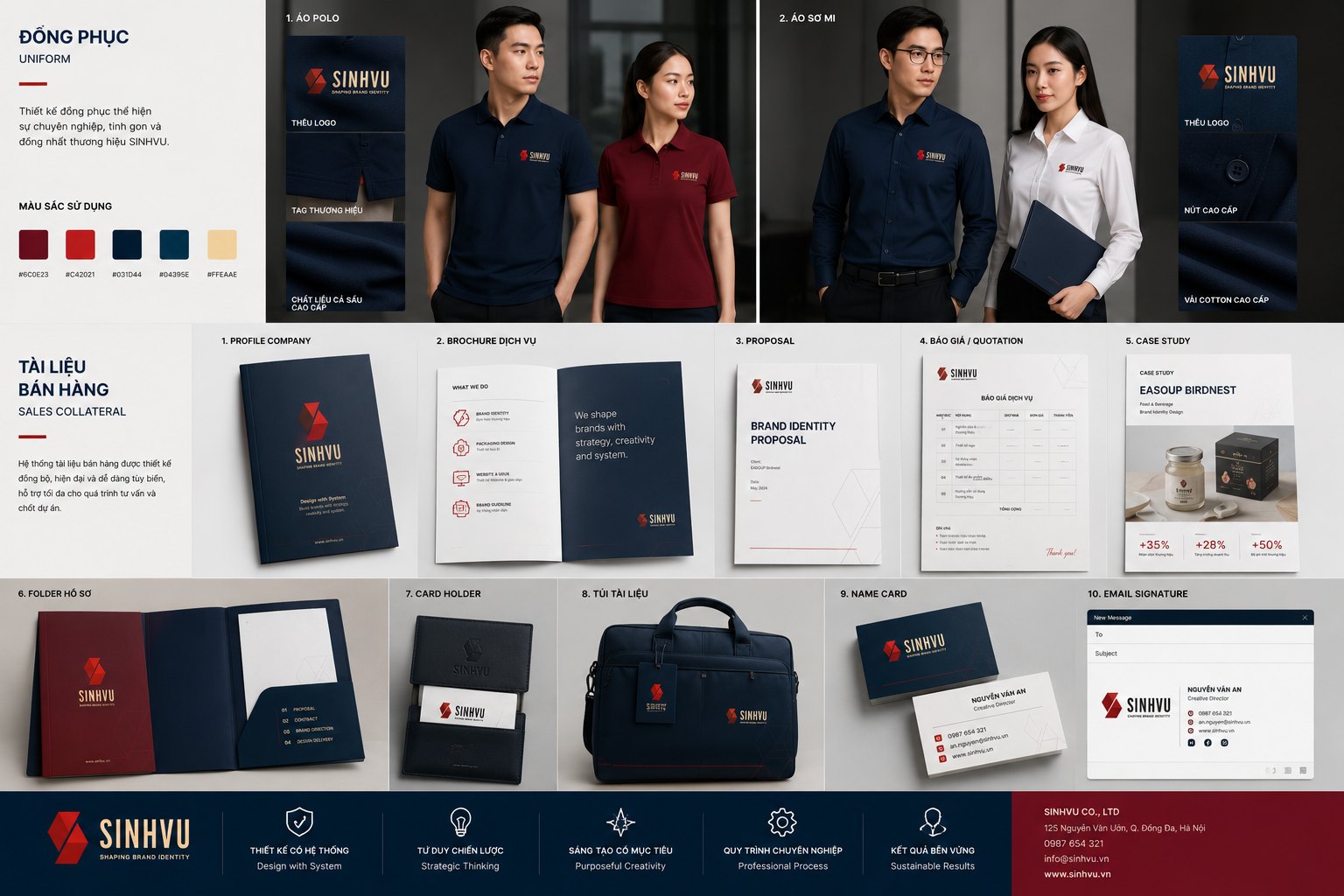
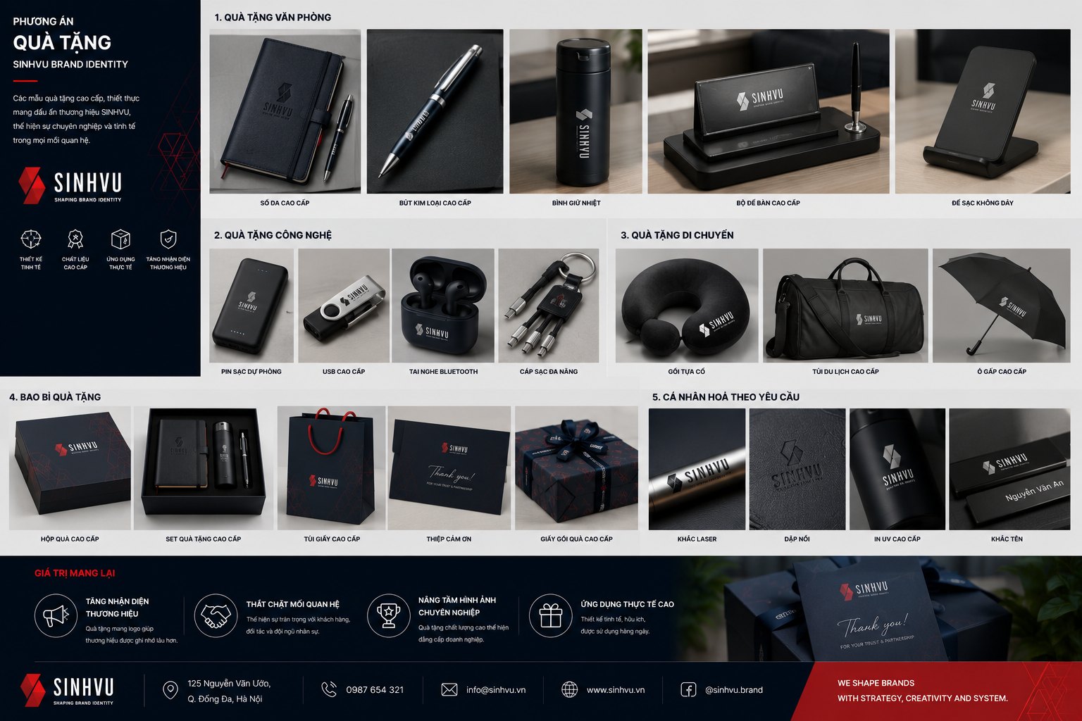
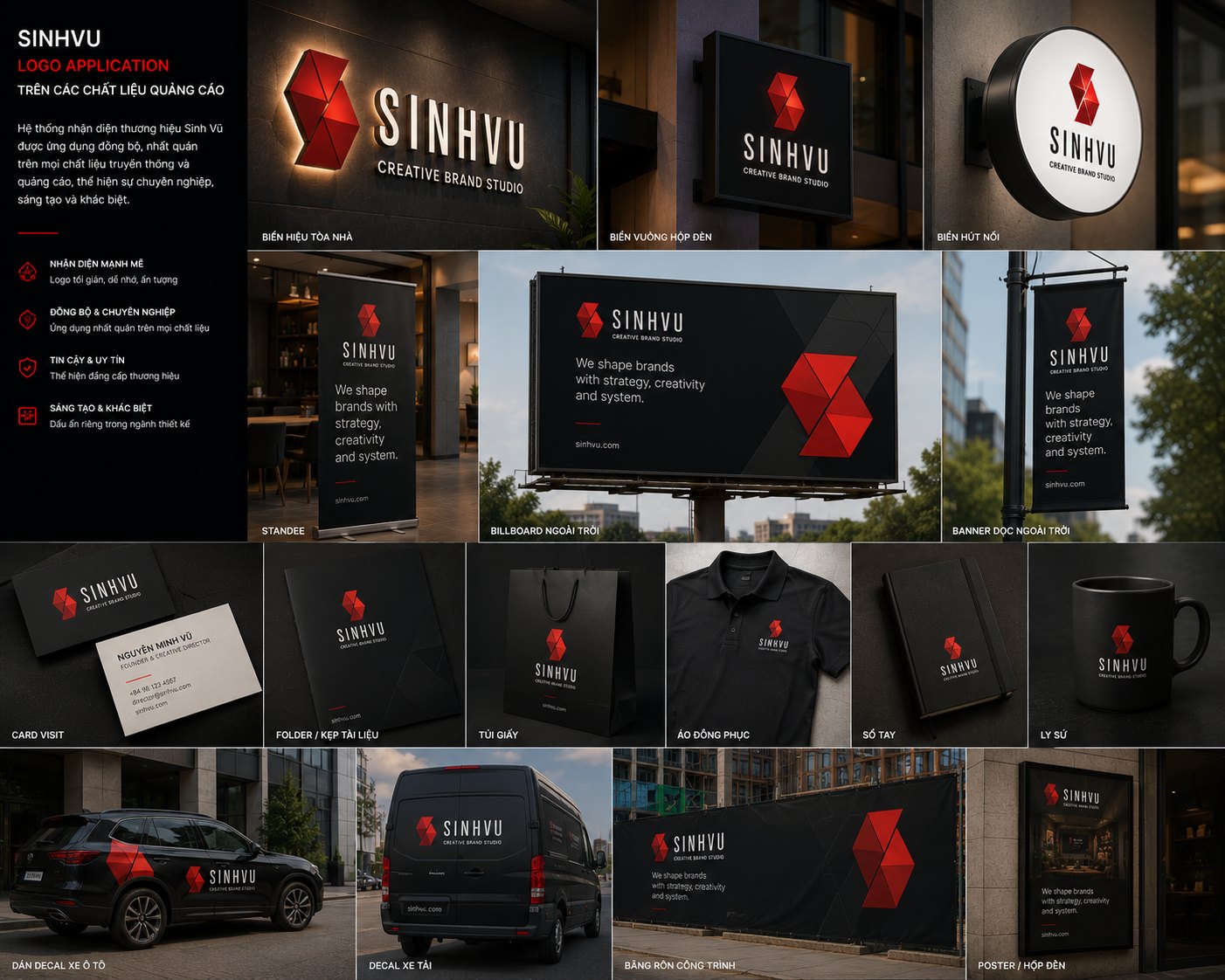
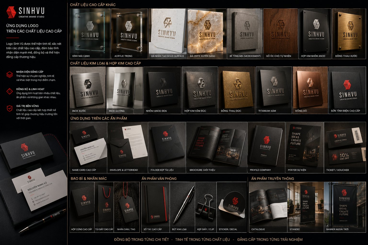
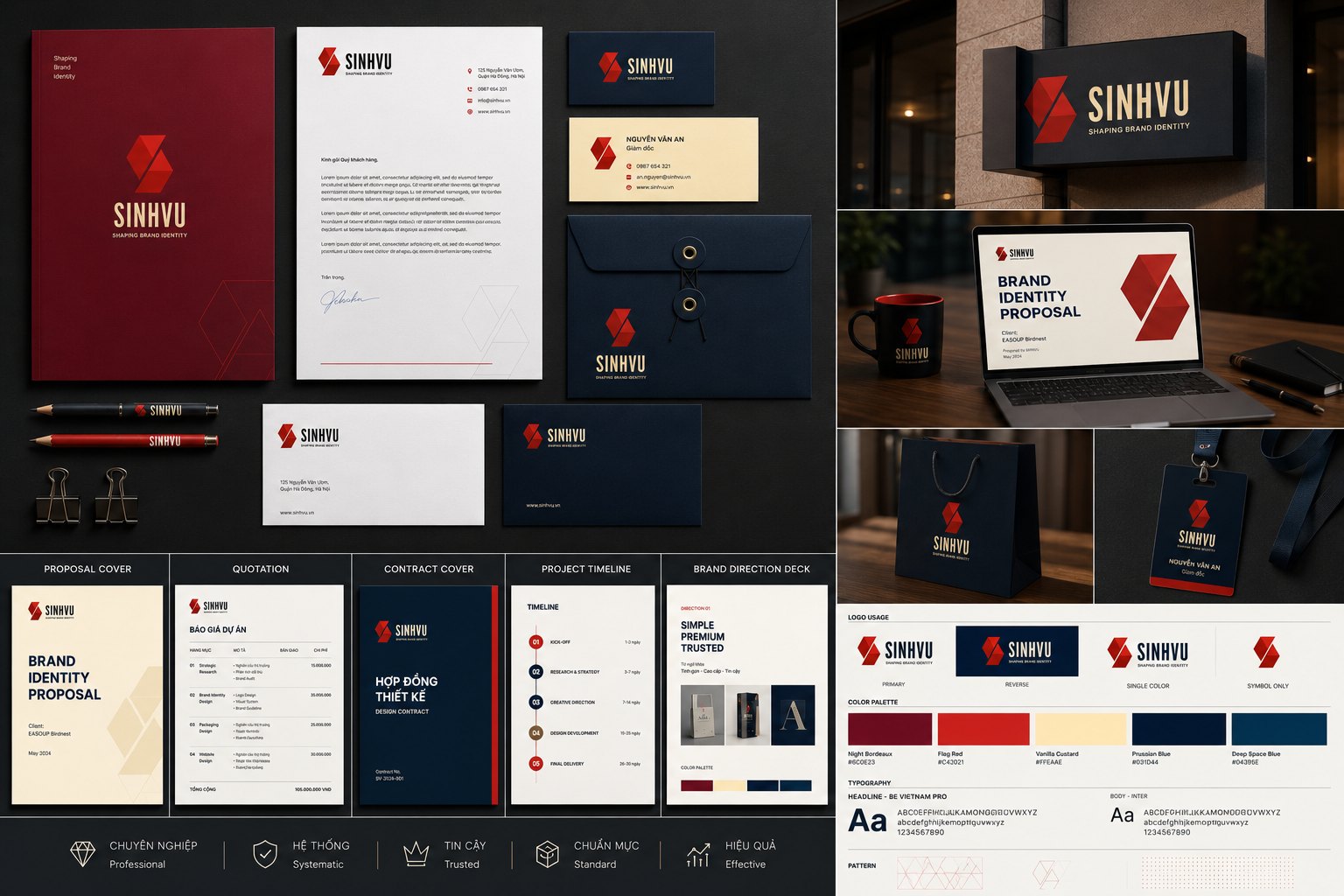
An identity system is only real once it leaves the presentation deck and lives on real objects. So we carried the mark and the palette across the full range of office stationery: letterhead, business cards, envelopes, folder covers, the company seal, notebooks, staff badges and pens.
The hardest test of consistency lies in the smallest objects. A seal only a few centimetres wide, a paper clip, a lanyard card, each still has to carry the right proportion, the right breathing space, the right red. We held the line down to every one of these objects, because a system that holds at its smallest scale holds everywhere else.
This care at the smallest scale is usually invisible yet still felt. When someone holds a Sinh Vũ business card, they cannot yet name what it is, but the sense of order and taste is already quietly saying, this is a place that attends to every detail.
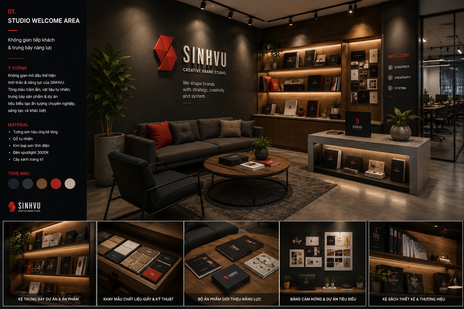
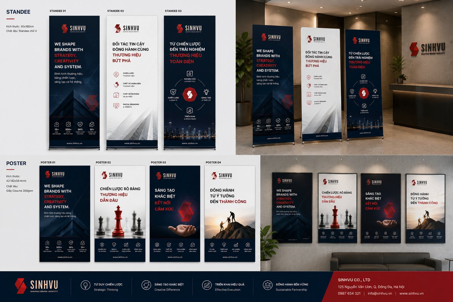
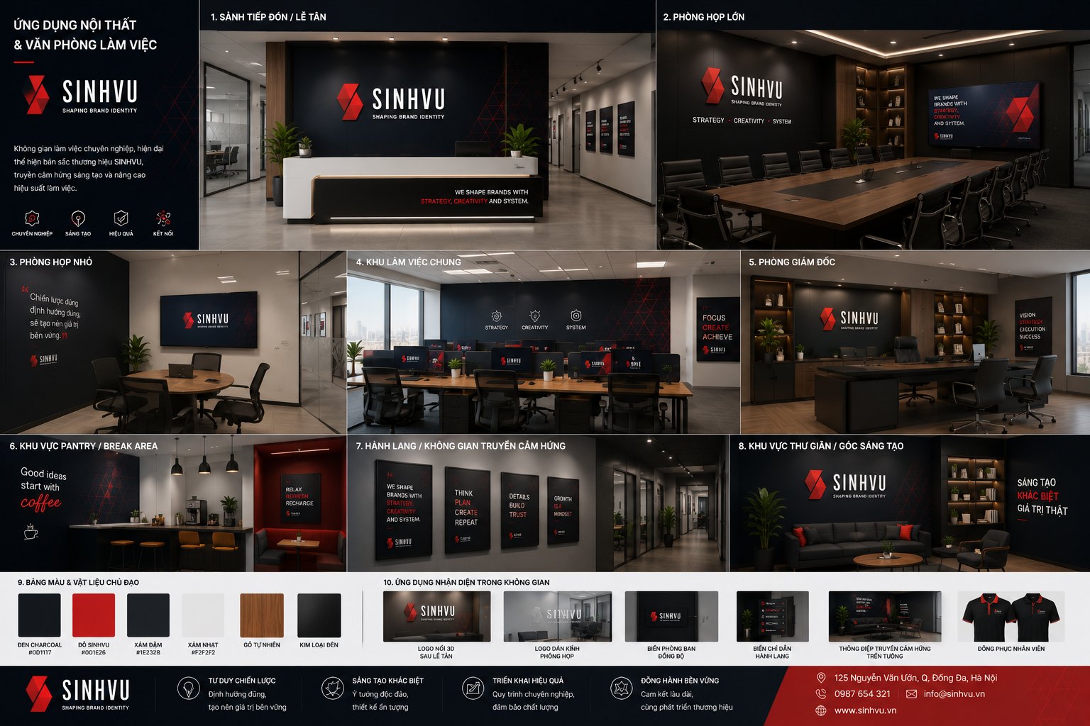
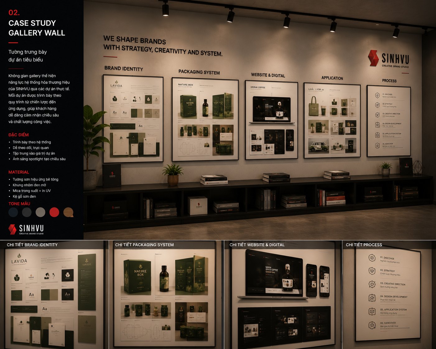
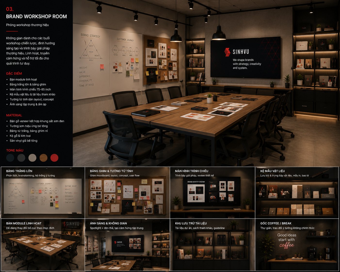
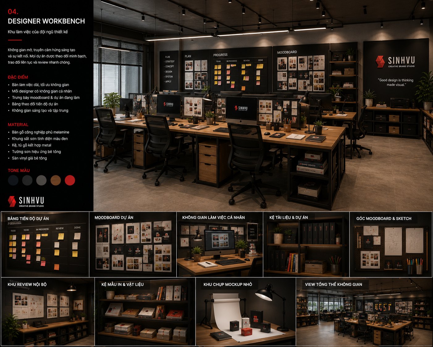
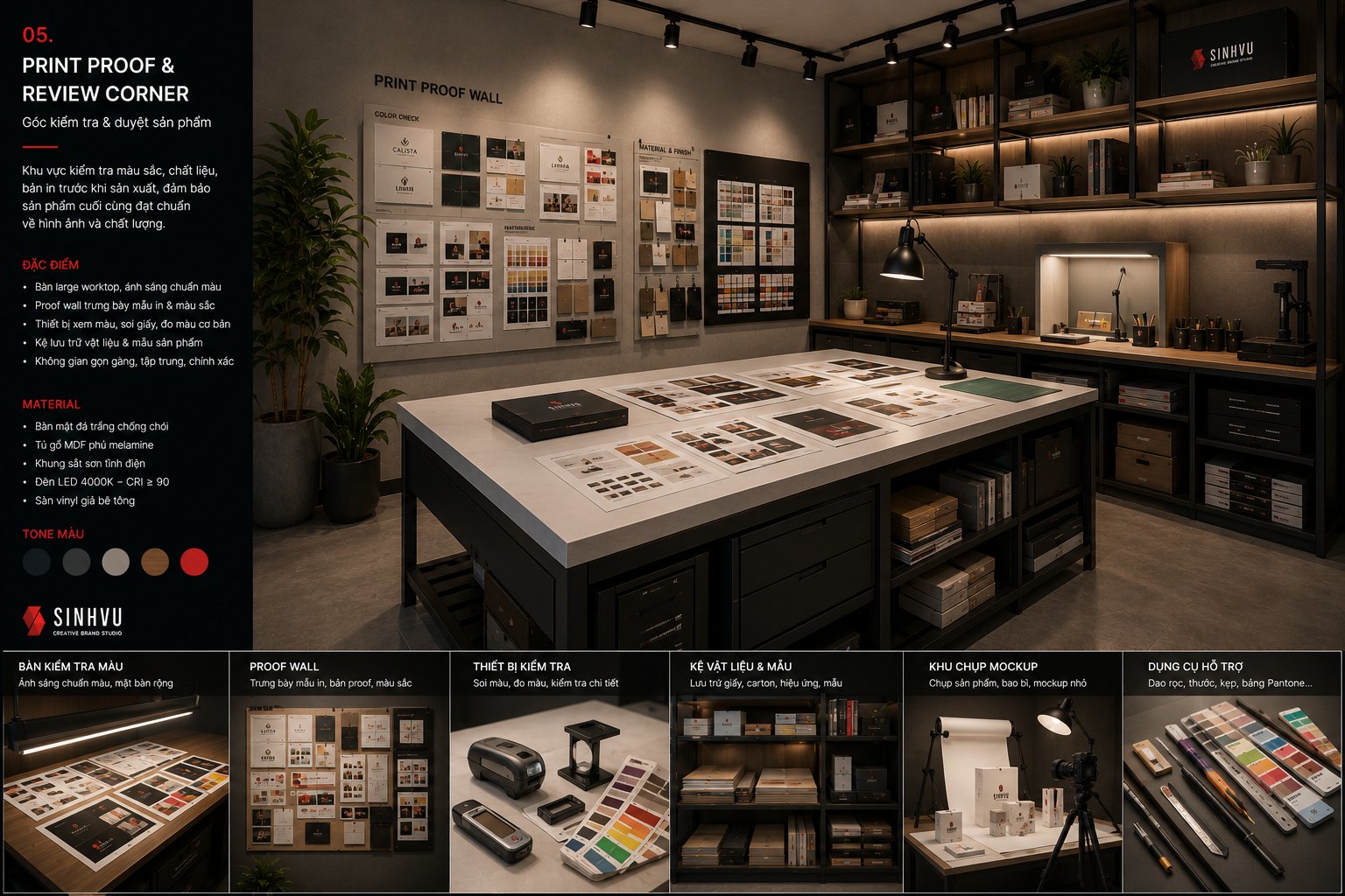
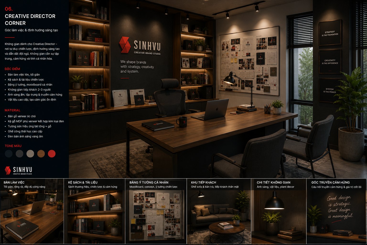
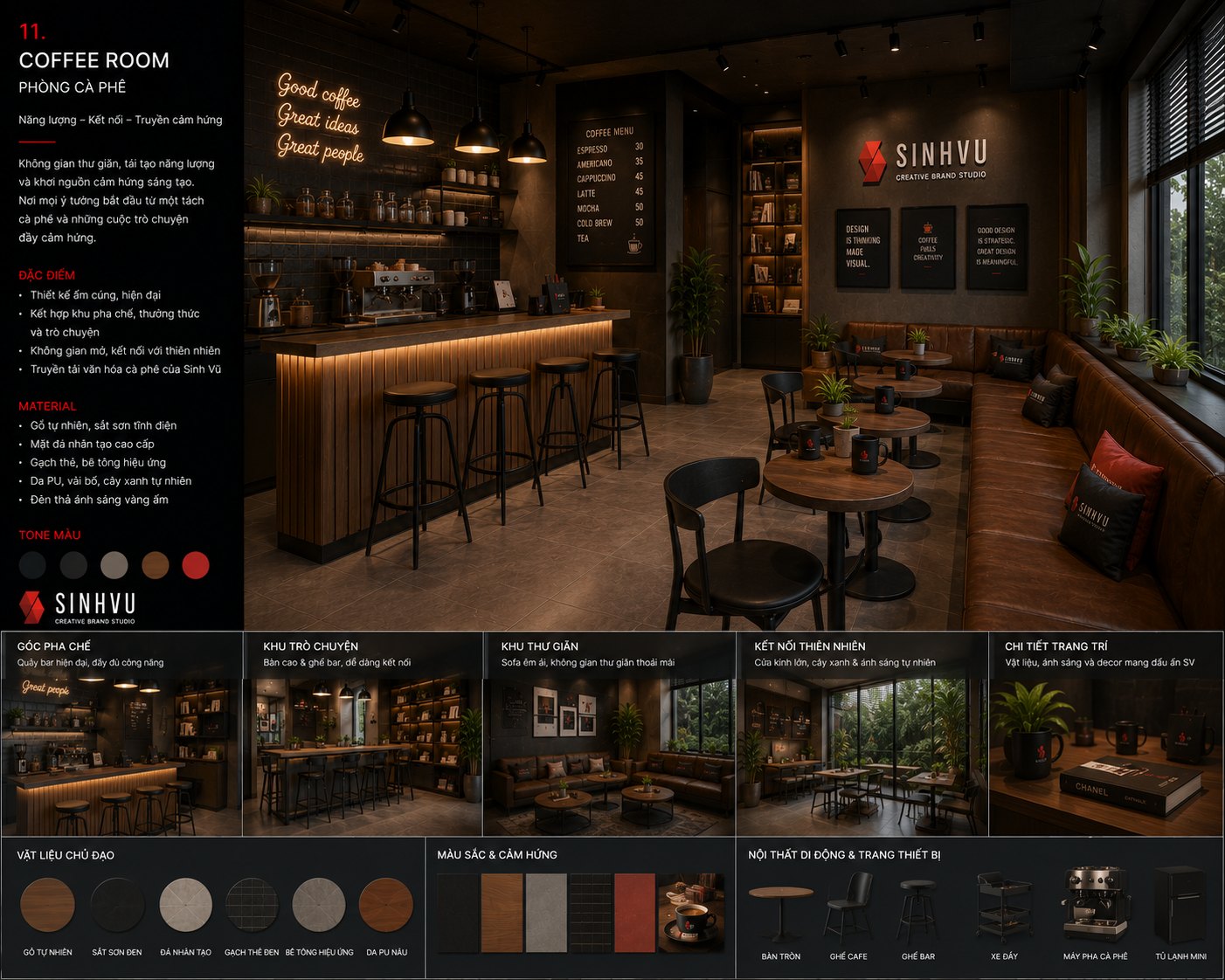
For a studio, identity cannot stop at paper and screen, because clients will walk in. So we carried the identity into the working space itself: the reception area, the workshop room, the design bench, the creative director's corner and even the coffee corner.
The space was shaped by the same three words as the position. The reception wall carries the symbol and the studio's statement, warm light and raw materials tell the story of creativity, and the tidy layout speaks of system. This was not decoration for its own sake, but a brand promise built into something you can stand inside.
A brand with a place is trusted in a very different way. A client walks in and finds the same spirit they met on the website and in the printed pieces, and that match turns an introduction into a lived experience, the hardest thing of all to fake.
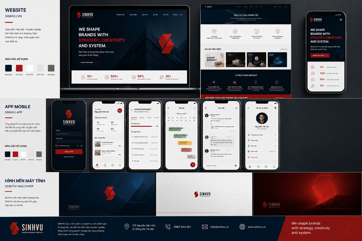
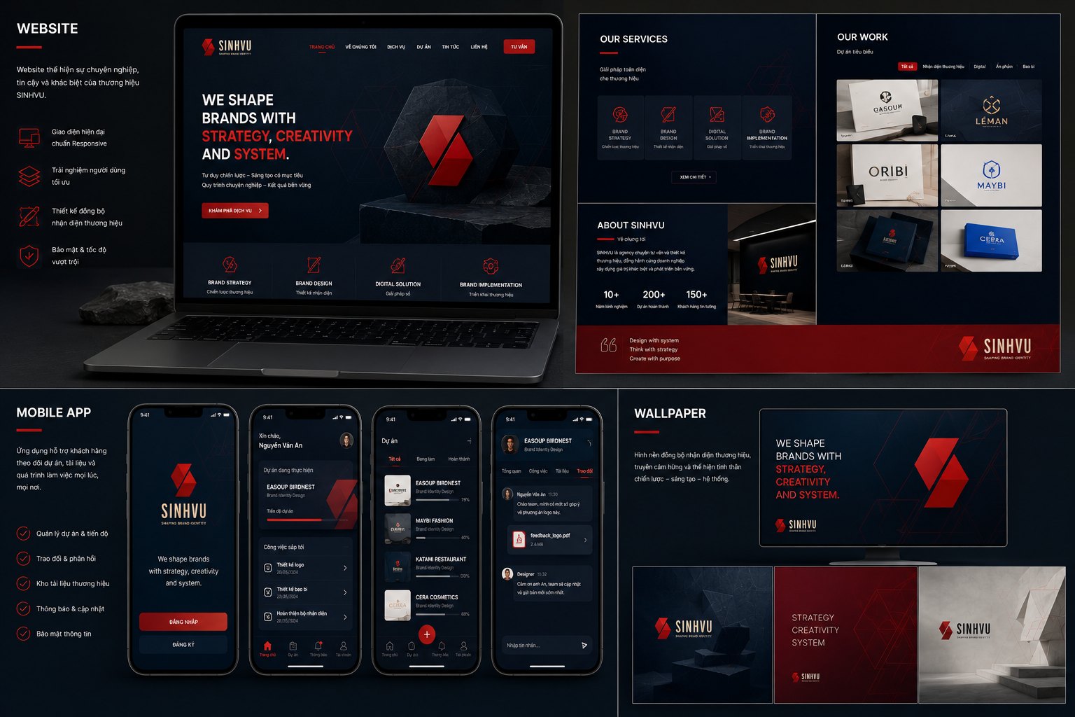
This is where Sinh Vũ goes beyond a good-looking face, and it is also the third word in the position: system. The identity was carried onto the website and the mobile app, built from a shared digital design system so every screen grows from the same root instead of each place inventing its own.
But the part few people see is the part that matters most. Behind that face, we built an operating system for the studio itself: three intake channels that gather every request into one place, and a set of software agents that carry the repeating steps, sorting, analysis and reminders. So the Sinh Vũ brand does not just look consistent, it runs consistently.
This operating layer is what turns the word system from a promise into something tangible. When a request comes in, it does not fall into a gap but travels a set route from intake to response. That is living proof of what we still tell clients, a brand built solidly enough runs on its own, it is not just there to be admired.
The process
Positioning and measure
We settled on the three words strategy, creativity, system as our position and measure for every decision, laying the ground before touching a single line.
Symbol and palette
From that position, the folded S symbol was born together with the Fiesta palette and its rule set, giving Sinh Vũ a single face.
From stationery to space
The identity was applied across all office stationery, gifts, uniforms and the studio space itself, so the identity lives on real objects.
An identity that runs
We carried the brand onto the website, the app and an operating system behind it, turning system from a promise into something that runs every day.
The result
What Sinh Vũ gained was not a handsome logo or stationery set, but a brand that proves its own method. Now when a client asks whether we can build an identity that is both beautiful and workable, we do not need a long pitch, we just point to ourselves: from the mark on the sign, the palette on the business card, to the system running behind it all.
But the deepest value lies in something harder to see, we earned back the right to be trusted. A studio that shapes identity for others, having held itself to that same measure, now carries every piece of advice with the weight of someone who has done what they recommend. In the end, the most convincing proof of a method is the person who set it.
The standard of a craftsman, the speed of a system
How Sinh Vũ built itself is how Sinh Vũ works for clients. Behind every project is a three-layer operating model, what Sinh Vũ calls the SVIA intelligence architecture: a conductor who sets the standard, a creative team who executes, an intelligence engine that carries the repetition.
Conductor
A founder with seventeen years in the craft holds the conductor's role: setting the aesthetic and strategic standard, approving core creative work, guaranteeing final quality. The lead's mark is present in every project, not diluted through layers.
Creative team
A team that executes the work at a high standard, in sync and disciplined, under the conductor's direction. Kept lean to hold the standard, never handing clients to trainees, never swapping people mid-project.
Intelligence engine
A system that carries the repeating work, holds memory and keeps consistency across every touchpoint. It does not replace the creative part, it frees people from the mechanical part, so the standard of a skilled person can be delivered at the speed of a system.
For the same budget, Sinh Vũ offers both the depth of a seventeen-year studio and the speed of a system. A freelancer struggles to match that speed. A large creative company struggles to keep that depth.
The full identity system
Tap any image to see it in detail. This is the full Sinh Vũ identity system spread across every surface, from office stationery, uniforms, packaging and gifts, to the website, media and studio space.
Does your brand already run like a system yet?
Tell Sinh Vũ what is on your mind about your brand. Sinh Vũ will point you to the right direction right away.