
Pizza Callo: the word Pizza spilling out of the round frame
Pizza Callo is a restaurant that wanted to bring the flavour of Italian pizza to Vietnamese diners and grow into a chain. Sinh Vũ designed the logo, the identity and the printed pieces, with one aim: that the logo alone should make people hungry.
An Italian restaurant for Vietnamese guests
Pizza Callo wanted to grow into a chain of restaurants selling pizza and Italian dishes. The restaurant's leaders needed a logo that looked professional, strong and cheerful.
That logo would be used on a great many things: advertising material, promotional items and everything used when dealing with guests. So it had to be compact, easy to recognise and printable on many different materials. Sinh Vũ made the logo together with a brand identity, meaning the set of rules that keeps the logo, colours and lettering the same everywhere guests see the restaurant.
A pizza inside a round shape
As the restaurant asked, Sinh Vũ concentrated on an image that makes people feel hungry. The whole logo sits inside one round shape, suggesting a pizza. The circle has a dark green rim and a red ground, with a patch of orange-yellow in the middle.
The word Pizza is white, in thick strokes and a very large size, spilling outside the circle. Large lettering that breaks the frame makes the logo look open and approachable, in keeping with an eatery anyone can step into. Above it is a smaller word, Callo, and below it the word pasta with a green sprig.
The year 1976 and the line "not just pizza"
Under the word Pizza is the number 1976, set in a serif typeface (letters with small strokes at the ends of each stroke) in reddish brown. This typeface differs sharply from the rounded lettering of the restaurant's name, so the number stands out as a detail of its own.
Outside the circle is a small line, "not just pizza...", opening with a red dot. The line tells guests that the restaurant also serves pasta and other Italian dishes, not only pizza.
On shirts, badges and printed pieces
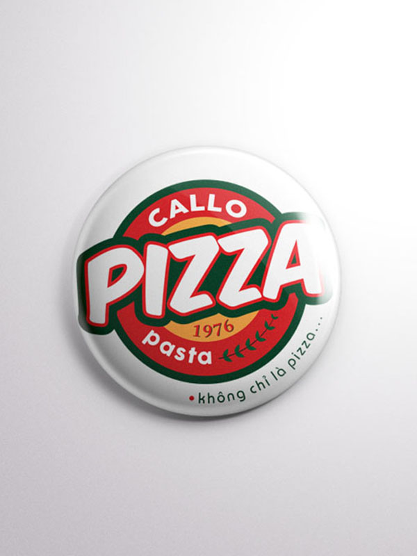
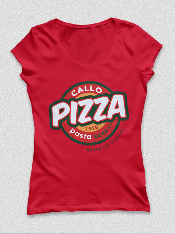
The logo comes in a version on white and a version on dark grey, so it reads clearly on light or dark grounds. Sinh Vũ mocked up the logo on a red T-shirt and on a round pin badge, two items staff and guests can wear.
The logo was also placed on a business card. A restaurant chain needs the logo to look the same in every outlet, so it was drawn with thick strokes and deep colours to stay clear whether printed on cloth or on paper.
The value
Pizza Callo has a compact logo that tells you at a glance the restaurant sells pizza. The owner remarked that the identity shows exactly what the restaurant sells and makes guests feel hungry, even before they have come to the restaurant.
A round logo on shirts and badges
In their own words
I am happy with Sinh Vũ's design. The identity shows exactly what we sell, and makes people hungry even before they have visited Pizza Callo.