The most innovative billboard advertising campaigns from around the world.
Done well, billboard advertising campaigns can be incredibly powerful. All of the billboard ads in this article go beyond the obvious to promote their products in clever, witty and innovative ways.
Large and prominently placed, billboards offer a huge canvas to target the public. But cutting through the surrounding visual noise is truly an art form. There are a range of ways billboard advertising campaigns can shake things up; whether it’s by using different materials, creating designs that interact with the surrounding environment, or just introducing some super-clever copy. Read on for our pick of the most brilliantly creative billboard advertising campaigns. Which is your favourite?
For some inspiring ads on a smaller scale, take a look at our pick of the best print adverts around.
01. IKEA Steps
The best billboard advertising: Steps by Mother London
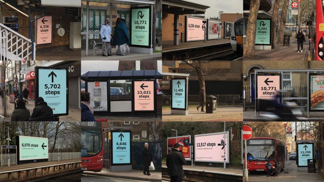 This intriguing approach to billboard advertising was created by Mother. To promote IKEA’s new Greenwich store – the most sustainable IKEA ever – the ad agency devised a campaign aimed at highlighting the store’s eco-friendly credentials. Billboards and posters all over London directed would-be shoppers to the new store, encouraging them to take the most eco-friendly route (on foot, or by public transport).
02. Rust
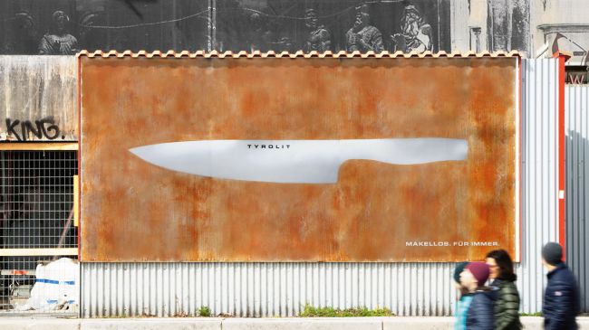
This billboard transformed over the course of a month
This billboard by Heimat transformed over time to show off Tyrolit’s Iceline knife range’s USP. Initially, passers-by were faced with a mysterious sheet of metal, bearing only the brand’s logo. In a matter of a few weeks, the surface became covered with rust, leaving only the shape of a knife untarnished. The tagline: Flawless. Forever. drove home the message.
03. Wave of Waste
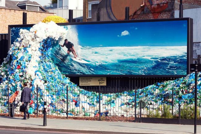
The plastic for this sculpture was all collected in the UK
To mark World Oceans day in 2018, Corona worked with Wieden + Kennedy on this sobering billboard advertising campaign. Artist Andy Billett created a 3D ‘wave’ from plastic waste collected in the UK, which combined with an image of Chris Hemsworth surfing to emphasise the volume of plastic ending up in our oceans. The public was encouraged to drop off their own waste at the site. Similar campaigns were run in Melbourne, Lima, Santiago, Bogota and Santo Domingo.
04. Who is America?
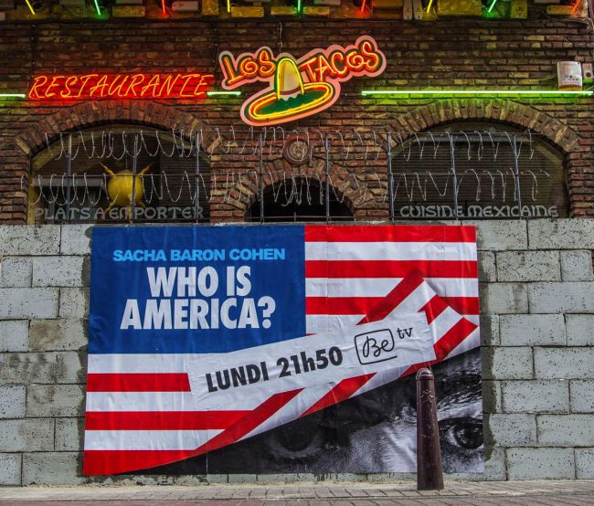
The razor wire’s a neat touch
Sacha Baron Cohen’s TV series, Who is America?, was an exercise in getting assorted American politicians to humiliate themselves on camera, with hit-and-miss results. But it’s hard to fault this Belgian campaign to get people viewing on BeTV; Brussels agency Happiness built ugly breeze block walls in front of Mexican restaurants, complete with razor wire, and used them as billboards to advertise the show. Strong stuff.
05. Follow the Arches
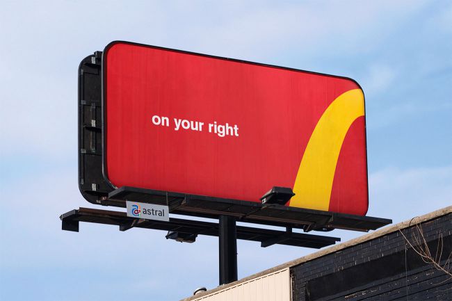
Now this is how you abuse a logo effectively
It takes a lot of chutzpah to mess with a logo, but that’s what Toronto agency Cossette, along with Spencer & Jordan, did for this McDonald’s campaign. For the award-winning Follow the Arches campaign, the team deconstructed the iconic golden arches and transformed them into minimal directional billboards to help steer drivers to the nearest branch of McDonald’s.
06. Reebok ZPump 2.0
Swedish agency Animal came up with an impressive way of drumming up publicity for Reebok’s new running shoes: it set up an outdoor billboard in central Stockholm, challenging people to a human speed test. Anyone who ran past the billboard faster than 17 km/h unlocked a brand new pair of ZPump 2.0 shoes.
The billboard used a speed camera developed specifically for this campaign, which used realtime object recognition and motion detection to identify runner’s movements and calculate their pace, to great effect.
07. Coca-Cola: The Sign
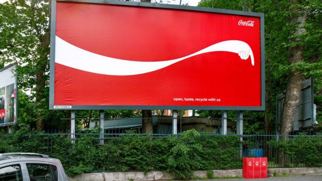
This way to recycle your bottle
This billboard advertising campaign from Publicis Italia encouraged Coca-Cola drinkers to recycle their empty bottles. The agency cleverly adapted Cola’s iconic ribbon design to literally point passers-by to the nearest recycling bin. There was some controversy surrounding the ads, however, with critics commenting that Coca-Cola was doing too little to offset the massive environmental impact of its products.
08. AIR-INK
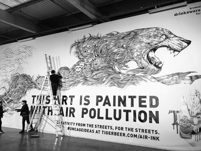
This billboard ad is painted with ink made from exhaust fumes
Launched via a successful Kickstarter campaign from Graviky Labs, AIR-INK is an innovative ink made from air pollution. A device captures particles of black soot from car exhaust fumes and chimney smoke, which is then processed and transformed into safe, top-quality ink.
To promote the project, the team roped in illustrator Kristopher Ho to paint a huge billboard for London’s Shaftesbury Avenue, effectively ‘recycling’ the pollution into artwork. To make the scale of the undertaking clear, and intrigue passers-by, the billboard has a simple slogan: ‘This art is painted with air pollution’.
09. McDrive
Taking advantage of the fact that in France its client, McDonald’s, operates a lot more drive-through restaurants (known as McDrives over there, because France) than its main competitor, Burger King, TBWA\Paris set up this cheeky pair of billboards near Brioude in the Haute-Loire. The ludicrously tall one gives directions to the nearest Burger King drive-through, 258km away, while the little one points drivers to a much, much closer McDrive. Formidable!
10. The Human Billboard
When extreme right-wing party Le Front National won the first round of the 2017 French presidential election, the country saw a rise in racist rhetoric. Leo Burnett France and Le CRAN (Le Conseil Representatif des Associations Noires) used a different type of billboard to remind the French people the lasting damage racist language can have.
Racist insults were collected via social media, and tattooed onto the body of a man to turn him into a ‘human billboard’. The man then walked around Paris distributing leaflets explaining the campaign and encouraging people to join the conversation.
11. Spotify
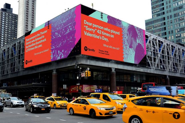
Spotify’s data-driven ads provided a light-hearted look at 2016
Spotify had some fun creating a series of billboards worldwide under the heading, ‘Thanks 2016, it’s been weird’. Drawing on Spotify’s vast repository of user data, the ads, created by its in-house team, are made up of posters inspired by some of the more unusual facts and figures related to the digital music service, and pointing out peculiar and funny outliers hidden amongst the data. See more here.
12. Unitech
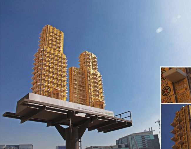
This Unitech advertising takes marketing to new heights
Developed by the team at advertising agency JWT, New Delhi, this Unitech billboard takes advertising to new heights. Here, hundreds of dummy matchboxes were produced and and stuck together in these Lego-like high-rise structures promoting new villas gated community at Karma Lakelands in India.
13. IBM
As part of IBM’s Smarter Cities initiative, ad agency Ogilvy & Mather Group
(now Ogilvy) designed “ads with a purpose”, adding a curve to the billboard to create a rain shelter, bench and even a convenient ramp while promoting the technology brand – because “if cities were smarter, life in cities would be better”.
The billboards seamlessly blend modern design with functionality to help people while they remind them who is behind the act of generosity – it’s a clever way to sell.
14. Burt’s Bees
To promote its Intense Hydration range, Burt’s Bees used its own consumers to reveal a before and after demonstration with an interactive billboard in Minneapolis, created with the company’s go-to ad agency, Baldwin&.
This clever use of design and construction meant that the ‘before’ image literally ‘flaked’ away as viewers peeled off the skin of coupons attached to the board, redeemable at local stockists. Eventually, all the coupons were removed and all that was left was a shiny, flat surface and a happy, smiling ‘hydrated’ ‘after’ image.
15. Lego
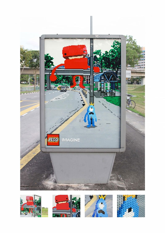
These bus stop billboards feature unique lego art that blends seamlessly into the surroundings
Lego has a consistently brilliant, creative and fun approach to its ad campaigns, but one that particularly sticks out is Oglivy Malaysia’s bus stop billboards, featuring unique lego art that blends into its surroundings.
Certified Lego artist Nicholas ‘Blackbulb’ Foo worked with Ogilvy’s creative team to design three separate bus stop signs: Whale, Monster and Caterpillar. From the front the murals blend into the background, with lego characters parading the streets as if the board is a portal to another dimension that’s entirely made of lego.
Also read: How Lego reinvented itself as a super-brand
16. Leica
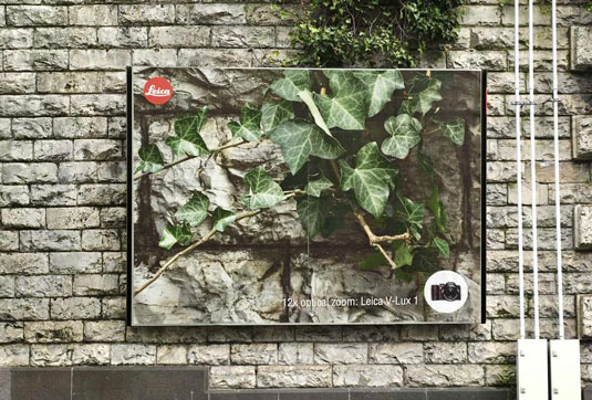
A picture speaks 1000 words, or in this case, 12 x optical zoom
A picture speaks 1,000 words, or in this case 12x optical zoom. These billboards designed by the team at Advico Young & Rubicam in Switzerland display exactly how simplicity can often be the most creative and impactful form of design. Each billboard is a zoomed in image (presumably 12X and taken by a Leica V-Lux 1 camera) of the object behind it, displaying the camera’s superior zoom quality that doesn’t miss a detail.
17. OBI
DIY chain store OBI decided to do something different by placing its billboards not in the usual places but on people’s homes themselves. Its thinking was based on the question: Why promote things that make our homes more beautiful, with advertising that makes everything look uglier?
Instead, with the help of advertising agency Jung Von Matt/Elbe, it came up with something much more imaginative and attention-grabbing. “The big challenge was the search for appropriate run-down houses,” Jung Von Matt/Elbe’s Max Pilwat explains.
18. McDonald’s
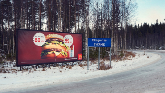
This billboard from McDonald’s ‘slashes’ the price difference of its Big Mac
Love it or hate it, McDonald’s has always managed to produce inventive advertisements, which is why it’s made it into this list once again. Created by advertising agency DDB Stockholm, this billboard takes an innovative approach to ‘slashing prices’ on the border of Norway and Sweden. Highlighting the price differences on the cusp of each country, the advert showcases how much cheaper the Big Mac is in Sweden.
19. British Airways
This design from British Airways certainly got our attention. Designed by the Ogilvy, the company uses surveillance technology to track flights – allowing a child to point to the overhead flights in real time. BA head of marketing Abigail Comber explains, “This is a first, not just for British Airways but for UK advertising.”
Channelling that childlike excitement of seeing your first ever aeroplane, the billboard is a truly marvellous example of interactive design. You can see the billboards in London’s Piccadilly Circus and Chiswick.
20. OREO
One of America’s favourite cookies, Oreo celebrated its 100th birthday with the ‘Wonder-filled’ campaign, and The Martin Agency was tasked with creating a series of inspiring animations. It then teamed up with Brand New School to take over the largest advertising space in the United States – Times Square.
“It’s an amazing venue that allows the work shine in a dynamic space that naturally fills people with wonder,” creative director of Magnus Hierta enthuses. “This piece also takes advantage of the Times Square space by creating a visual tapestry of sharing that spreads across the screens and leaps from building to building.”
21. Formula Toothcare
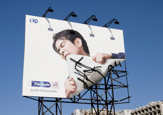
This billboard design tears apart the usual billboard design
This utterly creative billboard design for Formula Toothcare takes its tag line ‘builds strong teeth’ to extremes. The ‘broken’ metal frame makes the billboard design look all the more realistic and eye-catching – ensuring a strong execution in delivery. This would certainly catch our eye if we were walking past.
22. BMW
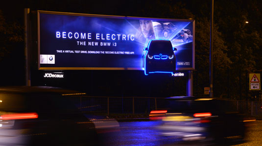
BMW pushes the electric element of its new car with halo lighting
Out-of-home communications agency Posterscope developed an illuminating outdoor advertising campaign to promote the BMW i3, which is claimed to be the world’s first premium fully electric car.
Posterscope’s Hyperspace division worked closely with BMW’s creative agency, WCRS, on the attention-grabbing campaign which incorporates ‘Halo’ lighting into customised billboard special builds to create an after-dark glow effect around 2D cut-outs of the i3.
become electric billboard
A companion app is available to increase the experience
Key parts of the car are separately illuminated to highlight the models hi-tech eco-friendly features and electric inner workings, while a cutting-edge printing technique accentuates the contrast with the backlit skin.
Part of a larger £1m campaign running on across roadside, rail and underground sites in the UK, the advertising also encourages consumers to download a companion mobile app from the App Store, enabling them to take a virtual test drive in the BMW i3.
23. Orphea
Orphea4D Protection is a powerful insecticide spray for exteriors. This brilliant campaign promotes the brand by transforming a normal billboard into a huge insect trap. Transparent glue was applied on a portion of the billboard in a recognisable shape and when flies and mosquitoes got trapped there, they made the shape visible.
24. C.A.L.M.
Street art can be a great way present a powerful message. To raise awareness of the charity C.A.L.M. graffiti artists Soulful Creative created these brilliant billboards. The posters aimed to highlight the statistic that three men under the age of 35 take their own lives every single day in the UK. The lighting is also a very nice touch – ensuring that passers-by will almost certainly take notice of the billboards.
25. Nike: Knitting
To promote its latest Free Flyknit sneakers, Nike got together with advertising giants Wieden + Kennedy Shanghai to knit a humongous shoe onto a billboard. With the help of three workers, strips of neon green were threaded together to create the shoe on top of a bare foot. The live knitting sessions took place on Nanjing East Road, one of the most heavily trafficked streets in Shanghai, and raised more than a few eyebrows…
Next page: More impressive billboard ads you must see…P2
